Looking at these two tally tables I discovered that the word lengths are quite similar however, there are some significant differences that prove my
hypothesis that the broadsheet has longer words. Even though, they both have the same amount, which is 3, of the biggest word (11 letters long) the cumulative frequency shows that tabloid’s cumulative frequency starts getting higher earlier on that the broadsheet suggesting there are more smaller words in the tabloid. I believe that the large amount of small words is not very significant as, they are little words such as, a, the, an, it etc that are used in every piece of writing no matter how complex it is however, most of the tabloid words vary around the 4/5 letters long area whereas, in the broadsheet it a lot more spread out but the words vary around the 5/6/7 letters long area. I have drawn a cumulative frequency curve to identify and illustrate where the median, upper quartile and the lower quartile can be found.
I am going on to find out the averages of this information so I can compare it with my hypothesis.
Mean
Tabloid
Mean:
To find out the mean I added the frequency column to get 100 and the added up the total column up to get 450. The mean = add all the numbers up together and divide the total by the how many there is. So:
450
100 = 4.5 = the mean word length for the tabloid.
Mode: 4 (most occurring)
Median:
There are 100 words so I divided it by 2 to get 50 and found the 50th value which is in the 4
Broadsheet
Mean:
The broadsheet clearly has a higher mean as there is more letter is total (486) and both newspapers have the same amount of words.
The mean is 486
100 = 4.86 = mean word length for the broadsheet
Mode: 5 (most occurring)
Median: 50th and the 51st value
4 and the 5 = 4.5
Viewing these calculations, it proves my hypothesis of the broadsheet having longer words is correct, the mean word length in the broadsheet is higher in the broadsheet and the mode, the most occurring word length in broadsheet is 5 which is higher than the tabloid’s mode which is only 4.
The cumulative frequency graph show the comparison between the two newspapers and my hypothesis that the word length in the broadsheet is longer has been proved as the median in the tabloid is 3.6 and the broadsheet’s median is 4. Looking at the inter-quartile range (tabloid 2.6 and broadsheet 3.7) suggests that the broadsheet has a much more varied length of words.
I added box plots to make it easier to view and compare the Tabloid and the Broadsheet’s Median, Lower quartile, Upper Quartile and the Inter Quartile Range (IQR).
Both newspapers have the same range of word length which makes the box plots easier to compare.
From comparing my box plots I have found that the broadsheet has a larger IQR. This shows that the broadsheet has a larger variety of word lengths than the tabloid. The broadsheet has a larger median suggesting that the broadsheet on average, a larger word length.
Both box plots are positively skewed which implies that the word lengths are mainly small however, I think this is because of the amount of small words such as, a, the, in, a, on etc that occur in every piece of writing.
I found the spread of data around the mean using standard deviation using the formula:
√2538 – (450)
- (100)
√2538 – 20.25
√5.13 = 2.26 is the standard deviation for the tabloid.
I did the same for the broadsheet.
√3050 – (486)
100 (100)
√30.50 – 23.6196
√6.8804 = 2.623
Broadsheet has a standard deviation of 2.623 whereas the tabloid has a standard deviation of 2.26.
Comparing these two answers it is clear that the broadsheet has a larger standard deviation than the tabloid meaning it has a bigger spread of data around the mean so the chances are higher of having a longer word length.
I am going on to compare the sentence lengths in the two newspapers. I am finding 100 sentences and recording the amount of sentences in tally table also, adding the ‘group’ and ‘freq. density’ column so it will possible to make a histogram to represent my data. I used a histogram as the area of each bar = the frequency. This makes it very easy to compare them as the differences are simple to see.
Tabloid
Looking at the histogram, it is clear that the broadsheet has a larger sentence length as; the broadsheet doesn’t have any sentences that are 40 – 50 words long sentences. Also, it is noticeable that the broadsheet has more spread out data.
I looked at the two articles and decided to compare the way the two articles were divided up into headlines, writing and pictures. I believe that the broadsheet will have more writing and to find out I am going to measure both articles.
Broadsheet:
Whole Thing: 21cm x 24cm = 504cm2
Headline: 21cm x 2cm = 42cm2
Picture: 21.5cm x 12cm = 365.5cm2
Writing: 22cm x 4cm = 88cm2
+
17cm x 0.5cm = 8.5cm2
96.5cm2
Check: 96.5 + 365.5 + 42 = 504cm2
Tabloid:
Whole thing: 27cm x 26cm = 702cm2
Headline: 10cm x 27cm = 270cm2
Picture A = 12cm x 7cm = 84cm2
Picture B = 12cm x 13cm = 156cm2
All Pictures= 84cm + 156cm = 240cm2
Writing: 27cm x 4cm = 108cm2
+ +
12cm x 7cm = 84cm2
192cm2
I then decided to change these areas into a percentage however, the have different totals (the area of the whole article) therefore, I am going to put them into a percentage so it is possible to compare them out of 100(%).
Area of whole article in the broadsheet: 504cm2 = 100%
Area of whole article in the tabloid: 702cm2 = 100%
Broadsheet:
Headline= 8.3%
Picture= 72.5% (to nearest decimal place)
Writing= 19.1%
Tabloid:
Headline= 38.5%
Pictures: 34.2% (to nearest decimal place)
Writing: 27.4%
With these results I have taken a few points into consideration such as, both articles are picked from the front page so it has to be expected to have a big picture for eye catching reasons also, in the tabloid the writing is bigger than in the broadsheet.
I am going to put these answers in a pie chart. So I can compare the two papers with diagrams rather than numbers.
I am going to round the numbers to the nearest whole number, so it is possible to put the numbers into a pie chart
Broadsheet:
8 + 73 + 19 = 100
360/100 = 3.6 degrees each
8 x 3.6 = 28.8o = Headline
73 x 3.6 = 262.8o = Picture
19 x 3.6= 68.4o = Writing
Tabloid:
39 + 34 + 27 = 100
360/100 = 3.6 degrees each
39 x 3.6 = 140.4o = Headline
34 x 3.6 = 122.4o = Pictures
27 x 3.6 = 97.2o = Writing
Looking at these two pie charts it is clear they are very different. Immediately you can see the picture on the broadsheet takes up a lot of space (72.5%) however, with it being from the front page it needs to stand out because it needs to be eye catching. On the tabloid, you immediately notice the big headline which takes up 38.5% of the space. The tabloid has 8.3% more writing however, the writing on the tabloid is bigger also, there is a section in the middle (12% of the whole article) which only has nine words in it.
I think the broadsheet gives more information, has a longer average word length and sentence length. Overall, my results agree with my hypothesis, however, I was expecting to have a higher percentage of writing in the broadsheet however, these articles were only small samples taken from the front pages on the same day. This should not be believed to be a true reflection of tabloids and broadsheet as, I only took one sample of each, a broadsheet and a tabloid and every newspaper article is different. I could have taken other samples from different days. If I was to do this again, if I had more time, I would take more than one sample of a broadsheet and a tabloid newspaper so there would be a better comparison between tabloid and broadsheet newspapers. I would also take a bigger sample of words and sentences to compare so again, I can get a fairer and better comparison.
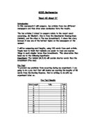
- what have you found overall in relation to yuor initial hypotheses?
- where there any problems in doing it?
- why should this not be believed to be a true reflection of tabloids and
broadsheets?
- if you did it again what would you change?