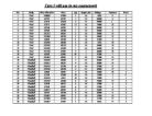
This is the data I got from the survey I did using a website selling used cars. My data is representative because I took a sample of four different types of cars. Also, for BMW and Ford, I got cars that are the same age so I can just compare the mileage and the price. For Audi and Peugeot, I got cars of different age so I can compare the age with the price. However, because I can’t get the same mileage for the cars with different ages, I wouldn’t get a very reliable result. I should keep all the factors the same apart from the one I’m testing but I can keep the mileage the same because some people use their car more than others.
Furthermore, I did the survey from a website that is currently selling cars so my data is new and my results will be up to date. I used cluster sampling because the data is already in groups which are the make of the cars. Then I randomly picked four groups to use for my investigation. I didn’t use systematic sampling or stratified sampling because the amount of cars the website had for sale was limited. If I took a systematic sample of the data, I would only get about five cars which isn’t good enough to work with because it will not be representative. If I took a stratified sampling to represent all the groups, I will also be left with a little bit of data to work with.
I decided to group my data because the spread of the mileage and price is too big. Also, they are all different. I grouped them so that I can easily see the distribution of the data. The problem with grouping data is that I don’t know what the exact values are any more, which means I will have to estimate statistics like the mean and median etc. I don’t want to estimate the calculations because I want my results to be as accurate as possible therefore, when I do calculate them, I will use the actual numbers instead. From the frequency table, I can easily tell that there is only one car with a low mileage and nearly half of them have a high mileage. Also, I used unequal widths because there are some big gaps in the data.
I put this data onto a pie chart and bar chart so that the percentage and frequency of a certain group can be seen quickly and easily. I also made cumulative polygons to how the cumulative frequency changes as the data values increase.
I put my data in order if size so it is easier when making calculations such as the median. I didn’t include the year because they are all the same so the results I get will be reliable.
I worked out the mean of my data because it is usually the most representative and because it uses all the data. However, it may be distorted by outliers. I also worked out the median because it is not distorted by outliers. However, it is not always a good representation of the data so I will use it together with the range and interquartile range to make it more useful. I can’t find the mode because all of the data is different. There isn’t one that is more common than others.
I calculated the range, interquartile range and the D8 – D2 decile range to see the spread of the data. I calculated the interquartile range because the range can be affected by extreme values as it only takes the difference between the highest and lowest number. The interquartile range tells me the range of the middle 50% of the data which is where most of the activity’s going on. I calculated the D8 – D2 decile range because it gives me the range of the middle 80% of the data which ignores any outliers. I did the decile range even though I did the interquartile range because the interquartile range might be cutting too much of the data away.
For the mileage, the range is very high and the interquartile range and decile range is much lower. This means there are some high values. The interquartile range and the decile range are quite close together so they give me a more realistic idea of the spread. For the price, the ranges are quite consistent so there shouldn’t be any extreme values.
Mileage standard deviation
The standard deviation of mileage is very high which means the mileage data is more spread out. An advantage of the standard deviation over the ranges is that it uses all the data.
Price Standard Deviation
The standard deviation of the price data is quite small so the data isn’t very spread out.
To prove or disprove my hypothesis, I am going to look at the correlation between the mileage and price of the BMW cars I have in my data. To do this, I am going to use Spearman’s co-efficient rank of correlation and a scatter graph.
I worked out Spearman’s co-efficient rank of correlation so I can know how well ordered the data is. Both the rank of correlation and scatter graph shows that there is a strong negative correlation between the price and mileage of cars. The strong negative correlation of -0.855 shows that as the mileage increases, the price decreases.
I can’t find the mode for the mileage and price because they are all different.
Both the mean and median year is 2004 if the mean is rounded off. The price mean and median is quite close together with around a 300 difference. However, the mileage has quite a large difference which is around 10 000 miles. I also calculated the mileage because it will also affect the results and I can’t control the mileage.
The ranges for the years are all close together so there aren’t any outliers for that. For the price, the range is quite high compared to the interquartile and decile range. There could be an outlier here. Also, the interquartile range and decile range for mileage are closer together than the range so there may be an outlier here.
To get the standard deviation, I will use Microsoft Excel to calculate it quickly.
Price Standard Deviation
Mileage standard deviation
The standard deviation of the year is very low so there aren’t any extreme values. The standard deviation of the mileage is quite high so this could produce unreliable results. This is because the mileage will also affect the price. The standard deviation of the price for Audi is higher than the price standard deviation for BMW which shows it is more varied which could be because of the years.
My scatter diagram and Spearman’s co-efficient rank of correlation shows that there is a strong positive correlation between the price and year of cars. The scatter graph and the strong positive correlation of 0.964 shows that as the year increases, the price also increases. This means that newer cars cost more. Also, I worked out the equation of the line of best fit so it can be used to predict the price or age of Audi cars.
All the ranges for the price are quite consistent so there shouldn’t be any outliers there. Similarly, the ranges for the mileage are also quite consistent so there shouldn’t be any outliers here either.
Price Standard Deviation
Mileage standard deviation
The standard deviation for both, the price and the mileage are low so the data is quite close to the mean.
I worked out Spearman’s co-efficient rank of correlation to find out the correlation between mileage and price. Both the rank of correlation and scatter graph shows that there is a strong negative correlation between the price and mileage of cars. This is the same result I got from my BMW data so it makes it more reliable. The strong negative correlations of -0.939 for Ford and -0.855 for BMW both show that as the mileage increases, the price decreases.
I chose to use equal widths for the price because the values are consistent with no gaps in between.
All the ranges for the year are close together. The range and decile range for the price and mileage are closer together than the interquartile range so I think the interquartile range is leaving too much data out.
Price Standard Deviation
Mileage Standard Deviation
The standard deviations for year price and mileage are all low which means the data isn’t very spread out and is close to the mean.
The scatter graph and Spearman’s co-efficient rank of correlation shows a strong positive correlation between the price and year of Peugeot cars. The strong positive correlation of 0.988 shows that the newer the car, the higher the price. Also, the strong positive correlation of 0.964 for Audi also shows this. This makes my result more reliable. The Spearman’s co-efficient rank of correlation for both Audi and Peugeot are very close together because all the data is of cars between 2002 2005 which means they have a low range.
Conclusion
My conclusion to my hypotheses is that they are in fact true. This is shown by strong co-efficient results and scatter graph gradients. The reason why the co-efficient rank of correlation for BMW and Ford has quite a big difference is probably because the mileage data for both cars had a difference. Ford had a mean mileage of 14865.6 whereas BMW had a mean mileage of 63962.1 which is a big difference. Also, the decile range for Ford is £1000 and the decile range for BMW is £3200. Furthermore, the mileage decile range for BMW is 27529 miles and for Ford it is only 11680 miles. The differences in these figures could be one of the reasons for the difference in co-efficient rank.
For my project, I think my sample size was too small. I could’ve went to a different car company that’ has a bigger amount of cars for me to use. If I used more cars for my project, my results are likely to be more accurate. Also, I could’ve got a bigger range of cars because the prices of cars of my data are quite low. I could’ve got a very expensive type of car and see how much that decreases compared to a cheaper car. Furthermore, I could’ve got data on a vintage car which the price increases as the age increases. This would’ve shown a big difference compared to the cars that I’ve done, therefore, the results I obtained in this project should not be used to estimate prices of other cars. It should be used for the type of car I used or a car in the price range that I used.
To improve my project, I could expand it by using data on different cars with a higher price and a lower price. I could also collect data on vintage cars to use for my project.