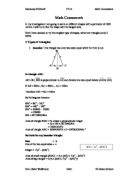
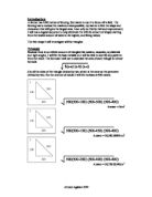
Triangles
Isosceles Triangles
Scalene Triangles
Equilateral Triangle
In order for me to analysis these results I will have to remove the results I got for the scalene triangles as there is no real trend with the results.
Analysis
The line of best fit shows a strong positive correlation. On this graph I am not going to represent the data I retrieved from my scalene triangles, this is because that data would dramatically change my trend line, in a way that no observations would be possible to be made. From this graph I can say that as I decrease the gap between the base and hyp, the area increases. This is very similar to the squares and I have also realised that the shape that has the perimeter proportionately has the largest Area, while the shape with the furthest gap between it length + width, base + hyp, and has the lowest area. I made a statement, when I was analysing the rectangles, about how the gap in between decreases and how that makes the area increase, It is the same in this case. An example being shape 1, which has a difference of 350mbetween the hyp and the base and it, has an area of 7070m2. On the other hand shape 3, which is not an equal shape but still has a difference of 50 between the hyp and the base and has an area of 47430. My Graph also backs up this theorem. As I have said already the shapes, that have been evenly distributed through lengths and angles, give the largest area and this agrees with what I have just said about the gap between the sides and area, as the shape with the lowest gap between the sides is regular, and in both cases the equal shape has had the largest Area. So far my hypothesis has been proven to be true.
Statement
I have found out that the shapes that give me the largest area are regular and because of this finding I will only use regular shapes for the rest of this investigation. This is because I feel that my findings are reliable and it will save me time. This is not the only thing I am going to change; I will draw a graph comparing the highest results from all the shapes as I continue and see if there’s a link between the amount of sides and the area. So in my next section, pentagons, I will draw a graph comparing the area of the equilateral triangle, square and the regular pentagon.
Pentagon
Analysis
What I can tell from the graph is that I increase the sides of a shape the area increase as well, so there is a positive correlation between the area and the amount of sides. An easy way to explain it would be to say as I increase the amount of sides, the area will increase. This is a statement that I did not make in my aim/hypothesis. I can tell that the area increases as I increase the amount of sides this is proved as in the triangle, which has 3 sides I received a total of 48,126m2, when I used the square I had an area of 62,500m2 and when I used the pentagon the area increased from the area which I received from the square, and the area I got was 68823m2.
I now feel that as I increase the sides the area will increase, so I should get a larger area with the hexagon.
Hexagon
Analysis
I can tell from the graph that the statement that I made earlier was true. The statement was as I increase the amount of sides the area will increase; basically there is a positive correlation between the number of sides and the area. My earlier hypothesis that I made at the beginning of the task has already been proved true, which was, regular shapes will give me the largest area for that certain type of shape.
Heptagon
Analysis
So far all my graphs prove that my statement was true and I have also realised that the increase between the shapes have decreased. Before the increase between the equilateral triangle and the square was 14,376 compared to the difference of the hexagon and heptagon, which is 1993.526. However, the area is still increasing as I add on an extra side, my hypothesis is still true.
Octagon
Analysis
This graph also shows that as I increase the amount of sides, the area will increase, which was my hypothesis. The trend line also supports what I have just said as it is always going up which shows a positive correlation, as I increase X, Y will increase as well. However, the increase has now decreased dramatically.
Nonagon
Analysis
I can tell from this graph that the hypothesis I made is true and that the observation I made is true, so far. My hypothesis was that as I increase the amount of sides the area would increase; I then expanded on this point and said that the difference between the areas was decreasing. A good example that shows this is the difference of 874.67611m2 between the regular octagon and the regular nonagon. When compared to the difference between the square and the pentagon, 6328m2, the difference of the octagon and nonagon is minor.
Decagon
Analysis
From this graph is it clear to me that as I have increased the amount of sides the area has increased at the beginning when I started with the square and the triangle the increase was large. However, as I moved on to the polygons and the amount of sides increased the area has increased as well but the figure in which it has increased by has decreased with time. My hypothesis has been proven to be true and as a result of this I will know move on to a shape with infinite sides, a circle. I am doing this as 8 shapes is a good sample to make an observation from and thus far my observation has been proven to be true and I do not feel there is any need for me looking for further evidence. So I will know move on to the circle, which has infinite sides, and if my hypothesis is true this shape will give me the largest possible area because it has the most sides.
Circle
Analysis
This final graph, basically, shows us that shape no.9, the circle, gives us the largest area. In addition to this, it also shows us a positive correlation in increase of area, as I increased the total amount of sides. From this I can say my earlier statement, which was as I increase sides the area will increase, was true. My hypothesis had already been proven correct by the rectangles and triangles. My aim was to see which shape the farmer could use, to get the largest area. The shape that the farmer should use is the circle, as when I increased sides, the area kept on increasing and because the circle has infinite sides, the largest number of sides available, it also has the largest Area (M2) available.