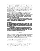
The table below display the amount of value lost by each Rover car.
Rover Cars
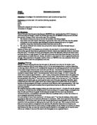
I then transferred the data onto my scatter diagram.
As you can see the graph shows a positive correlation and this means that as the mileage of a car increases the depreciation of the car also increases. Yet again some cars may not follow the same relationship, for example, a Rover car that had done 52000 miles lost a value of up to 64% whereas a Rover car that had done 43000 lost 87%. This again shows that there are other variables affecting the price.
Apart from this, the graph does show a positive correlation. The range of the percentage loss is a substantial 65% and this was due to a difference of 94000 miles in difference between the car that had done the shortest number of miles and the largest number of miles.
I shall now be checking whether Vauxhall cars follow the same pattern.
Vauxhall Cars
This table shows how much value the Vauxhall cars have lost.
The table and graph also follow the same pattern as the Rover Cars and this is confirmation that as the mileage of a car increases the depreciation of the car increases as well.
Hypothesis 3
Engine size and Price
A factor I thought would make a difference to the price of the car is the engine size. The basis for this statement is because I believe that the bigger the engine the more powerful and faster the car is and this means the price of the car would be higher.
For this part of the analysis I shall be using convenience sampling. And I decided to use the first 75 cars. This is so that the answer I get in the end is more accurate and fair.
The stem and Leaf diagram below displays the data I took.
Stem Leaf
0 9 9 9 5
1 0 0 1 1 1 1 1 2 2 2 2 2 3 3 4 4 4 4 4 4 4 4 4 4 4 4 4 4 4 4 5 6 6 6 6 6 6 6 6 6 6 6 8 8 8 8 8 8 8 8 8 8
2 0 0 0 0 0 0 0 0 0 0 3 3 3 5 5 5 5
3 0
4 0
The stem and leaf diagram shows that the mode for the most popular choice of engine size is the 1.4 litre engine and the range of all the cars is from a 0.9 litre engine to a 4-litre engine.
To find out whether the engine size is an important factor on the price I took the 75 cars and put it in the table below. If I had more than one type of the same engine size I found the average price of all the cars.
This tally chart below shows the data for the engine size and price.
Using the tally chart I created a scatter diagram to show the relationship between engine size and price.
As you can see from this graph it has a positive correlation. This just shows that as the engine size increases the price also increases. Some of the points on the scatter diagram do not follow the same pattern. For example the arrow that is shown on the graph marks a car with a three-litre engine. This car is worth more than a car with a four-litre engine. This could of happened because something else has affected the price of the car such as the age or the make of the car. Another reason would be because the price of the car is what it is worth now not what its value should be when bought new.
This scatter diagram shows the value of cars when bought new.
As you can see it shows a much more accurate result than the other graph but it still shows the same positive correlation but this correlation is much stronger.
This has helped prove my theory that engine size does affect the price of a car.
Hypothesis 4 Make and Model
Now I shall be investigating whether the make of a car has an affect on the price of a car. To find this out I shall be using a quota sample of twelve Ford Cars and twelve Rover Cars. I believe that the Rover Cars will be more expensive because Rover is elegant and more stylish than the Ford so it may be more expensive.
I shall be representing my data using a population pyramid. Below is a table with the data that I took. The price that I have used is the price of the car when it is new.
Ford Rover
25 20 3 2 1 0 5 10 15 20 25
As you can see the Rover cars cost slightly more because they have cars that are priced between the ranges of £20,000 - £25,000 whereas Ford did not reach this price range.
Hypothesis 5
Number of Owners and Price
In this part of the investigation I shall be using a stratified sample. I have decided to use a stratified sample because this will help to make the result fair and accurate.
To work out the stratified sample I used this formula below.
I wanted to use a sample of 40 cars and after using the formula above it has helped me to find the number of cars that I need for my sample. The next page best describes how I calculated stratified sampling. For the sample I need:
- 18 cars that previously had one owner
- 16 cars that previously had two owners
- 5 cars that previously had three owners
- 1 car that previously had four owners
The comparative frequency polygon above shows how the number of owners has an affect of the price.
- Cars owned by one previous owner cost within the range of £4000- £8000 as well as from £12000-£14000.
- Cars that have been previously owned by two owners cost within the range of £2000-£6000 and this costs less than cars owned by one person.
- Cars owned by three owners only cost a maximum of £4000.
- Cars owned by four owners cost a maximum of £2000.
The four next tables give abetter detail on how much the cars have lost:
One owner
Two owners
Three owners
Four owners
As there are more owners the percentage lost by the cars increase. Cars with one previous owner lost about an average of 35%. Cars previously owned by two people lost about 65% - 70%, cars that had three owners lost an average of 75% - 80% and cars with four previous owners lost 80+%.
This has helped me to come to the conclusion that number of owners does have an affect on the price. The more previous owners a car has the less it would cost.