Data following Stratifying (see following page)
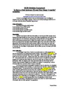
Above is the data after sampling had taken place. This data was put in a scatter graph using a program called Autograph®, and a line of best fit was also drawn to help illustrate the linear relationship between the two random variables, This can be seen below:
The above scatter graph indicates an approximate elliptical shape as well as linear relationship. Both of the variables are also random. Therefore I will use Pearson’s Product Moment Correlation Coefficient (P.P.M.C.C.) which will indicate the strength of the relationship, allowing me to formulate a hypothesis test to see if this relationship is significant, using critical values.
Shown Below is the Calculations done to find out the correlation coefficient for this data:
Necessary Calculations
SDx = Sdy =
Covarience =
P.P.M.C.C =
Hypothesis Test
Ho: =0
The null hypothesis is that there will be no relationship between academic achievement at G.C.S.E. level and at AS-Level
H1: >0
The alternative hypothesis is that there will be a positive relationship between the two variables. For this test I will use a 5% significance level.
The critical value at 5% significance level when n=50 using tables is found to be 0.2353.
Therefore since 0.49472>0.2353 we reject the null hypothesis and accept the alternative hypothesis that there is a relationship between participants’ G.C.S.E. grades/performance and AS-Level grades/performance.
Interpretation
I have found that there is a significant positive relationship between G.S.C.E. grades and AS-Level grades. I can see from my graph that the relationship is linear, and since my P.P.M.C.C. score is significant a line of best fit can be drawn and used as a predictor of AS-Level grades using G.C.S.E. grades. This line will be representative of the sample due to the relatively strong correlation between the two random variables. I can also see from my data that AS-Level scores appear to vary more than G.C.S.E scores as implied by the standard deviation. From the two mean calculations I have made from this data the average G.C.S.E. grade is just over a B and the average AS-Level grade is just over a C.
My aim for this investigation, as well as testing the relationship between G.C.S.E. scores and AS-Level scores, was to see if students could adapt to the higher intensity and increased difficulty of work at AS-Level compared to G.C.S.E. level. From my results it seems that most students cannot continue to perform at the same standard as they did at G.C.S.E. since the average grade obtained drops from a B grade to a C grade). Furthermore the standard deviation of AS-Levels is greater than at G.C.S.E level, indicating that students at AS-Level either do very well or very poorly, as oppose to at G.C.S.E. where students perform at a similar level to each other.
This data was worth collecting as it has provided an insight into students’ performance at two levels of education, and the relationship between the two – especially as it has been acknowledged that there is a large differential between G.C.S.E level of study and AS-Level study.
This investigation, although significant, has multiple flaws. Firstly the scoring system I have used gives a graph that the line of best fit has a smaller gradient than it should have. When I scored these papers I allow an ‘A’ grade at both levels a score of 5, meaning an ‘A*’ grade was given a score of 6. A better way of doing it would be to allow an ‘A’ grade at AS-Level to be 6. This would give a more accurate line of best fit.
Another flaw in this investigation is that it focuses on only students from three subject areas: Maths, English and Art. It is clear this is not representative of the entire population of students and doesn’t collect a broad enough set of data to give results that can be generalised. To counter this problem participants from a broader range of subjects would need to be sampled, this would allow the results to be much more representative.
The data used in this sample was exclusively from students at Sir John Deane’s College in Northwich, a centre of excellence which has high entry grades (B grades at G.C.S.E.) therefore again the results show only a section of the relationship between the two levels of education. This means that results cannot be generalised to a wider population. To help stop this problem the investigation would have to take samples from students at different colleges with varying entry requirements to give conclusions that could be more easily generalised.