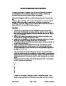
I selected my 36 records at random using a random selection process on a calculator, which is as follows:
SHIFT X ( 100 – 1 ) + 1 =
This process of random selection will ensure that the investigation is fair.
Hypothesis 1
The original price of the car will affect the second-hand price of the car.
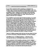
For this section of the investigation I will require 2 sectors of the car records. These are shown below:
I will use a cumulative frequency graph to provide my results for this hypothesis.
To do so I will need to make a few adjustments to my required car records, which are shown above.
The first adjustment will be to sort the records in order of the second-hand prices. This is shown below:
Secondly, I will need to categories the records into second-hand price groups. These are as follows:
Group 1 = £0 – £1000
Group 2 = £1001 - £2000
Group 3 = £2001 - £3000
Group 4 = £3001 - £4000
Group 5 = £4001 - £5000
Group 6 = £5001 - £6000
Group 7 = £6001 - £7000
Group 8 = £7001 - £8000
Group 9 = £8001 - £9000
Group 10 = £9001 - £14000
Group 11 = £14001 - £18000
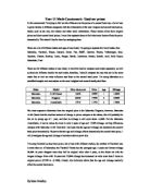
Now that the groups have been selected I can work out the frequency of each group. This process is done by figuring out how many cars apply to each group. Once those have been found the figures must be subsequently added together. This is shown below:
Group 1 = £0 – £1000 = 2 = 2
Group 2 = £1001 - £2000 = 3 = 5
Group 3 = £2001 - £3000 = 7 = 12
Group 4 = £3001 - £4000 = 8 = 20
Group 5 = £4001 - £5000 = 4 = 24
Group 6 = £5001 - £6000 = 1 = 25
Group 7 = £6001 - £7000 = 3 = 28
Group 8 = £7001 - £8000 = 5 = 33
Group 9 = £8001 - £9000 = 1 = 34
Group 10 = £9001 - £14000 = 1 = 35
Group 11 = £14001 - £18000 = 1 = 36
By using the information above, which includes the frequency, a cumulative frequency graph can be formulated. This is shown below:
The shape of the cumulative frequency curve will tell me how spread out the data values are.
The distribution of the data is not to the highest standard, as the curve is not particularly tight. This means that the results are not incredibly consistent because there is quite a wide variation.
I think this is due to the fact that there may be a few anomalies in the data, which has made a slight difference to the overall result. Also other car features may cause the result of this hypothesis to vary slightly. These factors are not surprising and will be taken into consideration throughout the course of every hypothesis in this investigation.
Overall the cumulative frequency graph does show a relevant curve, which proves that there is a relationship between the original price of a car and the second-hand price of a car.
The higher the original price of the car, the higher the second-hand price of a car. This proves my hypothesis correct.
Hypothesis 2
The older the car, the bigger the decrease in value.
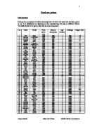
For this part of the investigation I will need to use 2 sections of the car records, however it would also be helpful to include a new column, as shown below:
The column in red is the new section. I created this new column on Microsoft Excel by deducting the second-hand price from the price when new. I have done this for all of my 36 selected car records. The information in this column will help to identify the difference between the new and second-hand prices of each car.
I will use a scatter diagram (shown on the following page) to show my results.
I can see that from the scatter diagram there is definitely a relationship between the age of the car and the second hand price of the car.
Again, there are a few anomalies, which have been pointed out, but they do not affect the overall result to this hypothesis.
The older the car, the bigger the decrease in value.
Therefore my hypothesis was correct.
Hypothesis 3
The higher the mileage the cheaper the car.
For this part of the investigation I will need to get my final results from the following information from the car records:
By using this information I will create a scatter diagram to show my results, which will then provide relevant information so that I can conclude this hypothesis and find out whether or not my theory is correct.
From this graph it is clear that there is a relevant relationship between the mileage and the second-hand price of the car.
The bigger the mileage the cheaper the car.
A few anomalies have been pointed out, though they do not interfere with the overall result of this hypothesis.
The results for this part of the investigation fit my prediction for hypothesis 3.
Hypothesis 4
The fewer owners the less decrease in value.
For this hypothesis I will need to use the following information from the car records:
I will create a scatter diagram (shown on the following page) by using the information shown above for all 36 car records.
I have noticed from this scatter diagram that, although the trend line suggests that my hypothesis is right, the information in the graph seems to put forward a different outcome of results to the trend line. There are many anomalies, which, although don’t interfere with the result of the trend line, seem insufficient.
I think this is due to the fact that the relationship between the number of owners and the second-hand price of a car is differed because other factors also cause a decrease in the price of a car. These other factors are not shown in the diagram because they are not relevant in this hypothesis.
Overall I think that the trend line is highly relevant in this graph because it proves that my hypothesis theory is correct. As the trend line suggests, the fewer owners the less decrease in value.
Hypothesis 5
The more extra features the car has, the higher the second-hand price of the car will be.
For this I will need to use the following information from the car records:
The extra features that I have chosen to use for this hypothesis consist of Central Locking, Air Conditioning, Airbags and Service History.
I have decided to create a scatter diagram for this hypothesis. To do so, I will need to devise a table of car records (as above), which includes the specific information that is required to make a scatter diagram. The information that is present in the table of car records will not be suitable for a scatter diagram therefore, a few changes will have to be made.
I have formulated a table with only one column, which shows the amount of extra features that apply to each car. This column is titled ‘No. Of Extra Features’.
Here is the table that I have remade to acquire the relevant information:
With all the required information now in place I can create scatter diagram, which is shown below:
The diagram shows that there is a relationship between the second-hand price of car and the number of extra features that are included. The graph shows that the more extra features the car has, the more expensive it is likely to be.
Of course, there are a few anomalies, which have been pointed out. This is not unusual and luckily they have not interfered with the overall result.
Overall, my hypothesis theory was correct.
To conclude this piece of coursework I have found that all the results of my calculations and graphs have supported my original hypotheses. This indicates that I produced relevant theories to investigate what influences the price of a second hand car.