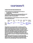
I think the age group of this advert would be teenagers up to young adults. In the picture there are two young females modelling the makeup, which shows that it might be aimed at that age group. Young adults of this age wear makeup and the girls reading the magazine would see the advert and maybe want to wear it from seeing it on the models.
The social class of this advert I think would be aimed at the group, C1, which includes people like supervisors and office workers, and then the rest, which includes people, like students and anyone else who wears makeup. I have chosen these groups of people because the makeup is not overly expensive, and looks appealing as you can see it on the model in the photograph. The makeup might also appeal to single people because they would want to look good, but not spend too much on doing that. Students may read this and will see the makeup, and the price; it is quite cheap but still looks good and fashionable, which would then appeal to trendy people. The models on the photograph are out and they look fashionable and look to be having a good time.
The selling point of these products is the price, not a lot of adverts put the price on the advert, but as this is quite cheap it will appeal to lots of people. The slogan “ Show some metal” gives the impression of how the makeup looks fashionable, as it is metallic. There aren’t really any other things on it to give a good image like value for money or good selling slogans or facts.
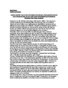
Advertisement 1, Graphics
Use of colour, I think the use of colour in this image is not very good. My reasons for this are; the colours don’t really make the product stand out, the dark background behind the two models makes the stand out, but not the product. There is only a little picture of the two products being advertised and you don’t really see them. This is not good, as you cannot tell what is being advertised by just glancing at it. The red strip across the bottom makes the small picture of the product stand out, but it would be more effective if it were a darker colour like black. The good thing about the image is, the lips and nails of one of the ladies are shown well on the photo so you can see what they look like on a person.
The use of clear outlines on the image are made by the two products being advertised, being made to stand out against the red background. This is also used on the text as it is white and shows well on the red background, and is clear to read but also quite small.
Instant impact. The main image is of two ladies, who look to be out and having a good time. This is the first thing you see, but it doesn’t make you look at the pictures of the products, as they are very small. The writing is also small, it would be better to make the text and photos of the products bigger and make the main image a b8it smaller. You would then be able to spot what is being advertised easier.