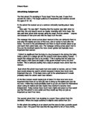
The text included in the advert is a bit too much. The terms and conditions are written at the bottom of the page and the details of the car itself are written at the top of the page, but instead of stating each key feature very basic. The advertisers have made sure that they have made it suitable for the readers. For example it has used an everyday situation where one of the parents have their hands full and are un able to open the doors and this is a main selling point to the car, the wording of the caption has been structured ion a positive and very catching way to the readers. It has also used the common statement about the children being a nuisance in the back of the car. But not anymore as the car its self has a built in DVD player! The advertisers have thought about what would sell and how it would appeal to the specific audience and have used everyday situations to lure their customers in.
The advertisers have included the Peugeot logo and have made that stands out and have also included their slogan which isn’t big but is bolder than the other text in that caption, which makes this slogan still stand out!
The slogan ‘The Drive of your Life’ is positive and sells the car. It gives the impression that the car will drive smoothly and will be comfortable and suitable for everyone and anyone who wishes to purchase the car. The slogan also gives the impression that nothing will ever beat a Peugeot.
The iconography used in this advert is all relevant to the car itself; each image around the car has a loose connection to a family situation. For example the house in the mise en scene is a typical family house; it is rare to see a twenty year old own a house this size and a car with 7-8 seats in. The child sitting in the advert also reflects the family situation. He could also reflect that as he isn’t in the car he is fed up as he has nothing to do, due to the fact that the car has a DVD player and is comfortable. The advertisers are making a suggestion that the car can also be entertaining to the children and doesn’t have to be a boring journey compared to the past journeys in which all families have experienced.
The advert is very obvious to whom it is directed at due to the images and the humour in which the advertisers have included in the advertisement. The target audience for this advert is families and the iconography plays a major part in selling the Peugeot 807.
The typeface which has been used in the advert is very plain; the font which has been used is either Times New Roman or Arial, two very plain and original fonts. The size of the writing depends on how important it is to the readers. The two main headings on the advert are bold and are in capital letters to stand out more. The advertisers have used a contrasting colour, so the writing stands out more. The white against the blue creates a soothing and calm atmosphere which could reflect the car and Peugeots slogan. The text at the bottom of the page is the small print, the important text with the price and how much fuel the car consumes. If the advertisers made the small print any bolder it could put the purchaser of the product at the beginning but luring them in with the positive comments at the top and showing an image of the car gives the reader a positive image and thought of the car.
The advertisers have very cleverly put an adults hand and the key facing the car; to the audience this could conotate and coincide with the captions of being in charge. The power has been given to that individual as they are now in charge of the doors and when people can get in and out as they are automatic and open by the key buttons.
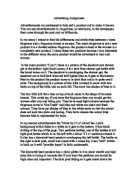
The second advert is the Ford Streetka. The function of this advert is to notify the targeted audience about this new soft top Streetka Luxury and to promote that it has 1 years’ free insurance for over 21’s. The advert does have some similarities to ‘Touch of Pink’ by Lacoste which is a perfume. They have both produced adverts that have similar mise en scene, which reflects the purity and freshness of the item they are promoting or marketing.
The advertisement is in colour and these colours are very loud and vibrant. They give the impression that the car is youthful, ‘cool’ and energetic. The mise en scene to the advert is very busy and energetic. This could represent the target market in which this car is suitable for. The colours could also be gender specific, as the colours are mainly pinks, yellows, and oranges and include flowers and insects, the car could be aimed for a girl target audience. The Ford Streetka is a small and petite car with small gadgets which can be associated with a female. The flowers and insects give the advert a fresh and revitalising feel to it. The colours are calm but at the same time energetic. The flowers are blowing across the page and the insects or dragonflies are randomly placed on the page, some that are near the car or are flying by. In the mise en scene there is a sun which is made out of the overlapping of the different colours used. In the ‘sun’ there is a face with sunglasses, in one lens the light is shining out of it as though a person is winking at you. From this the advertisers have given the target audience a positive facial expression but in disguise. The whole picture is very lively and also very summery. The season summer is associated with this car due to the fact that it has a soft top and the car is ideal to pose in and look hot and sexy.
The position of the car on the page is near the bottom, but is parked at an angle and shows a majority of the back of the car. The cars body is smooth and has many curves this could also reflect a woman’s body. Consequently the target audience would be women, due to the fact that they want to look sleek, sexy and hot in and out of the car. The silver of the car contrasts with its mise en scene. This means that the car stands out although there are insects and flowers blowing over the image, the iconography is very well presented on the page and keeps the eye interested for a long time. The caption on the page emphasises the shape of the car, it stresses the curves of the car and follows the same outline. The colour of the text is white and is outlined in a baby pink; the text itself has light glistening from it which gives the effect of diamonds reflecting the light. The advert also includes Fords logo and also has the price of the car which is at the bottom of the page in clear bold blue writing. The small print is present on the page but at the top.
From what I have suggested above I can conclude that the advertisers are aiming this advert at over 21’s and mainly females. The advertisers who made this advert have put an incentive on the page for over 21’s by saying they will get 1 year’s free insurance if they purchase this Streetka Luxury.
The OK magazine in which I took the advert out of is for women aged seventeen years plus. The advert was suitable for this magazine due to the fact that the target audience is woman and that the age of the purchaser is early twenties.
Both adverts advertise cars but have different markets and where in completely different magazine. The Ok Magazine is aimed at seventeen plus and the Marks and Spencer’s magazine is targeted at those who either have a family or those who are forty plus. Both adverts were advertised in completely different ways, but they still appealed to a wide range of people, although the Streetka was gender specific this could mean that more effort and time had to be taken into consideration as they are cutting the amount of purchasers. So the advert had to be more visually interesting and more suited to females.


