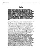
What are the connotations of the masthead?
The connotation of ‘Nuts’ is men’s private areas, crazy, exciting and fun. The masthead is red and red is a dominant colour, it shows sex, and it’s romantic.
Who is the cover star? What kind of target audience would be interested in her? What is her appeal?
The cover of the star is Jennifer Ellis and men would be the target audience that would be interested in her appeal is because she is pretty, she has big boobs and blonde hair and she is the stereotype of what men want she also has that girl next door appeal.
Describe the images used of the women. How they are being represented? Do you agree with this representation of women? Why might it be dangerous for both male and females?
The women that are used on the front cover of the magazine are young attractive girls who are maybe in their 20’s. They are representing typical blonde girls but it can be dangerous because it might cause the reader to think they have to look the girl on the magazine and it can give a bad name for the girl on the front cover, it can be dangerous for men because they might think it is ok to treat women like that.
Can you find any examples of exclamation marks? Why have they been used so extensively here?
On the magazine cover they have used 13 exclamation marks. They use so many to make it stand out so you know it is good quality gossip and makes you want to read it.
Can you find any examples of alliteration? Why have the publishers used this?
There are some examples of alliteration e.g. ‘Scouse Sex Bomb’. The reason the publishers have used this is to make the headline stand out and it makes you want to look at it.
What colours have they used on the front cover and why? How do they fit in the audience?
The colours that they have used on the front cover are red, orange, yellow which are very bright and fiery colours. These colours fit in with the target audience because the colours are primarily masculine and not actually feminine.
Why have they designed the bottom part of the front cover to look as though it has been ripped?
The magazine has been designed with a rip at the bottom for it not to look to perfect and it looks more masculine with it like that.
Look at the language used. Pick out 3 examples and suggest why each example has been used to appeal to the target audience.
The language used is quite sexual because the type of things they use e.g. ‘sex bomb’, 220mph super car and ugly animals. This language has been used to appeal the target readers because mostly men are really into the topics in the magazine.
Describe the fonts used on this front cover and explain the reasons they have been used.
The fonts that are used are big and bold. They use those fonts because they eye catching so men would want to buy them.