At the bottom of the right side of the double page spread, are details on the main advertised feature of the car in this particular advert, the Audi A4’s “Multitronic Gearbox.” “Multitronic gearbox for improved driving dynamics,” is in black bold san-serif typeface at the bottom of the page next to the seem. This statement is simple and has the purpose of informing the reader to what reason the “multritronic gearbox” serves. It is in a larger font than that of the writing to the right of it, which goes into more detail about the gearbox system. Also the details about the gearbox are not emboldened unlike the statement next to the seem.
The paragraph with the further information about the gearbox system gives information about the “Multitronic transmission” on the Audi A4, using words which are meant to attract the potential buyer, such as “seamless” which describes the acceleration of the car and “ease” which describes an automatic gearbox. These are all to attract the reader of this particular magazine. Also in this paragraph, at the end, the price that the car is available from is shown. The price that the Audi A4 is available from is £18,640. This implies that the target market for this car is people who are middle class people with a relatively high income.
Underneath the paragraph in emboldened, black, san-serif font is “The new Audi A4.” This is a very simple statement, which informs the reader of the make and model of the car. It is positioned in the bottom right hand side of page, which is on the right side of the double page spread. This is because if the reader is not particularly interested in the advert and only glances at the page, then, “The new Audi A4” is the last piece of text that the reader will see on the page and so will stay in their mind.
In the top right hand corner of the right side of the double page spread the name of the manufacturer of the car, Audi, is shown. It is in red san-serif print with a font style unique to Audi and is positioned under the four-ring symbol of Audi. The four rings are in a silver colour and are given a modern three-dimensional look, which gives an impression of similarities to metal and a likeness to the car advertised which is also in silver. Silver, or metallic grey, is also one of the most popular colours of car purchased in the UK, and that is probably why the colour of the car advertised is in silver, although the car will be available in a variety of different colours. The symbol contrasts to the writing directly under it, this makes both the text and Audi symbol stand out more. Also, both the symbol and the text stand out on the musty yellow background because they are both extreme contrasting colours to the background.
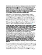
In the centre of the left side of the double page spread is a figure, consisting of parts of the Audi A4’s chaise, engine and interior, which has the purpose of depicting a person on a pair of skis, holding ski poles and wearing a scarf. This picture has the sole purpose of interesting a potential buyer scrolling through a magazine, because it is unusual, imaginative and interesting. It will also keep the reader on this page while they figure out what parts of the car have been used to symbolise parts of the skier, his clothing and skis. This means that when the reader has finished their interest in the ski figure then they may look at the main focus of this advertisement; the picture of the car, and then read through the advert and information about the car itself. This is an inventive, innovative and highly original advert although it uses the same technique that quite a lot of companies use to sell their products. The reader is drawn to the advert by an object of interest, which is not the main focus of the advert at all, and then reads on to notice the product itself. Audi use this same method of advertising for another advert for the Audi A4 that also has a figure made out of parts of the car, this time of a kangaroo carrying a baby kangaroo in its pouch.
In the figure of the skier, the main feature advertised in this advert, the Audi A4’s ‘Multitronic gearbox,’ forms the main lower legs of the skier and is the largest object in the figure, and so attracts the reader. The reader then goes on to read about the multitronic gearbox in the information on the advert. The rear view mirror is used to represent the eyes of the skier, which is symbolic to real life, as the rear view is used to see; it extends vision. The seat belt of the car is used to represent the scarf that the skier is wearing and is also symbolic as a scarf and seat belt are both used for protection, although for different protective purposes. A scarf is used to protect your neck from the cold and a seatbelt is used to protect your body in the event of a crash. An enlarged spark plug is used to represent the upper body of the skier. This presents a likeness to the heart, which is in the upper body, because the body couldn’t function without a heart, much like a car couldn’t function without spark plugs. The knees of the skier are represented by cogs from the engine of the car. Cogs are similar to kneecaps as they join two elements of the engine and allow them to move either side of it; much like a new allows the upper and lower leg to move either side of each other.
The main focus of the advert, the ‘Multitronic gearbox’ forms the lower legs of the skier. This as with previously mentioned items from the car is highly symbolic to the human limbs it represents as a gearbox is used to determine whether a car goes forward or backwards and it controls the speed. This presents a likeness to the legs of a person because, as with a gearbox and the car, the legs control whether a person moves forward or backward, and also controls the speed a person travels at, again like the gearbox for a car.
The head of the skier is represented by the steering wheel of the car, which again is highly symbolic as the steering wheel has control over the actions of the car, as the brain inside the head of a human controls their actions. This statement is also a circle of events because a steering wheel needs a human with a brain to operate it in the first place, so that may be where the link between the steering wheel and head comes from.
Other parts of the figure are represented by parts of the car such as the such as the ski poles which are represented by the wind screen wipers, a couple of bolts and two plates of metal with the Audi four-ring symbol on them. The skis themselves are represented by metallic parts of the outer body of the car. They are given the look of sleekness and modern sophistication to increase the attraction of the car to the potential buyer.
The sport of skiing depicted by the likeness of the figure to a skier is supposed to be similar to the car itself and the enjoyment of driving this car that is given to the driver, much like when a person skis for enjoyment. This is where the link in the advert between skiing and driving appears. Driving a domestic car is not a sport, but can be viewed as pleasurable and fulfilling much like skiing.
The figure of the skier is gives the illusion of movement, which can be seen because of the skier’s posture. He is made to look slightly bent forward for speed and his ski poles are held under his arms as if he is gliding along. Also his scarf is given the impression of being blown back by the oncoming force of wind to simulate movement. Although the figure is imitating movement it is in perfect focus, this is the same technique of computer enhancement the designers of this advertisement have used on the car. This also creates a link of similarity between the figure of the skier and the car.
The Audi symbol is also on many of the components that collectively create the figure of the skier. This is so when the reader looks at the figure of the skier, which is the enticing focus of the reader to this advert, they will see the Audi symbol several times. This may increase their interest in the car and their interest in the information on the page about the car.
Underneath the figure of the skier, at the bottom of the left side of the double page spread, are the words ‘Vorsprung durch Technik’ in small, black san-serif font. These words are in German, which is where the manufacturer of the car, Audi, is based. Roughly translated it means advantage over technology. This has been the slogan of the company for many years and is included in most of their adverts. It can be used to attract the reader because when they see it, they become interested and try to guess what it means. It serves as a device for keeping the attention of the reader for a few more seconds, which can be vital. As a result of this advert someone may go on to evidently chose to buy this car and so the advert serves it’s purpose.
Next to the German slogan, in small, red san-serif font is a web site address, ‘www.audi.co.uk.’ This shows that the company has established itself on the Internet and so is a modern company. It also serves as a source of additional information for the reader, which again may lead to the purchase of the advertised car, or even another Audi model found on the internet through this address.
Underneath the web site address and the slogan are some small informative details in small, black san-serif font. They are important details about the VAT included in the price of the car and that the car comes with a ‘free tank of fuel, number plates, road fund license and first registration fee.’ These important details are not large and readily visible to the reader because the aim of the advert is to create interest in the car, and so the details are only read by the reader if they are interested, and have actually read thoroughly through the advert.