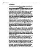
In “Bella” the text surrounds a main picture on the right-hand side. Bright and vibrant shades of luminous yellow and pink make up a large portion of the text. These colours are often considered female colours and will often attract those of that gender. These colours also help identify the nature of the magazine as they are almost “fake” and imply interest and gossip. A text box is created to attract the viewer’s eye. It contains a promise that will cause the reader to lose a significant amount of weight. Weight is important to many of the target readers and it may therefore cause them to purchase the magazine. “Bella” contains a large amount of writing to describe each of the many stories inside of the magazine.
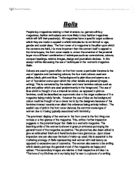
Comparatively, “Trout Fisherman’s” front cover has little writing. This is to allow the background to be shown through. It may also have less writing because, unlike “Bella”, “Trout Fisherman” is based around just one subject instead of many. Less text is needed to describe its content. Also, sections of the text and background of “Trout Fisherman” are sectioned red to show importance.
Other design features in “Bella” include the title to attract interest and the competition to win, “£10,000 M&S lingerie”. The titles are often shocking, giving the target audience the incentive to buy and read through the magazine. The competition goods are of a prize which will attract middle-aged women, encouraging them to buy.
Similarly to this, “Trout Fisherman” also features a competition aimed towards the target audience. Fishermen believe purchasing the magazine may give them the chance to win “Wychwood Gear”. Unlike “Bella which has a plain masthead, “Trout Fisherman” has a masthead featuring the scaled filling of a fish exterior. This attracts attention and identifies the genre of the magazine. It also gives a much glossier, high quality feel to the magazine in, unlike “Bella”.
In “Bella”, language is a major factor used on the front cover of the magazine. It constantly uses incentives such as “Get a FLAT TUM in 6 WEEKS” to encourage purchase. It also uses a variety of facts and opinions to form unrealistic promises. This includes “Amazing real-life stories to make you laugh and cry”. It is a factual statement that there are “real-life stories” but whether these stories “make you laugh and cry” is just a matter of opinion. These unrealistic promises make the magazine seem more interesting and worthwhile to read. Several ambiguous headings describe the stories that the magazine contains. These headings often use emotive and sensationalized language throughout as woman are usually emotionally connected and can empathize easily. “I watched my little SUPERMAN fly past my window” is an example of one of these headings. It does not deeply describe the storyline but creates an emotional title the audience will wonder about. Also, “SUPERMAN” is in capital letters to represent the horror and fright the writer is feeling. The major portion of the text is in first person. This allows the reader to feel more involved and connected with the magazine.
In comparison, “Trout Fisherman” uses significantly less emotive language. Instead the cover uses words such as “cool” and “explosive” which have several alternate meanings. Men tend to prefer this type of language as it creates more of an intellectual challenge for them to consider. The use of “explosive” and “tactics” in “The flies and tactics for explosive action” creates a military masculine theme for the target audience to relate to. Throughout the cover, the writer has used specialist terms and phrases to show the knowledge of the subject, encouraging readers to buy as they believe they may be able to improve on their talent. Also, throughout the magazine cover, the writer uses phrases such as “vital”, “exclusive” and “best-selling” to emphasize how essential the magazine is for those of the target audience. They believe that with this magazine they can improve drastically.
Overall, “Bella” and “Trout Fisherman” differ significantly to suit their target audiences. They use language, design features and images extremely differently but their basic layout is fairly similar with the main image on the right and the majority of the text on the left. “Bella” often used emotive images and language to appeal to the emotional side of women while “Trout Fisherman” used active and militaristic pictures and phrases to attract the masculinity of men. Both magazines have successfully created a front cover which attracts the audience.