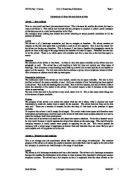
The size of the text used in the advert is very small, about 8 or 10. This is like many other things due to the amount of space available.
Purpose
The purpose of the advert is to inform the reader what the job is about, what is required and most importantly to make the reader want to apply for the position. The advert however does not do this very well. There are a number of reasons for this and they all link back to the problem of space available.
To improve this advert it could simply be enlarged. This would make more space and therefore more information and techniques could be used in the advert to both draw more peoples attention to it and to make the company look more professional.
The main aim of an advert is to stand out and attract the reader’s attention. To do this a boarder would be very useful because it would separate the advert from others on the same page. This would help the company because it would attract more people to applying for the job. This would present the company with a wider range of applicants to choose from and therefore they are more likely to get a more capable and willing person to do the job.
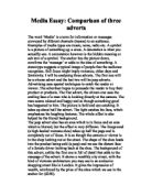
Advert 2 - Window & door installers
This is an average size job recruitment advert that uses a wide range of techniques. The intended purpose of the advert is to attract the reader’s attention and make them want to apply to the job so that the company in question can look through a ride range of candidates.
Layout
The advert is of a landscape orientation and has a thin boarder. The advert is of a landscape orientation because this enables the information to be written in clear sections; title, descriptive writing and contact telephone number. The advert has a thin boarder so that it is separated from the other adverts on the page and so it stands out. The boarder is only thin because the advert is quite small and therefore space is very precious.
Structure
All the information on the advert is centre aligned and centre justified. The title has also been formatted into bold to make it stand out. This is because the title contains information on what the job is. Therefore if this is bold the reader does not have to read the advert to see what job is being advertised. This means that if the reader is searching for the job advertised in this specific advert they can see it without having to read anything in depth. The advert contains no sub-headings or no address because these take up valuable space that is not available. The main writing on the advert is in a single paragraph. This is also due to space being limited.
Presentation techniques
As already mentioned all the information in the advert is centre aligned and centre justified. This is in order to make the advert look balanced and therefore make it look tidier. If an advert is tidy and balanced it then looks more professional giving a good impression of the company making it appear respectable to the reader. This could then give the reader the impression that this company could help them become successful.
Both the title and contact telephone number have been formatted to bold so that they stand out. It is important for the title to stand out so that the reader can tell without reader a lot of information what the advert is advertising. The telephone contact number is in bold so that it also stands out. This is important because once the reader finishes reading the main paragraph it stands out to the reader encouraging them to take further action into applying for the job.
The font sizes vary throughout the advert. The largest in font size is the title to help it stand out. The main writing in the advert is of around the font sizes 10 and 12.
Purpose
The purpose of the advert is to inform the reader what the job is about, what is required and most importantly to make the reader want to apply for the position. This particular advert does this fairly well, however it could be improved in many ways.
The most obvious way to improve the advert is to increase the size of it creating more space for information. The company logo could also be applied to the advert. This would mean that the reader can either see the logo and instantly relate the advert to the company or they could remember it for future references.
The advert could also contain different types of font. This would make it easier to distinguish the different sections of the advert.
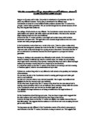
Advert 3 - First Choice Ski
This is a large and detailed advert. This advert would cost a lot to advertise and therefore would suggest the company in question is a big company with a far bit of money to spend. This gives the reader the impression that the company could have a lot to offer them and therefore could take their career in a positive direction.
The intended purpose of the advert is to make the reader want to apply for the job so that the company can get a good number of responses so they can select the best possible candidate to fill the position the most effectively.
Layout
The orientation of the advert is landscape, however it is particle square and therefore it is hard to notice the orientation. The advert has thin boarder. This is because the watermark acts as a boarder as it reaches the edge of the advert automatically creating a boarder. The advert also contains margins. This is feasible as space is not a worry.
Structure
The advert contains a heading, a logo, three paragraphs, an address and ten bullet points. These are all feasible thanks to the advert being large.
The logo is positioned in the top right corner of the advert. This is because our logical order of reading is from right to left and from up to down. Therefore this is the first area the reader would look.
The heading is also at the top for the reason of logical order. The title is also larger than any other text and this is so it stands out. This would then mean that the reader can automatically associated the company to the advert. The logo also helps to do this. The title is also split into two styles with the emphasis on the ‘Ski’. This is emphasised by being in a more casual type of font (serif).
The rest of the advert contains information about what the job requirements are and how to contact the company. This is arranged in several paragraphs and bullet points. The paragraphs help break up the information. This makes it easier to digest the information and also encourages the reader to read the information. This is important because if all the information was in one paragraph it would look a lot and therefore the reader would not want to reader it. The bullet points help break up the information and provide information in the form a checklist.
Presentation techniques
The first paragraph of text in the advert is left aligned and left justified. This is because this paragraph leads into the bullet points that follow. The information in the last two paragraphs in centre aligned and centre justified. This is to keep the advert balanced and therefore looks professional.
The logo is on the advert for a few reasons. One reason is so that if the reader recognises the logo they can relate the advert to the company without having to read any information on the advert. Another reason is that if the reader sees the advert they can relate the logo to the company in the future.
The advert has a watermark covering the whole area. This is a picture relating to the job/s on offer. This is because it both attracts the reader’s attention and provides the advert with a background image making use of all the white space available.
Purpose
The purpose of the advert is to inform the reader what the job is about, what is required and most importantly to make the reader want to apply for the position. This advert does this very well using a variety of techniques.
To improve the advert it could contain a more prolific boarder ie a double line boarder, to keep it apart from the other adverts on the page and to make it stand out more than it does already. This would help is stand becuse it would catch the eye of the reader.