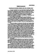
The layout of the advert is very typical of a perfume advert in a magazine. The main body of the image is taken up by the 2 models entwined with only a small image of the actual perfumes at the bottom of the page. The reason for doing this is so that as the reader inspects the advert they will be drawn down the image and the final thing they will see and remember is the image of the perfumes with the brand name beneath it. This will then lock in the audiences memory rather than the actual larger images of the models themselves which are more there just to attract the initial attention of the viewer.
There aren’t many denotive levels to this advert, most readers will have their own connotations on the image. As I mentioned earlier some of the connotations may include the link of white to purity and goodness and black to evil and mischief. The other thing that people will interpret from the image is that you could get a semi naked male/female like the one in the advert from using this perfume! Or even if you have a partner, they could look/act like this to you if they have this very perfume. But of course for each audience member the reaction will be different depending on their situation and how they connote things they see. The non-verbal structures in this advert add a lot to the meaning. The way the 2 people are holding and caressing each other gives the feeling of them being very passionate and sensual, which of course makes the audience think that it’s the perfume which has made them behave in this way. The facial expressions also show the reader how the 2 people in the picture are enjoying themselves and that wearing the perfume is a pleasurable experience! The clothing, or lack of, again puts the couple in a position of passion making the advert quite lustful. This will appeal to many readers who would like to be like the 2 models and therefore may buy the perfume under false pretences. On the whole the mise en scene is aimed to create a sexy feel to the advert and does this by having the complete advert focused on the 2 models that are positioned in a seductive way with almost no clothing to add to the raunchy effect.
There is little text on the advert, just the brand name under the images of the perfume. This is followed by ‘parfum’ underneath that just so that the audience is clear on what is being advertised. Because D&G is regarded as an expensive respected brand name there is no need for any more text on the advert. Brand loyalty from its consumers will simply sell the product because of its name.
The male in the image is pictured grasping the female model in such a way to make him look powerful and in control. He is also kissing her on the neck, which again makes him look as though he is in the commanding position. This is a common ideology that the male is stronger than the female resulting in the male being in control. This is highlighted in this particular advert, but it also counters the more modern ideology that women are independent and dislike the male taking control. The females’ position and facial expression showing the audience that she is actually enjoying it.
I believe the audience for this advert would be a younger adult, early 20’s who could be in a relationship. They could be male or female as the advert caters for both but they more than likely have a good income as Dolce and Gabbana is an expensive perfume, but not only that they are probably a mainstreamer who follows the fashion trends and brand labels. That is the type of person who would most benefit from this advert and would connote from it that they should go buy it to aspire to be like the models featured in it. It is likely that this advert would be in a magazine aimed at this age group so the conditions they receive the advert should not affect its impact unless its put in a magazine or place which would receive the wrong audience who may be opposition or aberrant.
In conclusion, the advert has a very sexy feel to it, which is created by the colours, mise en scene, and the characters involved. There is a definite target audience of younger adults, and the whole advert has a positive feel for the Dolce and Gabbana branding. The small amount of text produces more focus on the images which means the audience will connote its own meaning more than if they had to read reams of text. This should definitely help sell the product to its specific audience.
Rob Green