Evaluation for GCSE Production (CD Covers)
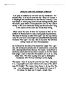
I set out to make a CD cover for a fictitious band called …………. Initially I the layout was to be a conventional square used by the majority of designers and bands, I believe that this allows for ease of display in high street retailers such as HMV and Virgin. As………are primarily a niche market band (their music borrows from many genres: experimental/folk/country/electronica ) it was decided that the main points of distribution would be independent retailers such as The Chain With No Name. Because of this I allowed the design of the packaging to reject the square and go for something a little more adventurous – the gatefold rectangle.
My research began with the simple exercise of looking at album designs across as many different genres as possible. The aim of this was to gain an idea as to the breadth of design options available and to investigate possible links between designs, musical content and target audience. Other research was carried out through scanning the shelves of HMV, browsing sites such as Amazon.com and reading ‘100 Greatest Album Covers’, by Storm Thorgsen or ‘Greatest Album Covers of All Time’, by Grant Scott. Designers that caught my attention were Hipgnosis and Andy Warhol. I especially liked the Velvet Underground ‘Banana’ design. I feel that Warhol cleverly combined humour, ambiguity, sexiness, style, punk D.I.Y aesthetic and simplicity – all of which feature in the music within the sleeve – not to mention how the target audience like to think of themselves.