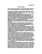
The design appeals to the audience because it is colourful, has a bold banner and fits inside a semi-circle.
The slogan
Our slogan is simply ‘’eat one pack, and you’ll be back’’.
The reason for the ‘’you’ll’’ language is because it is more colloquial for teenagers. We decided our slogan should be ‘’eat one pack, and you’ll be back’’ because many people will purchase a pack just to try it out, and many will come back again, again and again.
Michael Daniel
The television advert
The television advert lasts for thirty seconds. We divided the whole advert into six main parts-each one lasting for five seconds.
The main plot behind the advertisement is Jack, an normal average teenager walks into his local shop. He buys a pack of froops then walks tries a froop, then runs back into the shop and buys another six packs! There is no commentary, just sound effects and the voices of Jack and the shopkeeper. The main sound effects we have chosen are footsteps, door openings, and speech. The sound effects are comical, which attracts young and old audiences alike.
Whenever the name froops is mentioned in the advert heavenly music drifts from the speakers. Also the froops packet is very colourful compared to the backround and is sparkling. The advert makes the people believe the froops are very tasty.
Radio Advert
The radio advert has the same rules as the television advert-it lasts thirty seconds and is divided into six main sections. It is almost exactly the same as the television advert.
To sacrifice the visual aids we have quickened the pace up, and added more speech. Also there is commentary.
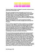
The Poster
The poster is a sparkling packet of froops amongst other
Michael Daniel
dul packets of crisps. At the top of the poster is the froops logo, and at the bottom there is a short message which says ‘’bursting with fruity flavour’’.
It has a very colourful foreground and all the text is black and bold. After looking at the froops poster customers think that froops are ver tasty, and are much more appetising too eat then normal crisps. It also has all the froops characters around the poster.
The packaging
The packaging of the froops crisps has all the information required for a crisp packet, nutritional values, price, ingredients, and the logo and slogan. All the text on the packaging is bold and black, and the actual packing has a character depending on what flavour it is.
The appearance of the packet is tropical and is attractive to the eye.
Michael Daniel