A slogan can be something to associate the product to an image, sometimes it uses repetition and alliteration. It can give more ambiguous meanings, this is important because it would apply to more people.
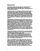
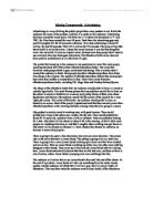
There is no slogan except the David Beckham logo that I could notice for Advert 1. For Advert 2 there is a small writing at the bottom saying ‘The Fragrance Potion’ this make the Fragrance special and different from any other one. Slogans sometimes use comedy but in my adverts there is none used. I think the slogan for Miss Sixty is not really effective as you cant really see it but if it stood out more then It would be.
A logo is a Picture/Signature of the company they are used to show that the product is their own and to make sure people don’t get mixed up with other products advertisers who use them. The logo for Advert 1 is D mirrored and has intimately BECKHAM under it. Advert 2 is elixir Miss Sixty in pink to make it a feminine thing. This is written boldly and stands out pretty well. It relates it to the product by saying its brand and what fragrance it is. This I would say is effective as it says the brand name without it people might buy other fragrances. If the logo wasn’t there they other brands that are not the brand that advertise it could make a look alike of it to sell their own product, like Red Bull lots of other companies make copies of it like ‘Blue Bolt’ , Red Roster’.
The picture in Advert 1 is him and Victoria together and his arm on her bum. In Advert 2, they have Asia Argento and they made her look like a rebel. They used it show that you could be that person and lots of people want to be someone like David Beckham. They give the Brand a good name and identity to the buyers. Advert 1 has all colours blended so you have to have a good look to see what it actually is also they put the feminine fragrance on the left where the colour is light green to make it more light and pure but on the right where they put the man fragrance they used black colour to show the darkness as man prefer black as a colour. Advert 1 uses all Pink to make it stand out and be more feminine. Both advert have the main picture in the middle and have the actual product at the bottom corners this to catch the attention with the main picture and then to read on to see the product.
Advert 1 has David and Victoria together as a couple, the layout of the colours is modern and the way they put different colours for the different sex. The advert includes both of the target audience a man and a woman in the right age that they are aiming at. Advert 2 has a clear picture of the target audience with the product smaller but big enough to see and know what it is, it uses thorns to make the product look like its more healthy and better because its natural also this gives it a rebel affect. Both of the adverts use the basic layout the products are placed on the bottom corners to make the customer look at the main picture then at the product as they read. The main BIG picture captures the eye first it does it because it is big and usually very BOLD. This picture usually shows the product or the Target audience. The adverts use BOLD writing to catch the attention then the stuff that has to be on the advert but not important to actually advertise the product like the terms and conditions, the price they are usually written in small writing.
I would use more standing out pictures and writing on Advert 1 and maybe use a Slogan to get the reader memorising the advert. This would work because the advert would be memorised until the reader is in a shop and sees the product. For Advert 2 I would maybe put more information on it otherwise it is pretty good. Give more information because as this advert is in a magazine the readers would have more time to read it.
I would say the Advert 2 is more effective as it stands out from the crowd using its Pink colour and BOLD writing also the way that it uses thorns to bring it more to nature and make it more of a rebel style which will attract more buyers that want to be a rebel.