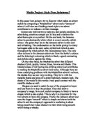
Slogans are used to catch the eye of the prospective buyer and lure them in to buy the product. They also show a company’s image. So a cool, stylish company is likely to have a slogan which is also stylish. This is why it is important for the two adverts to have chic slogans. Firstly, the Jameson advert just uses the slogan “smooth” which is simple and shows both the advert’s and the company’s approach to marketing is about being smooth but it also relates it to their drink being smooth with it being a whisky.
In contrast the maybelline advert’s slogan, “maybe she’s born with it, maybe it’s Maybelline ” is long, which detracts from its style. It is however good because it plays on the word maybe being present in maybelline, and repeats it.
Fonts are used to tie in with a company image. So if a company uses stylish, cutting-edge fonts then the same would be thought of the company. This is why when maybelline uses three different fonts it does not work. He fonts are not stylish in any form because firstly, their outlines of metal shades looks dated, secondly, because of their overall incoherence and thirdy, because of their poor contrasts of the clashing white and silver which went out with rolled up jacket sleeves and male perms.
In quite the opposite way, in the Jameson’s advert, the coherence between the sleek black font and white background was true brilliance and inspired. It puts so much more emphasis on the product. The font that Jameson uses is easy to read and simple. It is saying to the reader, “I am simple I am not trying to trick you”.
Then they use bolder text when they are trying to get across a particular message with an important word.
The wording is the actual piece of an advert which makes people buy the product but only after you have sold them the company image and drawn them in with other techniques. The language in the maybelline advert uses simple and easy to understand language. Although simple can be stylish in the case of language. Using simple language in this advert just reduces the appeal to simpler people who are less likely to appreciate style. This is exactly what happened here. maybelline use semi technical terms such as hyper pearl formula which just again lower their demographic appeal because anyone with much intelligence would realise that hyper pearl formula is just made up. Maybelline continues with their metals’ theme throughout which is notable. They also use alliteration several times throughout the piece e.g. “Lips look” and “Lights up lip”. They finally inform us, with more bogus scientific information, that they will stay for “hour after hour” which is a good promise to make to lure people in, if they believe it.
The Jameson advert actually explains the process, which makes their whiskey better then others. This opens them up and personalises you with them. They use the word bourbon for their American market and the word scotch for their British market although they imply the same meaning. I think it is wrong for them to use a negative word, “don’t” so early on in their advert. Then they finish the wording with the alliteration of ‘extra effort”. But then, after the bold section they use the phrase “drink responsibly and stay smooth” which interestingly, although not cutting edge, contrasts strongly with the mentality of drinking 5 years ago.
All companies try to have an underlying message throughout their adverts to truly indoctrinate us. The two adverts here have surprisingly different underlying messages. The maybelline advert is trying to be young, cool and stylish so playing on the re-birth of love for cities from shows like sex and the city they have the reference of the reflection in the model’s sunglasses of a skyscraper. They also have the lipsticks set out to look like skyscrapers themselves.
The Jameson’s underlying message is not hidden from view in any shape, or form. It is using the almost mist-like condensation on the bottle and the word smooth to make you thirsty and longing for one, or at least that’s what they try to do.
In conclusion, the maybelline advert did not achieve its goal of being stylish. However, it did manage to have a subtle undertone not highly noticed. It used several rhetorical devices and some of the colours it used were vibrant and stylish in their own right. The Jameson advert did achieve being stylish with its slick letters, and easy to understand message. It didn’t narrow its demographic appeal and it retained an intelligent side which cannot be said for the maybelline advert. Nevertheless, it didn’t try to have any other messages other than to try to excite you to drink it and in that respect is quite dull but sometimes dull sells.