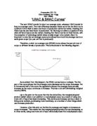
As is evident from this diagram, the SRAC curves have a U-shape. The first part of the curve shows that the average costs decrease as the output increases. Yet in the second half of the curve the opposite is shown; the average costs actually increase as the output continues to increase. This has to do with diminishing marginal returns (DMR).
Up to the point on the curve that hits the dotted line, the marginal physical product (which refers to an addition to total physical output as a result of using one more unit of input) has been increasing. This continuous increase can be a result of hiring extra workers, purchasing more machinery, or a number of other things which can increase production.
However, after this point on the line the average cost begins to increase as output increases. This means that the marginal physical product is now decreasing, or in other words, using one more unit of input will actually lower the total physical output. This is when diminishing marginal return (DMR) starts. The reason for this is that this extra unit of input, such as an extra worker or extra machinery, may not be efficient enough in producing more output.
An example of this could be post-men in a certain neighborhood with 100 houses. Say each post-man can deliver mail to 20 houses per hour. At first there may only be one post-man delivering to 20 houses each hour. Therefore if the input increases by one and another post-man is added, 40 houses will receive their mail each hour, showing an increase in output. Again, if another post-man is added, 20 more houses will receive their mail each hour and the output will continue to increase. However, once more than five post-men are added to deliver mail in this neighborhood, there will not be enough houses in the neighborhood for each postman. Quite possibly they will then be assigned to only 16 or 17 houses each, which will not result in an increase of output since they can only deliver to 100 houses anyway. Also, this extra post-man that has been hired will need a salary, so as a result the average costs will rise.
This is a clear example of diminishing marginal returns (DMR), since whenever successive equal amounts of a variable factor (the amount of post-men) are put to work with a fixed amount of other factors (the maximum rate at which they can deliver mail and the amount of houses in the neighborhood), there will come a point when the addition of total output becomes progressively smaller. Thus additional units of output become increasingly more expensive to produce, which means that average costs must be increasing, explaining why the short-run average cost (SRAC) curve begins to slope upwards.
A long-run average cost (LRAC) curve looks almost identical to a SRAC curve, and also has a U-shape (see diagram. Just as in the SRAC curve, the first part of LRAC curve shows that the average cost decreases as the output increases, and in the second half of the curve the opposite is shown; the average cost increases as the output continues to increase. However, unlike with the SRAC curve, this increase in average costs does not have to do with diminishing marginal returns but instead with economies and diseconomies of scale.
Strictly speaking 'economies of scale' refers to increasing returns to scale, which is when a given increase in inputs leads to a more than proportionate rise in output. In other words, when output rises (due to more input) the average costs decrease. This is shown in the first half of the U-shaped curve. The second half of the U-shaped curve shows the effect of 'diseconomies of scale', which refers to decreasing returns to scale and occurs when a given increase in inputs leads to a less than proportionate rise in output. This shows that the production of output is less efficient as the amount of input rises, causing the average costs to increase at higher levels of output resulting in an upwards- sloping curve. At the point in the middle of the U-shape, where the curve hits the dotted line, there are constant returns to scale. This means that a given increase in inputs leads to the same proportionate rise in output and there production is at its most efficient, so there are no of economies of scale present at this point.
As was previously mentioned in the introduction, the short run is a period of time when at least one factor of production cannot be varied, meaning that there must be one fixed factor of production. Yet the long run refers to a period of time when all factor inputs can be varied, meaning that there must be no fixed factors, with the exception of technology (which takes notably longer to be varied). Therefore a LRAC curve is composed of several individual SRAC curves, which each depict the average costs of production when different amounts of input is used. The LRAC curve can be obtained by taking the lowest SRAC for each possible level of output, thus the LRAC shows the minimum level of average costs attainable at any given level of output. This can be illustrated in the following diagram:
Therefore, it can be concluded that the SRAC and the LRAC curves are identical in shape. Yet the shape of the SRAC is a result of the effect of DMR on average costs and output of a product, and the shape of the LRAC (which consists of the lowest points from many individual SRAC curves) is a result of changing economies of scale and returns to scale.