The model that I decided to choose for this particular data is the exponential function:
I will now find out the values for a and b. In order to find a and b, I will randomly pick for values for x and y. Then in both the equation I will isolate for a. I will substitute and then solve for b:
There are also some other values I got for both a and b when I did it with the same method but with different values of x and y:
Out of all this, I decided to choose , using the years 1950 and 1990. I will now graph it using TI-84 Plus:
Graph 3
This model is the best fit to the data. But as we can see that some of the points are quite off. From above this is the best that I could see.
A researcher suggests that the population, at time can be modelled by
Where , , and are parameters.
This is a logistic equation and the parameters in this equation each have a special role to perform:
Apart from the parameters, and are important variables which are part of the logistic equation. in this equation is defined as time or years in this case. is defined as the population at time in millions and e is a natural log which is equal to 2.718281828.
So in order to find, , and , I used my TI-84 Plus. Method is shown in the appendix:
So the equation is therefore:
Graph 4
The researcher’s model fits the original data every well. It fits the data very well than the exponential regression.
The exponential graph is continuous and keeps on leading the way up. When connecting this model with really life population growth of china, I think this graph is very limited. The reason is that the growth of the population can be stopped. This is a very hard mission but it is not impossible. Whereas the exponential model cannot be stopped as it is infinite.
The researcher’s model instead is very accurate in terms of fitting the data. Also, I used my TI-84 Plus to see where does the graph go at certain range. I noticed that when I set my window to this:
I noticed a horizontal line. This suggests that the y value at certain value of x will not increase. This is true in really life too because there is only a certain amount of people China can hold or any other country can hold. That is why this graph is very accurate in terms of population growth.
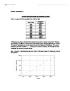
Now I will be looking at a new data set from year 1983 to 2008 from the 2008 World Economic Outlook published by the International Monetary Fund (IMF).
I will first use this new data and graph it using Logger Pro:
Graph 5
If we compare this time period of 1983 to 2008 to the time period of 1950 to 1995, the growth rate of China’s population has reduced. The reason behind this is that if we look at 1983 to 2008, there is a difference of 25 years and the population has increased to 297.6 million. Whereas, if look from 1950 to the next 25 years, that is to 1975, the population has to increased up to 373 million. The population growth rate is decreasing of China’s population.
So now I am going to use the researcher’s model, and my exponential function, Function to see how the two different models fit this data. I will use TI-84 Plus for exponential function and Logger Pro for researcher’s model:
Exponential Function:
Graph 6
The exponential function was no were close to the graph. If we take a look at it the exponential function looks like a line whereas there is a big bent towards the right. The population rate is decreasing whereas the graph is still going way up.
Researcher’s Model:
Graph 7
As we can see that the start of the graph is very good as it almost covers the first two points and later the graph is way off then the data itself. As I said earlier, the growth rate has decreased and so the data points can be seen at the bottom of the line that is going straight up. We can see a sudden bend in the data points which suggests that is not a good fit.
Now I use both data set, that is I will use the data set from 1950 to 1995 and mix that with the new data set from 1982 to 2008. I will then modify the researcher’s model using Logger Pro. Method is shown in the appendix:
Graph 8
In order to check it, I will use my TI-84 Plus. Method is shown in the appendix. I will find the parameters of the researcher`s model first and then graph it with my calculator. This is what my TI-84 Plus showed me:
Therefore,
Now I will use this new equation to graph again with my TI-84 Plus. Method is shown in the appendix:
Graph 9
As we can see that the graph from my TI-84 Plus matches the graph that I got with the help of Logger Pro. This new modified version of the model fits the data from 1950 to 2008 fits very well as it almost goes through each point. Also there is no big jump in this particular graph. The graph almost looks like it is easily making its way up.
Also, this researcher’s model is not always going to work. If there are earthquakes or natural disasters the population will decline. Also it will take time to get back in track. Declining of population is possible but not so common. For example,
Graph 9
The graph will not be able to cover all the points. In short, other graphs should also be used because this graph will not always work, for example when the population actually starts declining.