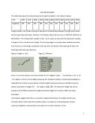
To prove this and give an example of the unrealistic results the already generated line of best fit from Figure 1.2 was used and the x-Axis extended to evaluate.
If one takes a rough estimate at the highest point of the graph one would get a result such of (250, 353).
Which would imply a height of 3.50 meters in 2146.
At first sight this might not seem to be an unachievable value, however the height of one storey of an average house is about 3.00 meters.
So to get a proper picture of the height one should look outside of the 2nd floor of a building and then image a person
almost jumping through that
window from the ground.
Windows are normally placed at a height of 0.70 meters above the floor. This gives one a feeling at how unrealistic the predicted height is and how unsuited therefore a line of linear nature is.
Any cubic function can be discarded as well. The eventual gradient would prove to be even steeper than the one of the linear graph. (Add other things)
A sinus function might seem a reasonable solution as one can see fluctuations that produce an wave like form, however the general trend towards a greater height would not be depicted when using a sine function and the annomalties do not reoccur regularly. The sin or cosine function for that matter are unsuited, as they are only able to depict discrepancies that occur with a regular pattern.
The function of a logarithm seems to provide the most suitable choice. It shows a slow steady slope, that decreases as the x-values grow.
The general Logarithmic function is expressed as and includes 4 parameters b, c, d and k. Firstly the focus will solely rest on b, the parameter who controls the vertical stretch and k which represents to vertical translation. Restricting the parameters until later to b and k, makes it easier to determine the value of these and both of them are sufficient to model a suitable graph for the given data. So the new equation we are dealing with goes as follow .
As the values for x increase expression of log(x) increases as well. If log(x) increases furthermore, resulting in a vertical expansion, however if the graph is vertically compressed.
A negative b causes a reflection along the x-Axis, even if b is now negative a vertical compression is found when and a vertical expansion occurs if .The parameter k determines the y value when x=1, as the expression of log(1)=0, so by default, meaning k equals zero, the y value at x=1 is 0, the effect of the k can be expressed by stating (1,k). As whenever the x-value is 1 the y value equals k.This all seems very abstract and in order to give a proper understanding here are some graphs that represented modified graphs of .function as the
One can see from the graphs that all of the functions have an asymptote at x=0. If b is positive the functions approach the asymptote while rapidly decreasing in y value. In case of the blue function where b is negative the y values increase as the function approaches x=0.
Also note that the domain is limited to positive x values only. However the previously stated domain includes x=0 as a valid x as one can see:
So a slight modification must be made so this domain can be also used for a logarithmic function model a graph to fit the data.
The new Domain must be stated as . Zero is now a non-permissable value and the restriction that x must be a multiple of 4 has also been revoked so a proper graph can be created.
The Rage however stays .
So now in order to find a suitable logarithmic function with the format of to fit the data from Table 1.1 the system of equation is used. Only the parameters of b and k were used, since they give one enough room to model a function and the system of equation is limited to two unknown only.
See next page for the acquisition of b and k.
One should not at this point that these points were not randomly chosen. They both represent anomalies and therefore do not fit the general pattern, however their effect on the curve of the graph must also be taken into consideration. The graph attained by this calculation does fit these points very well as the graph on the following page proves.
The axis' have again been shifted to provide a better visualization of the graph. The x-axis begins at 30(1926).
One can see that the graph fits really well with (36, 197),
(40, 203) and
(84, 236). However the other points are not really included on the graph.
Therefore it is fit to create a graph which suits the other points and then average the
value of the parameters in order to find the best fitting graph.
One can see from Figure 3.0 that the points from (52, 198) to (80, 225) follow a rather regular pattern and so following the same steps as before using the system of equations one can attain a suitable graph for these points.
Now using the just attained new equation the functions graph will added to the graph already present Figure 3.0's draw a comparison between the two and prove that an averaged function would provide the best fit.
A graph that represents the average function can be calculated by averaging the b and k of Equation 1 and Equation 2. To distinguish between the two function’s parameters let b1 and k1 be the parameters of Equation 1 with b2 and k2 belonging to
Equation 2.
b now represents the averaged value.
Forming a new equation using the newly acquainted values one gets the following function
To test if the averaged function is really better suited to visualise the progress of high jump athletes one has to take Figure 3.1 and add Equation 3( ).
Note that even though the graph only directly passes explicitly thorough one point it does not differ greatly from any points on the graph.
After finding a fitting logarithmic function, the limitations of this model function need to be explained and analysed. The axis' chosen from Figure 3.0 through to Figure 3.2 do only offer a limited view on the function and one of the main problematic with logarithmic functions lie in their asymptote along x=0.
To understand the problem properly it is suited to move the x-axis back to the origin.
As one can see this graph as well has an asymptote at x=0. This proves problematic, since no negative values are permissable, however the graph clearly enters the fourth quadrant and the likelihood that the gold medallist height of the 1908's (8) Olympics was about 1.00 meter is rather slim.
Looking back at the general equation which was already introduced as
one can see that for the here used model function only the parameters of b and k were used.
If one had added d for example, the
parameter that controls the horizontal translation one could have avoided facing the problem of rapidly decreasing height as the function approaches x=0, because assigning d a value lesser than 0 would have resulted in a shift of the graph and the asymptote by the value of d towards the left.
If the asymptote moves further into the positive values.
The last parameter c controls the horizontal compression or expansion. Causes a horizontal compression, effectively flattening the graph. On the other hand if the graph is expanded by a factor of , this expression is also valid for the factor of the compression.
A negative value of c causes a reflection along the y-axis.
Up until now fits the give data from Table 1.1 well enough. So no refinements are necessary, yet.
However there needs to be a more suitable equation without the problems of asymptotes logarithmic functions propose.
Using technology a line of best fit of exponential nature was generated. The default equation of exponential function is however the parameters of the logarithmic function were already ladled so they have to be renamed in order to avoid confusion. b will be substituted by l, so the new equation is
.
There is a special restriction regarding l also called the base. The base has to be greater than zero, so a valid function can be produced. In addition if the gradient is negative, meaning the y values are decreasing as the x values increase. The opposite happens if then the graph grows.
A represents the y-intercept this is easily explained as the graph has to intercept the y-axis if x=0. So if zero is substituted for x: the expression will always equal 1 regardless of the value of l.
The exact equation that was generated by the software was
Usually the rule of only three significant digits applies, however in this case l would end up to be rounded off to 1.00 which would result in a flat line at y=171.46999... Therefore it is necessary in this case to keep the decimal places as inconvenient as it is, the equation as seen in extremely sensible and should be kept as accurate as possible.
To receive an accurate understanding how well the modelled and generated function compare a graph is necessary.
It is obvious that the generated equation suits the data points very well and also fits the data later on. There is no asymptote which generates an error for 1896(0).
As well the values are fare more realistic as the x-values decrease. However the modelled function might prove more accurate in the future as the logistic functions gradient continues to decrease whereas the exponential function's slope will increase.
Using the two equations one is able to estimate what the winning height could have been if the Olympics happened in 1940 and 1944.
The results of the Generated equation seems more reasonable as, for example in 1940 the drop from 1936's 203cm to 200cm is more realistic than the almost 6cm drop Equation 3's result states. However no definite answer can be given as there is no great difference between the results to eliminate the possibility of one or the other.
If the graph is well fitted to the data points one is also able to predict or retrace possible heights that athletes should have achieved in the past.
However one cannot wholly trust the results common sense is needed in evaluating the likely hood of the height.
Starting with prediction of the gold medallist height in the Olympics after this year's the corresponding x-value has to be calculated.
Then following the same steps as above, a prediction for 2016 can be made.
The height of 251cm seems reasonable looking at it purely mathematically. Within a timespan of 48 years (1932 to 1980) the height increased by 39 centimetres. So it following the same trend an increase by 15 centimetres over 36 years (1980 to 2016) should be achievable.
However if one adds common sense into the equation, it becomes firstly clear that a prediction is very hard to make since there are a lot of outside factors.
For example the environmental factors are not ideal or because of the lack of fit athletes the height might decrease in comparison to the precious years.
As well we have seen that there is no definite pattern the results follow. Though there is a general trend that suggest the height will continue to grow one also has to take into account that
human bodies can only sustain so much strain.
Considering that the strain increases with the height achieving a greater height will become harder and harder and at some point, a maximum height should be reached.
However a prediction that is not so far off the data which was used to model the function might not be that much off.
A height of 235cm seems reasonable prediction but again there are many factors which can cause a random glitch, meaning an exceptional high or low height as before mentioned.
These values should not be used as definite predictions but more to give someone an idea of what the potential height could be.
Table 2.0 Data table for the height of the gold medallists in high jump from 1896 until 2008.
In order to use the modelled graph the years have to be modified so 1896 equals 0 on the graph, so the same modification as occurred on Table 1.0 to Table 1.1 must be made.
Table 2.1 Data table for the height of the gold medallists in high jump from 1896 until 2008, with year 1896 as year 0.
In order to be able to rate how well the graph is fitted to depict the additional data the new data from Table 2.1 is taken and plotted with the modelled equation giving following graph.
Note that the graph is quite will fitted starting from 1928 (32) until 2008 (112). However then the graphs falls more rapidly as it approaches x=0 and derivatives greatly from the data points.
However the graph can be modified to better fit the data points.
The general equation gives one more opportunity to modify the function further to meet one's needs. Until now only b and k have been used.
In order to attain a better fit graph the suitable values for c and d will be determined.
One of the main problems as one can see from Figure 4.0 and as repetitively mentioned is the fact that the graph does not give a valid value for x=0.
To change that a d has to be defined as it shifts the asymptote.
Using the point (0, 190) and substituting for x and h respectively into is bound to give one a new graph with a valid y-value for x.
The new equation now is .
To check if there has been any improvement the new graph is added to Figure 4.0 in order to compare it with the original equation.
It becomes clear that even though the problem of the asymptote has been solved that the new graph misses the other data points by a great deal. This can however be easily corrected as the parameter c which has not been used yet, can flatten the equation and so moves it towards the data points again.
In order to get the best possible value of c the last point (112, 236) is used as it is the last point and in order with the general trend. The formulae of the function will be expanded by adding c and its value will be calculated by substituting 112 as x value and 236 as h value.
And again in order to confirm if the addition of a parameter improved the graph the function
will be added to Figure 4.1 to compare the graphs with each other.
The new equation here represented by the green graph is the best suited one as it does not have a visible asymptote nor differs greatly from the data points. The trend line passes the data points with the general shape of a slight positive slope into a plateau.
The general trend of the data points show an over all increase of height as the years progress.
However there are a few random fluctuations throughout the graph.
The first notable swing can be seen from year 1896 to 1908. During this period there were foreshadows of the Great War, where the nations main concern were not athletic competition, but preparations for the on coming war. The First World is also responsible for the missing value at x=20 which represents the year 1916, as with the Olympics there is also the ancient tradition that no games can be held if there is war.
The same explanation is there for the missing values of the years 1940 (44) and 1944 (48) as the Second World War was raging.
No value is available for the 1900 Olympics which were actually held in Paris. However they were part of the Parisian World Exhibition, the same goes for the 1924 Olympics also held in Paris, however they were not part of a World Exhibition.
One can see a pattern that whenever a year's value is missing the next years height drops below the height of the previous years.
The graph starting from 1960 (64) seems to be reaching a plateau however this trend is broken in 1968 (72). This is the same year as the Fosbury Flop was introduced and started to become the prominent high jump technique.
Starting from that year again a steady increase can be seen until again a plateau is reached 1988 (92).
From that point on the height mostly stayed the same.
In this portfolio for the display of equations the software MathType Light (Version 6.7a) was used.
The graphs were displayed using Autograph (Version 3.3.0010) and the same software was also used to generate the Lines of best Fit.
The data tables were taken from Microsoft Excel Starter (Version 14.0.5128.5000).