Histogram graph
A histogram is a type of bar chart. On the x-axis I put my data group; on the y-axis I put the frequency of the data. One of the more commonly used pictorials in statistics is the frequency histogram, which in some ways is similar to a bar chart. In this project, it tells how much income and how much spent on coffee are in each numerical category.
Here is a table I rearranged which shows how much income and how much spent on “take away” coffee per week. I use mean and median to calculate the X(income) and Y(spent on coffee).
Average X=(90+100+120+150+150+150+110+100+150+200+160+140+150+180+160+200+220+120+170+250)/20=153.5
Average Y=(6+20+10+20+0+10+28+0+30+30+14+28+14+10+20+8+14+10+10+2)/20=14.2
The mean average is a helpful way to sum up data to number. The number above is the average X and Y. The mean average tells us the “typical” data value.
The median average is also useful, median equals mid-value.
Median X=150
Median Y=15
In statistics I collect information from the past and try to represent it in a helpful way, so I used mean and median average to represent my data.
Standard Deviation
Standard Deviation means how spread my data is, I use the Greek letter sigma σ.
I prefer to use N-1 form of σ, this formula forces the data N>1. It tells us how wide my data is.
σ(X)=40.373
σ(Y)=8.028
Estimate intervals
The central limit theorem, in simple form tells us that 95% of our data is between mean average plus and minus 1.96σ. When N is large, I cannot give someone all my data as a result. So instead I present mean average and σ.
X
Average X-1.96σ=70.87
AverageX+1.96σ=229.13
Y
Average Y-1.96σ=0.73
AverageY+1.96σ=30.73
Mean average +/- standard deviation shows that the range that includes the most data in this project, so the area which contains most data is from 70.87-229.13(income),0.73-30.73(spent on coffee).
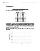
Cumulative frequency table and curve
The cumulative frequency table counts up the running total to a maximum.
Cumulative frequency table and Cumulative frequency curve show the frequency of data. The median quartile which is on the curve shows us at how much spent on coffee is the median point in this data. Lower quartile which is on the curve shows us as at how much spent on coffee is the lower point which means the first quarter on the frequency axis, but the answer are in the y-axis. Upper quartile shows us at how much spent on coffee is the upper point which on the curve. Interquartile range shows us at what range the most frequency has in this project.
Correlation
In this project, I say that there is a correlation between someone's income and the cost of coffee. This means that as one figure changes, we can expect the other to change in a fairly regular way. A figure that is useful is the coefficient of determination. This is written as r2 and is found by squaring the correlation coefficient. Because the correlation coefficient must be in the range -1 to +1, and square numbers must be positive, the coefficient of determination must be in the range 0 to +1.
R2=0.001
It means the income and spent on coffee have completely no correlation.
The regression line is defined by two numbers - the gradient and the intercept on the vertical axis of the line that best fits those points
I use the formula below to calculate the A and B .
A=17.9
B=-0.03
So, b+ax=-0.03+17.9x
In conclusion, I like to say that the income have no correlation with the spent on coffee. I calculate mean average, standard deviation, 1.96σ, cumulative frequency with lower quartile, median quartile and upper quartile. I also used correlation and a+bx, in order to figure out the relationship between the incomes and the costs on coffee. Finally, I found there is no relationship, no matter the person has higher income or lower income. Maybe the person who spent on coffee more than others just because the person likes coffee.