Saying this, because Spalding is not an industrial town, it is an agricultural one because of a lack of raw materials; there is very little back-to-back housing to redevelop. This makes Spalding attractive as there are only the areas around the railway and river to redevelop and the bypass, which is unattractive, and channel mean Spalding’s expansion is limited.
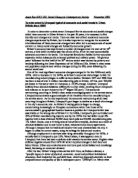
A Map Locating Areas In My Study Area, Spalding.
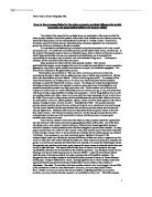
A Map Locating My Study Area, Spalding.
We are collecting this data because we want to look at the environment through our sense of smell, hearing and sight and judge how good or poor the environment is in different areas of the same town and then see if there are any trends or patterns in the data in which we collect. To do this, we had to judge what factors were important to us to make an area an attractive environment. The features chosen are:
- The Landscape Quality- the amount of trees and how well kept the grassed spaces are.
- Derelict Land-the amount of large, derelict areas creating eyesores or if there are no derelict areas at all.
- Litter and Vandalism-the amount of litter and vandalism in an area creating untidiness.
- Noise- the amount of noise, varying from normal, quiet, residential standards of noise to very noisy main street levels.
- Gardens & Fences-how neat and well-maintained gardens and garden fences are.
- Street Furniture-how well provided areas are with street furniture such as streetlights creating light at night.
- Air Pollution-if offensive smells and obvious air pollution can be detected easily.
- Street Parking-the amount of street parking either increasing or decreasing road congestion.
- Industrial Premises-the amount of unattractive industrial premises.
- Traffic Flow-if there is normal residential traffic or heavy vehicles and through traffic.
- General Conditions Of Buildings-if the buildings are in immaculate or a seriously neglected condition.
Some of these features were given more or less penalty points than others because it was felt that they were more important environmental factors. For example, air pollution was given a score out of ten because it was felt very important as it damages the environment, whilst garden and fence damage was only given a score out of 4 because it does not pose a great danger to the environment, but looks unattractive.
To study these features, the whole year 10 group, comprising of the Year 10 geography students, collected the data in the chosen survey area of Spalding, the town in which our school is situated.
This large group was then split up into the four tutor groups and then each tutor group was divided so that pairs were formed. Each of these pairs had ten location points (labelled points within enumeration districts, see page 7) to visit one by one and score the location points on the various features listed above. In each environmental district there was a total of 3 location points and each pair had only one location point from each environmental district. The location point received more penalty points when the area surrounding it wasn’t of good environmental quality, and less penalty points when the area around the location point was of good environmental quality. Four pairs surveyed each point to eliminate any harsh or generous markings or those groups that had deliberately made up scores without surveying the area. The pairs were not allowed to survey the points together or compare scores because we wanted to find the average environmental score of an area to make it a fair test and people may have deliberately swapped answers to cut corners and not survey the points properly.
Once the scores had been taken by measuring the chosen environmental factors, the total of the location point was calculated. Using ICT, we transferred the scores we had collected from our investigation onto the computer for each environmental factor and the total of these scores added together onto the computer. Once all four sets of results for each location point were entered in the computer on the spreadsheets, it calculated the mean average of the four scores for each of the factors and, most importantly, the total of the three location points in each enumeration district, which we used most in the drawing of our graphs, conclusion and evaluation. Once all of the groups had entered all of their scores, the data could be processed with the aid of the ICT program later that day because the spreadsheets were easy to print of and obtain data from. This was done because it meant the computers allowed everyone easy access to the results of the investigation and also because the results could easily be altered on the computer if there was a mistake.
This data was collected in order for us to have primary data to use in our investigation, to give us first hand experience at collecting and processing data, to answer our question and it was also for us to see how much the environmental quality can change in just a small area such as Spalding.
All 40 enumeration districts were surveyed in Spalding and used in the investigation, not just the districts I personally surveyed. Therefore all enumeration districts were samples for my investigation (the results being the average from all three location points in a district).
We decided to take data from particular points to give an overall picture of enumeration districts, three location points was felt enough in each enumeration district. If just one location point in each district was surveyed then it may have been a fair reflection on the whole enumeration district.
It has to be noted that the primary data (the data we collected) is not the only data being used in the investigation. Secondary data from maps and photographs, more primary data that I took whilst collecting the environmental quality data, are both being used. Statistical data from the 1991 census data, which has to be collected from ICT sources on the computer network, is also being used in our investigation. The variable that I have chosen to use in my investigation from the census data is the percentage of detached houses in an enumeration district because this too will give an indicator into how the social disadvantage varies within Spalding, because geographical theories such as Mann’s, Burgess’ and Hoyt’s (described in detail in the analysis section) suggest that the more detached houses there are in a district then the higher the environmental quality of an area due to the detached houses being the furthest away from the centre of the town.
To present the data I have collected from both primary and secondary sources, I had to process and manipulate the data to suit my needs. The unprocessed data can be found in the appendix.
On figure 1, page 12, I am presenting a chloropleth map showing the average environmental quality score of the enumeration districts in my study area of Spalding. I have presented the data in this way because it is a good, clear, illustrated way of showing the average environmental score of enumeration districts. To manipulate the data to get it suitable for me to use to draw the graph, I had to use the computer to find the environmental data for the whole ward (environmental district) rather than just the individual data points and then design a suitable key to go with the colours representing the environmental quality of districts, indicating that a lower score means a higher environmental quality because these districts received less penalty points. The graph (and the labels on it) shows where the best and worst areas are environmentally and that the poorest environmental quality follows a route along Pinchbeck Road in the north of Spalding, down to the central business district (the CBD; where the environmental quality is particularly bad), and follows Winsover Road to the west of the CBD. The best environmental quality seems to be in the west and north-west of Spalding, down Woolram Wygate and Wygate Park and continuing along Horseshoe Road, Hawthorn Bank and continuing along London Road and St. Thomas’ Road before reaching the poor environmental quality district 1, the CBD. After this chloropleth map I wanted to see if there was a link between the average environmental quality of enumeration districts and the distance from the centre of Spalding (the Red Lion in Spalding town centre) so I decided to do this effectively I would have to draw a scatter graph to investigate if there was any relationship between the two variables.
On figure 2, page 13, I am presenting a scatter graph showing the relationship between the average environmental quality score of enumeration districts against the distance, in kilometres, of enumeration districts from the centre of Spalding Town. The average environmental data score is from the primary data we collected, whilst the distance from the town centre is from a secondary, ICT source available to all students. I have presented the data this way because it is a really effective way of showing the data and indicates clearly, with the addition of a trend line, if there is a relationship between the two variables. To use the data to create this graph, I decided to use the average data scores of whole wards as the points on the graph rather than individual points because it reduces the chance of any errors upsetting the results and creating unnecessary anomalies. I then used this data, which had previously been entered into the computer, together with the data concerning the distance from the town centre (which was already on a computer spreadsheet) to create the scatter graph on the excel computer program. The graph shows that the environmental quality score is generally higher, indicating lower environmental quality, in those wards that are only a short distance from the town centre and the enumeration districts have generally lower scores indicating higher environmental quality in these wards when they are further away from the town centre. This point can be seen on the annotation on the map. The line of best-fit shows that the environmental quality increases as the distance from the town centre also increases. Of course there are anomalies, and they will be discussed in the results analysis section. After finding that there is a relationship between theses two variables to discuss later, I now want to find out about my other variables. My first job is to look at my social disadvantage factor, the percentage of detached houses in an enumeration district.
On figure 3, on page 14, I am presenting another chloropleth map showing the percentage of detached houses in the enumeration districts in my study area. I have again presented the data in this way because it is a good, clear, illustrated way of showing the different percentages of detached houses in different enumeration districts. To manipulate the data to be able to use it in my graph, I had to take the percentages for the percentage of detached houses in each of the 40 wards from the 1991 census data on the computer instead of using primary data I had collected (this secondary data is very accurate though). Again a suitable key had to be drawn up and the wards shown on the map had to be coloured in to represent percentages. The chloropleth map shows the highest percentage of detached houses is in the north of Spalding and follows a route along West Marsh Road, West Elloe Avenue and Ladywood Road, and continues along Woolram Wygate and Fairview Way. The map shows the lowest percentage of detached houses in the town centre, in the CBD along Double Street, London and St. Thomas’ Roads and Churchgate, and the majority of the enumeration districts with low percentages of detached houses are centred around the town centre. I now want to see if there is a relationship between this variable, the percentage of detached houses in enumeration districts, and the average environmental quality score of the 40 enumeration districts, so to link the two variables in my hypothesis I felt a scatter graph would be most suitable to investigate a relationship between the two.
On figure 4, on page 15, I am presenting a scatter graph showing the relationship between my chosen social disadvantage, the percentage of detached houses in an enumeration district, and the average environmental quality score of the enumeration districts. The percentage of detached houses is secondary data from the 1991 census data available to me on the computer and as a print off whilst the average environmental scores of enumeration districts are primary data. I have presented the data this way because it is a really effective way of showing the data and indicates clearly, with the addition of a trend line, if there is a relationship between the two variables. To use the data to create this graph, I decided to use the average data scores of whole wards as the points on the graph rather than individual points because the percentages of detached houses apply to the percentage in the enumeration districts and not individual points in the wards. I then used the census data already on the computers with the entered statistical primary data to create a graph on excel. The graph shows that those enumeration districts with higher environmental quality scores, indicating a lower environmental quality, have generally lower percentages of detached houses than those enumeration districts that have lower environmental scores (indicating good environmental quality) which have generally high percentages of detached houses. This point can be seen on the annotation on the map.
To analyse the results, I must first find some trends concerning Spalding itself from my results and identify some anomalies. Regarding the first hypothesis, how distance from the centre of town affects environmental quality, the trend is that the environmental quality is of better quality the further away from the centre of town an enumeration district is. This is shown by a negative correlation on the scatter graph because a lower environmental score indicates higher environmental quality. Poor environmental quality can be found along Pinchbeck Road and Winsover Road because the bypass does not relieve these roads of heavy traffic and the CBD because it is noisy, congested, there is a lot of street parking and there is a lot of litter and vandalism and these factors carry heavy penalty points. The points it was given, such as 6 out of 8 for street parking, mean it has extremely poor environmental quality compared to the rest of my study area. Good environmental quality can be found in quiet, residential cul-de-sacs such as the ones off of Wygate Park, Woolram Wygate and Matmore Gate such as Birch Grove, (below), which received few penalty points because of, among others, good air quality, the immaculate buildings and the lack of industrial premises.
One of many anomalies is enumeration district 13, which is very close to the town centre but has good environmental quality. Looking back at my original data, I can see that this ward contained a location point I personally surveyed and, as can be seen from the photograph on the next page and looking at the points given in the environmental survey, a suggestion as to why this enumeration district has good environmental quality is that it is an attractive area in near the CBD with no derelict land, very little litter and vandalism, no industrial premises and the buildings down this road have no major signs of neglect.
The results according to the second investigation into social disadvantage, where my hypothesis related to the percentage of detached houses in an enumeration district and the average environmental quality score of enumeration districts show me that the percentage of detached houses in an enumeration district increases when the enumeration district has a better environmental quality. The lowest percentages of detached houses occur around the terraced streets of the enumeration districts surrounding the CBD such as St. Thomas Road and London Road. There are old, terraced houses here near the congested, polluted town centre and more detached houses on the outskirts of town where there is less congestion, noise and overall better environmental quality than the centre of town. Anomalies include an enumeration district in which I surveyed a location point, ward 8. This enumeration district has a reasonably good environmental quality but a very low percentage of detached houses, only 6.6%. A picture can be seen at location point 3.5 in this ward and this is an anomaly because this area contains terraced, warden-controlled pensioner bungalows and, although not seen on the photograph, this area also contains a lot of semi-detached council housing instead of modern, detached housing.
I now have to use Spearman’s rank, statistical analysis, to find the strength of the relationship of my variables. By doing this on the computer, it will give me a very accurate figure.
I feel I have the results I have found because of a number of physical factors, which have upset the environmental quality score data. The first of these is that as Spalding has expanded over time it has swallowed up surrounding villages and overspill settlements such as Elloe, Fulney and Westlode and they have upset the collected data because they had their own layout of urban zones before they became a part of Spalding, meaning wealthier, environmentally better areas of these small settlements may have become parts of environmentally poor districts of Spalding. Another physical factor affecting the collected data could be that many of the council estates are on the outskirts of Spalding or away from the centre of the town (for example the Royce Road estate and Lansdowne Court) because of a lack of space for them to be built in near the town centre and they may upset data readings because they are on the outskirts of the town near to the higher-class residential areas while they are themselves modern but low-class housing. It is also true that bigger, detached houses are built on the outskirts of town as there is more room for them to be built and therefore there is no need to build terraced or semi-detached housing. These physical and the aforementioned human factors may have
caused the anomalies found within the investigation, coupled with possible human errors and misjudgements that may have occurred throughout the process of the investigation.
I have found that the environmental quality decreases the further the distance of an enumeration district from the centre of Spalding town and this relates to my hypothesis as I hypothesised that environmental quality would increase the further the distance from the centre of the town and therefore I have been proved wrong-my hypothesis was not true. There is a negative correlation instead of my predicted positive correlation on the scatter graph. I have also discovered that the west side of Spalding has the best environmental quality and my evidence to prove this is the chloropleth map, figure 1.3, page , which shows the west of Spalding has the overall lowest (therefore the best) environmental data scores. This relates to the Burgess Concentric Ring urban model (page 2). Regarding this variable, the study now poses the question: Why do human and physical factors cause the environmental quality to decrease the further the distance from the centre of Spalding town?, and this is something I could study and investigate in a future project.
Regarding the second variable, I have found that the percentage of detached houses increases the further away from the centre of town an enumeration district is and evidence to support this trend comes from the collected data for the investigation which can be more clearly seen in the scatter graph formed from it. This relates to my hypothesis as I predicted this would be the trend formed by the investigation, so it means my prediction has been proved correct. And as I predicted, a positive correlation has been formed on the graph and can be related to Mann’s urban model (page 2).
The final question the investigation now poses is: Are the variables of environmental quality and percentage of detached houses in an area related to each other and the distance from the centre of town? (eg. why do both variables not share positive correlations), and this is again a question I could look into in a further investigation.
The successes of my data are that one of my hypothesis’ was found to be correct and parts of both the hypothesis’ related to a recognised geographical model. There were limitations on the data however, as we were only able to investigate in Spalding and not the surrounding settlements or extreme remote parts of the district.
In evaluation, I feel the collected data was reliable and not as I expected because of physical and human factors, but more recordings on each data point could have been made to make the mean more reliable and equipment, rather than educated guesswork, could have been used to decide what to give environmental data such as air pollution as this could have made the investigation that much more reliable.
I personally feel my conclusions were valid as they were based upon strong and carefully collected data and evidence can be found in the project to back them up. If the project was to be extended then more data points in each enumeration district could be studied, the remotest parts of Spalding could also be included in the experiment and more data readings for each point could be taken to make the mean more accurate.
If I did the project again, I would change the studied roads in a district to give results which may give different results and spend longer at each data point so the areas could really be studied in detail and then be given a score as we only had a certain quantity of time in which to carry out the study.
Word count: 2,438 words
These sources were helpful in my project:
The Wider World by David Waugh Publisher: Nelson Date of Publication:1994
Snippets From Old Spalding Town Publisher: D. Richards Date of Publication:1994
by Trevor Bevis
On the following pages are copies and raw data sheets used in the project.