Firstly we look at the labour market, if unemployment falls labour shortages might occur where skilled labour is in short supply. When this happens, it puts pressure on wages to rise and since wages make up a relatively high percentage of total costs the result is that the end product price is increased and the deficit is passed on to the customer. In the product market, rising demand and outputs can put pressure on scarce resources resulting in suppliers of the materials to raise prices to increase profit margins. Cost push inflation can also come from the demand for raw materials and commodities, when an economy is booming, the demand for these items are in high demand and can result in an increase in price.
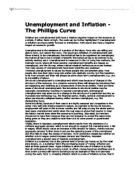
The Phillips curve went on to be an economic tool used by a lot of the developed world’s economies, to predict inflation and unemployment rates by comparing them to recent years just as these two countries have tried to below.
Below are two diagrams that have been created which directly compare the inflation rates and unemployment rates for Country A and Country B.
Country B
From the graph above we can clearly see an association between the rate of unemployment and the rate of inflation. By studying it we can come to the general assumption that in country B when ever inflation rates are high, unemployment is low and when unemployment rates are high inflation is low, for example, when the rate of unemployment is at its lowest in year 1 with a rate of 0.5%, inflation is at its highest with a rate of 7.7%. We can also see that when unemployment is at its highest at 9.7% inflation is at its lowest since the record began with a rate of 0.7%. This graph wholly backs up the work of William Phillip and below we can see when the data is plotted on a scatter graph and a curve of best fit is added as it mirrors that of the original Phillips curve shown above.
Country A
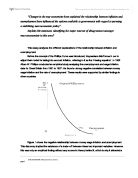
Now is the turn to evaluate the findings for country A, by studying this graph we can also see that the rate of unemployment and rate of inflation do have some sort of relationship however it completely differs from country B, as we can see from the graph that both lines peak and trough but the interesting point is that unemployment seems to follow the trends of inflation, with an average of 1-2 year delay. For example we can see that the rate of inflation troughs in year 3 with a figure of 4.2% which is followed by a low rate of unemployment at just 4.6% in year 4. Another example of this trend is when in year 21 the rate of inflation peaks with a figure of 3.9% which is followed by a high rate of unemployment at 7.5% in year 23. Thus, from this graph we can make the conclusion that unemployment is affected by the rate of inflation, with a 1-2 year lag. The lag effect is due to inflation and unemployment being affected by aggregate demand. When AD increases, output will increase and therefore unemployment will fall as firms hire more workers to meet the demand. Depending on the starting position on the long run aggregate supply (LRAS) curve, inflation will also rise as firms raise their prices. Firms will take time to adjust both their labour requirements and the selling prices of their goods/services. As the two variables are correlated, the data for country A does not appear to match with Phillip’s findings and this could be due to the money illusion theory. Money illusion occurs when workers think that they are better off because they have received a pay rise, while in reality, because of the falling purchasing power of their income due to inflation they are not.
In contrast to country B, when plotted on a scatter graph the curve of best fit has no resemblance to the Phillips curve and it was cases like these that got sceptics thinking.
In the 1970’s it was evidence like this that suggested the trade of between inflation and unemployment had broken down, economists witnessed a number of cases in which stagflation had occurred within the economy, that is when inflation and unemployment reach high levels simultaneously. Theories based on the Phillips curve suggested that this could not happen, and the curve came under concerted attack from a group of economists headed by “Milton Friedmen”. It was because of this that new theories were explored to explain how stagflation could occur.
Milton Friedmen believed that the Phillips curve only held its relationship in the short term and that in the long run there was no trade of between the rate of unemployment and the rate of inflation, Friedmen believed that the position of the Phillips curve was established by the populations expectations of inflations, it was through this that the expectations augment Phillips curve was born. It was established that in the short term, the short term curve looks similar to a Phillips curve apart from the fact that it shifts up when inflationary expectations rise. In the long run it was believed that only a single rate of unemployment was consistent, this figure was known as the natural rate of unemployment and it allowed inflation to fluctuate freely meaning that there was now no trade of between unemployment and inflation. The resulting long run Phillips curve was a vertical straight line and is shown below.
To conclude all this information I believe that in the short term the Phillips curve can be been an accurate economic tool to a certain degree however as the economy has developed there are too many factors that can affect inflation and unemployment for it to be stable in the long run. This is why the long term Phillips curve has been developed which with the natural rate of unemployment figure being correct, can be accurate over an extensive period of time.
Bibliography
Dunnet. A (1998) Understanding the Economy- An introduction to Macroeconomics. New York: Addison Wesley Longman LTD
Phillips, A. W. (1958). "The Relationship between Unemployment and the Rate of Change of Money Wages in the United Kingdom 1861-1957".
Wikipedia. 2006 Phillips Curve. Available at: http://en.wikipedia.org/wiki/Phillips_curve
Tutour2u. Phillips Curve. Available at http://tutor2u.net/economics/revision-notes/a2-macro-phillips-curve.html
Phillips Curve video, PajHolden. 2006 Available at: http://www.youtube.com/user/pajholden