ii) Pie chart –
Here the pie chart shows that the European ethnic group is large compared to other ethnic groups. This a visual reference as it contains no quantitative data. The pie chart also makes it easier to see which ethnic group is which by different colours.
iii) Bar Charts –
This Bar chart shows that the European ethnic group is the highest than any other ethnic group. It shows quantitative data by showing percentages.
3. A quick overview of the ethnicity is the best way to show a presentation, whereas detailed information’s is better for qualitative reasons.
4. European is the most commonly occurring ethnic background and other ethnic groups are the least commonly occurring ethnic background.
5. i)
i) The largest weight is 90 and the smallest is 40.
ii) Stem and leaf
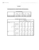
weight in kgs Stem-and-Leaf Plot
Frequency Stem & Leaf
2.00 4 . 24
7.00 4 . 5588899
10.00 5 . 0001223444
16.00 5 . 5555555667777889
15.00 6 . 000000000022344
12.00 6 . 555555668889
5.00 7 . 02344
4.00 7 . 5556
5.00 8 . 00223
2.00 8 . 55
3.00 Extremes (>=88)
Stem width: 10.0
Each leaf: 1 case(s)
The highest frequency is 85 and the smallest is 24. There is an outlier of 88.
iii) Box plot –
The highest is 85 and the smallest is 42.
The stem and leaf provides this information most readily as it contains both quantitative and qualitative information.
6.
i) The histogram’s median is about 60 – 65
ii) The stem and leaf plot ‘s median is about 60 – 65
iii)The box plot’s median is 60
7.
a) histogram – 15% of students with weights of less than 52 kgs
b) Stem and leaf – 16%
)the box plot – cannot be done because only the weight has been shown rather the frequency.
8. The Histogram shows both quantitative and qualitative data of weights and the number of students. However it doesn’t show the precise weights in detailed.
The stem and leaf plot again shows both quantitative and qualitative data of weights and does show the exact weights in detailed information. It also showed the extreme value outside the range.
The box plot shows the maximum, minimum, upper quartile, lower quartile and the median but does show the exact weights. This can be more essential for qualitative information.
9.
In reading a histogram chart it is essential to note the weights of the student falling in the range of 40 – 95 kg. There gradual slow peaks near the median especially at 60 kg. Then after the median, then the distribution is more spread out with a few peaks.
weight in kgs Stem-and-Leaf Plot
Frequency Stem & Leaf
2.00 4 . 24
7.00 4 . 5588899
10.00 5 . 0001223444
16.00 5 . 5555555667777889
15.00 6 . 000000000022344
12.00 6 . 555555668889
5.00 7 . 02344
4.00 7 . 5556
5.00 8 . 00223
2.00 8 . 55
3.00 Extremes (>=88)
Stem width: 10.0
Each leaf: 1 case(s)
In the stem and leaf diagram, it shows that the weights fall between 42kg and 85kg. It also shows the peak between the weight 55 – 64 kg, which one would assume that there is a peak at or near the median.
Analysing the box plot, the weights ranged between 40 – 85 kg. The median weight is around 60kg. It also shows that 50% of the heights lay in between 40 and 60 kg, and the other 50% lies in 60 – 85. It also shows 3 outliers after 85 kg.