Aim
I am aiming to find out whether used cars have a correlation between there engine size and there insurance group. I will also aim to find out the comparisons between the most popular colours of the cars shown on my data sheet provided.
Introduction
During this investigation, I am investigating correlations and comparisons between used cars sales.
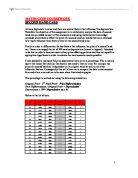
For each I will chose 18 cars at random, this will therefore calculate to 36 cars. The reason for choosing 36 cars is because there are 360 on a pie chart and consequently it will be easier to portray on the pie chart. I will use the random button on my calculator; the sequence I used to do this was;
66 SHIFT RAM
This sequence will make my investigation unbiased and a fair test and additionally more quick and efficient. Once my numbers are highlighted on the data sheet, I will go on to write a hypothesis for both correlation and comparisons.
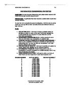
Furthermore, all of the results and data I collect during the investigation, will be put into clear and well laid out tables, which can be used to produce other graphs such as scatter diagrams and bar charts. If there is any data missing from my results I will have to show this clearly on my graphs and tables, scatter diagrams will be very helpful if this occurs for the anomalies will clearly state an incorrect or missing piece of data. Moreover if I were to add a line of best fit this, would help me to predict and calculate the differences between the low data and the high data.
I am aiming to find out whether used cars have a correlation between there engine size and there insurance group. I will also aim to find out the comparisons between the most popular colours of the cars shown on my data sheet provided.
Introduction
During this investigation, I am investigating correlations and comparisons between used cars sales.
For each I will chose 18 cars at random, this will therefore calculate to 36 cars. The reason for choosing 36 cars is because there are 360 on a pie chart and consequently it will be easier to portray on the pie chart. I will use the random button on my calculator; the sequence I used to do this was;
66 SHIFT RAM
This sequence will make my investigation unbiased and a fair test and additionally more quick and efficient. Once my numbers are highlighted on the data sheet, I will go on to write a hypothesis for both correlation and comparisons.
Furthermore, all of the results and data I collect during the investigation, will be put into clear and well laid out tables, which can be used to produce other graphs such as scatter diagrams and bar charts. If there is any data missing from my results I will have to show this clearly on my graphs and tables, scatter diagrams will be very helpful if this occurs for the anomalies will clearly state an incorrect or missing piece of data. Moreover if I were to add a line of best fit this, would help me to predict and calculate the differences between the low data and the high data.