Admin
Cape Fear
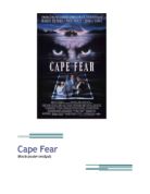
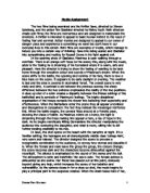
Movie poster analysis
This poster uses minimal lighting but only focusing the light on a set of what seem very tired and rugged eyes, giving hints of distress and anger already from the movie poster. Catching the eyes of the audience it makes the audience believe somebody is watching them as they are viewing the poster, and also how the eyes are set in the lake as if he is a monster almost.
The movie poster is set in the middle of a lake, it just so happens the lake is named after the title “Cape Fear” so the poster really sets the scene for the actual movie, showing the boat in the middle of nowhere with forestry by the sides gives a spook effect as if they are lost, with the eyes watching over the boat it gives the sense of maybe someone being hunted or spied on. The family photo at the bottom shows a standard American family but with a tear in the photo by the Daughter, with the daughter grasping to the father it connotes maybe that the daughter gets taken away, family problems also. A key signifier would be the Eyes in the center of the poster, and connotes that maybe the person who hide behinds those eyes has a revenge or a certain anger towards that family and is wanting to separate it.
The family all has very smart/casual clothing, showing that maybe they are of a higher middle class, and the make-up used on the eyes show a certain distress, giving a powerful meaning of anger to the poster really generalizing it to its genre of a thriller. Also this film was produced by Universal Studios, which is a massive company creating many thrillers such as “The Butterfly Effect”. The slogan above the eyes even poses a threat of revenge and connotes a spook effect “But the past is coming back to haunt them” the font is very thin and horror like, and is located between the eyes and the boat showing some sort of link between the two. Also “from the acclaimed director of good fellas” shows this film could also be action packed as the move “good fellas” is an action film with lots of killings. In the poster it really emphasizes how Robert Dinero is featuring in the film, as a strong young male when this film was made it really catches the audience’s eyes that he features in this movie. Emphasis on the movie title is also used greatly as it is shown in the center of the poster, almost like its resting/lurking in the lake with the eyes and the photograph. An iconic image for this poster would me the thrilling tired eyes of a murderer, it really targets the thriller genre and puts a certain scare into the poster, and the style of the poster with a dark setting and the lightning shows examples of images associated to a thriller genre, and the fact it is set in a distant location out of civilization. Robert Dinero really takes up the generic type to be in this thriller movie as a killer. Also the red sky in the background of the boat signifies that blood will be shed and somebody will die.