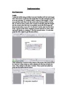
Then go down to format picture and left click on it. Then in image control you can see the sub title colour with a drop down menu next to it. If you click the arrow on the drop down menu you should see the option watermark, click on this then click ok confirm the change. On my computer instead of saying watermark it says washout however this means the same as water mark. I am performing this tactic below:
After you complete this task your picture should
Look like this.
The other tactic I used was auto shapes this is very simple to use. If you click on the auto shapes button at the bottom of the screen:
You will get a drop down menu showing a list of shapes available for you to use. If you scroll over these options yet another option menu shoots out.
Click the shape you want to draw and then drag your mouse/hold down the left mouse button to draw it.
Business card
I used publisher because it handles both text and images well. I started of by choosing a blank publication of a business card. Two things that I have used a lot on the business card and not much on the leaflet or the poster are transparent text boxes and the use of a fax number. Transparent text boxes are very useful for writing text over a picture i.e. a watermarked picture.
First of I clicked on the text box icon as pointed to above. Then I drew a box like the one below.
When it is not transparent this happens:
Fbjsfnksfnjdsfojkdsnfksdmf,snfbjdsafbjkdsfb
It completely covers the text.
When it is transparent this happens:
Fbjsfnksfnjdsfojkdsnfksdmf,snfbjdsafbjkdsfb
This is how I did it. First of all I hovered my mouse over the edge of the text box so my mouse cursor becomes 4 arrows pointing in different directions I then right clicked. I then clicked format text box. I then clicked on the colour and lines tab:
I then changed the transparency bar to 100 percent. This making the text box transparent.
The other tactic I used is that I put a fax number on the business card this is because the business card is only for selected customers and also because Tom does not want any old so and so faxing him.
Hard copy explanation
What you have to do here is match the number on the hard copy with the number on this piece of work.
Leaflet
-
The logo- The logo was created on word using lines from auto shapes. Tom then decided to use it for the logo. He gave me a printed copy of it and I then scanned it on to paint using the scanner. I then edited it in paint making it suitable for all of the designs. I then copied it on to my designs in publisher. To copy I used Ctrl + C and to paste I used Ctrl + V.
- Image- To get this image I went on to the deals page of our web site and copied it onto Paint shop pro. I then cropped it down to the correct size and also edited appropriately to suit the task...
- The slogan- This is the shops slogan I basically memorised it and then typed it into publisher in size 10 times new roman.
- This is a list of the categories of deals at the computer market I memorized them and then typed them into the leaflet design using size 18 times new roman.
- Border- This is the black border. As I made the leaflet using a blank publication I had to deign the border myself. So what I did is I went on auto shapes and used rectangles all the way around the piece of work. I then filled the rectangles black by clicking the fill button.
- Mistake- I kept this as a mistake for proof. Here I forgot to type in ‘DEALS’ in size 20 times new roman, bold. Instead I accidentally left it to say ‘Main inside heading.’ You will see that on my final design I have not made this mistake.
- Images of deals- To get the deal images I went around the shop picking up what I though was our most impressive deals and taking a picture of it with a white background behind it. I then loaded the pictures up on the pc. Next I copied the pictures one at a time and inserted them in to the correct text boxes I made earlier.
- Find more- Here I told the reader where to find more deals. E.g. on our website.
- Explanation- Here I explained a bit about the selected product e.g. the make of the product. I found this out from the website. The price I worked out in excel. On Tom’s computer were he had them all written down in excel. All that I needed to work out in excel is the final price after you add the VAT and take away money through January sales…
10) Contact details- Here I give the reader the contact details starting with the more important details in size 16 and in bold to the least important size 12 not in bold.
Business card
- I watermarked a picture of a computer we sell in the background. I took a picture of it then uploaded it onto word and then watermarked it and then pasted it into publisher. Once it was in publisher I sent it to the background.
-
The logo- The logo was created on word using lines from auto shapes. Tom then decided to use it for the logo. He gave me a printed copy of it and I then scanned it on to paint using the scanner. I then edited it in paint making it suitable for all of the designs. I then copied it on to my designs in publisher. To copy I used Ctrl + C and to paste I used Ctrl + V. The text box behind it was made transparent
- Contact details- Here I give the reader the contact details starting with the more important details in size 16 and in bold to the least important size 12 not in bold. The text was in medieval writing to give it a more exciting look.
- The title- The title was made big (size 24) So that it would stand out on the business card.
- The slogan- This is the shops slogan I basically memorised it and then typed it into publisher in size 10 times new roman.
Poster
- I watermarked a picture of a computer we sell in the background. I took a picture of it then uploaded it onto word and then watermarked it and then pasted it into publisher. Once it was in publisher I sent it to the background. I made sure I used a different computer then the one on the business card so that our stock range looked wider.
- Word Art- I made some word art in word and I then copied it and then pasted in the correct place on the poster. The word art was mainly size 36 as because it is a poster the writing can be bigger then the writing on say the business card.
- Auto Shapes- I made the explosions and the break off effects using auto shapes. I basically drew it out on word then grouped the auto shapes to gather, copied it and pasted it on to publisher.
- I watermarked a picture of a computer we sell in the background. I took a picture of it then uploaded it onto word and then watermarked it and then pasted it into publisher. Once it was in publisher I sent it to the background. The text box behind it was made transparent
- Image- To get this image I went on to the deals page of our web site and copied it onto Paint shop pro. I then cropped it down to the correct size and also edited appropriately to suit the task.
Corrections
Spelling and Grammar
After reading my final written design I found quite a few mistakes. So took care throughout designing my final designs not to make to many mistakes. Also throughout making my designs I used spell checker, which is shown on word as an ABC button. You can also activate it on word by pressing F7.
Unwanted sentences
Through out my final designs I kept on finding I was making sentences that was not wanted or that did not make sense. To prevent this I read through my work to check for mistakes I then also asked Tom to read through my work as well.
Copy right laws
To prevent breaking the coy right terms I asked permission of all the websites before taking any pictures. As by accident I took one from the tiny website with out ASKING PERMISION but before printing the leaflet I deleted it. So in the end I did not break any laws after all.