Data Tables
Europe
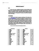
Data Tables
Oceania
Data Tables
North America
Data Tables
South America
Data Table Result
- The wealth and life expectancy of a continent is linked and is likely to have a strong positive correlation. I believe this happens worldwide.
- Females generally tend to live longer than males worldwide.
Summary
Hypotheses 1
This data supports my first Hypotheses that wealth and life expectancy of a continent is linked and is likely to have a strong positive correlation. This is seen because the higher a continents mean GDP - per capita the higher its mean Population Life Expectancy has been. This is with the exception of South America. This goes against my hypotheses. This does not prove my hypotheses incorrect as I need more sufficient evidence.
Hypotheses 2
This hypothesis has already been proven correct because on in every continent the mean Male Life Expectancy is always lower then the mean Female Life Expectancy.
Scatter Graphs
A scatter graph is a graphical summary of bivariate data (two variables X and Y), usually drawn before working out a linear correlation coefficient or fitting a regression line.
In scatter graphs every observation is presented as a point in (X,Y)-cordinate system. The resulting pattern indicates the type and strength of the relationship between the two variables.
A scattergraph will show up a linear or non-linear relationship between the two variables and whether or not there exist any outliers in the data.
Scatter graph is a graph made by plotting ordered pairs in a coordinate plane to show the correlation between two sets of data.
The reason for me choosing the scatter graph as a way of displaying my data is because the scatter graph is easy to read and understand. Also you can visibly see the correlation which is not possible with other methods.
Reading a scatter graph:
- A scatter graph describes a positive trend if, as one set of values increases, the other set tends to increase.
- A scatter graph describes a negative trend if, as one set of values increases, the other set tends to decrease.
- A scatter graph shows no trend if the ordered pairs show no correlation.
Interpreting a Scatter graph
High positive correlation Perfect positive
Low correlation Perfect positive
High positive correlation
High negative correlation
Scatter Graphs
Asia
Scatter Graphs
Africa
Scatter Graphs
Europe
Scatter Graphs
Oceania
Scatter Graphs
North America
Scatter Graphs
South America
Scatter Graph Results
- The wealth and life expectancy of a continent is linked and is likely to have a strong positive correlation. I believe this happens worldwide.
- Females generally tend to live longer than males worldwide.
Only hypotheses one was attempted with this data as hypothesis two could not be preformed with this graph. It would have had no extra information and would have been too time consuming.
Hypotheses 1
This data shows the data table in a visual form. Personally, it is easier to see that continents that have less GDP – capita also have a lower life expectancy. The most visible are the countries that have been circled around. These countries are a lot worse then the rest of the countries. These countries can actually be seen to be totally different compared to the rest of the world.
Histograms
In statistics, a histogram is a graphical display of tabulated frequencies. That is, a histogram is the graphical version of a table which shows what proportion of cases fall into each of several or many specified categories. The categories are usually specified as non overlapping intervals of some variable.
.Histogram is a specialized type of bar chart. Individual data points are grouped together in classes, so that you can get an idea of how frequently data in each class occur in the data set. High bars indicate more frequency in a class, and low bars indicate fewer frequency.
One of the main reasons for me choosing histograms is because it provides an easy-to-read picture of the location and variation in a data set. The histogram is another way of visually displaying your data. This makes it more appealing than a set of tables.
Interpreting Histograms
If the columns in a histogram are all the same width then you can compare the frequencies of the class by comparing the heights of the columns. The column with the largest area indicates the modal class.
The height of a column is like averaging out the frequency over all the values in the class.
Height = Frequency
Class interval
The taller the column is the greater the average frequency for the values in that class is.
Histograms
Asia
Histograms
Africa
Histograms
Europe
Histograms
Oceania
Histograms
North America
Histograms
South America
Histogram Results
- The wealth and life expectancy of a country is linked and is likely to have a strong positive correlation. I believe this happens worldwide.
- Females generally tend to live longer than males worldwide.
This was extended work to give me more information indirectly concerning hypotheses one.
This data shows me that the modal group for population life expectancy worldwide is the 71-80 age range. Unsurprisingly the economically worst off continent, Africa, was the only continents to have any country with a Population Life Expectancy of below 40. On the other hand Asia, not being the second worst economically continent, alongside with Africa, had countries with Life Expectancy lower then 60. To summarise so far in my investigations only South America has not fitted in with my first hypotheses.
Standard Deviation
Standard deviation is the most commonly used measure of . It is a measure of the degree of dispersion of the data from the mean value. It is simply the "average" or "expected" variation around an average.
Standard deviation would show me how spread out the values in the sets of data are. It is defined as the of the . This means it is the (RMS) deviation from the average. It is defined this way in order to give us a measure of dispersion that is:
I have chosen this method because although the scatter graph and histograms do show population distribution they do not give a precise and exact answer. This can easily be obtained by using standard deviation.
- A non-negative number, and
- Has the same units as the data.
Interpreting Standard deviation
Interpreting standard deviation is quite easy to read. A large standard deviation indicates that the data points are far from the mean and a small standard deviation indicates that they are clustered closely around the mean. In this case 0.9 is a large standard deviation and 0.1 is a small standard deviation.
The formula for standard deviation is;
Σƒx² -x ²
√ Σƒ
Standard Deviation
Asia
Standard Deviation
Asia
Standard Deviation
Africa
Standard Deviation
Africa
Standard Deviation
Europe
Standard Deviation
Europe
Standard Deviation
Oceania
Standard Deviation
Oceania
Standard Deviation
North America
Standard Deviation
North America
Standard Deviation
South America
Standard Deviation
South America
Standard Deviation Results
- The wealth and life expectancy of a country is linked and is likely to have a strong positive correlation. I believe this happens worldwide.
- Females generally tend to live longer than males worldwide.
Hypotheses 1
This data does mainly concentrate on Hypotheses two but it can also be relevant to Hypotheses one as well. The continent with the highest GDP- per capita, Europe is also the continent which on average is closer to its mean then any other country. Also the continent with the lowest GDP- per capita, Africa is also the continent which on average is furthest away from its mean then any other continent.
Hypotheses 2
This data proves that females have longer Life Expectancy then males, without a doubt. The females live so longer that they are further away from the mean then the males. This is because females are above the mean for each and every continent, unlike the males who are always below the mean. This table can be misleading in the concept that it seems as if men in Europe have a Longer Life Expectancy then women in Europe. This is not true. The fact is that both men and women have high Life Expectancy in Europe; (with the women averaging higher then the men again).This results leads to a high Population Life Expectancy which is close to both of them. In this case the women are closer to it, but they still contain a higher Life Expectancy.
Spearman’s Rank Correlation
Spearman’s rank correlation is used to compare two given sets of data.
You use the formula p = 1- 6∑d²
n(n²-1)
d is the difference between the GDP-per capita and Population life expectancy.
n is the number of countries in the specified continent.
To work out the value of p for the results of the GDP-per capita and the Population life expectancy you add another two rows to the table. The first row is for the value of d (difference) and the second row is for the value of d² (difference²).
Interpreting Spearman’s rank correlation
The value of p will always be between -1 and +1.
________________________________________________________________________
-1 0 1
If the value of p is close to 0 there is almost no correlation.
If the value of p is close to -1 there is strong negative correlation.
If the value of p is close to -0.5 there is weak negative correlation.
If the value of p is close to 1 there is strong positive correlation.
If the value of p is close to 0.5 there is weak positive correlation.
Spearman’s Rank Correlation Results
- The wealth and life expectancy of a country is linked and is likely to have a strong positive correlation. I believe this happens worldwide.
- Females generally tend to live longer than males worldwide.
The Spearman’s rank correlation tables show the following results about the correlation between the GDP-per capita and the Population life expectancy of a continent:
Looking at my data it is visible that all the continents have positive correlation. This proves my hypotheses, that all the continents have a positive correlation between the GDP-per capita and the Population life expectancy of a continent.
The accuracy of my hypotheses can be further developed. Instead of saying that there is a positive correlation between the GDP-per capita and the Population life expectancy worldwide, I could further develop this. Looking at my data I can tell the strength of the correlation of each specific continent.
Conclusion
- The wealth and life expectancy of a country is linked and is likely to have a strong positive correlation. I believe this happens worldwide.
- Females generally tend to live longer than males worldwide.
My first hypothesis was proven correct. I realised that the continent do contain a correlation between the wealth and life expectancy of a continent.
However for most of my data South America did seem to be an exception. I believe this to be because of the size of data for this continent. Although stratified random sampling was accurate it did not work in these circumstances. Another method I could have used was to give each continent the same number of countries to represent it. Only four countries were chosen for South America, I do not think that this was a sufficient enough number to represent a whole continent. I say this because I believe that the chosen method was mainly all about luck, which countries are chosen to represent a continent. This would give a biased reading. To overcome this problem I would definitely have to increase my data.
For this reason I think that although my hypotheses was correct and if I was to try the same investigation again with a data size of seventy instead of sixty my hypotheses would be more successful as well as more accurate.
For my second hypotheses there were no such problems. My hypothesis was not one hundred percent accurate because as always there were a few exceptions. The exceptions consisted of four countries four countries all from Africa. These countries had a higher male Life Expectancy then the female Life Expectancy. These countries are listed below.
Apart from these few countries, (which just prove that men can live longer then women!) my hypotheses was correct, because worldwide females tend to live longer then males.
Looking at my investigation I feel in order for this data to be more accurate I would certainly need to have some minor adjustments, like the size of my data. I feel this did affect my results as the size of the data resulted in me being restricted from significant data that was not chosen due to my method of sampling.
If this investigation was done again I would actually stick with the same methods, however I would expand my database and also use an even wider variety of representing my data (for example I could use the cumulative frequency graph). This would enable me to have a more accurate set of results.
Spearman’s Rank Correlation
Asia
Spearman’s Rank Correlation
Africa
Spearman’s Rank Correlation
Europe
Spearman’s Rank Correlation
Oceania
Spearman’s Rank Correlation
North America
Spearman’s Rank Correlation
South America