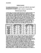
To get a better view of the pattern of estimation I am going to find the IQR of each set of data. The IQR gives us the middle 50% of the data. We calculate it so we are looking at the majority of the population, this is much more accurate reflection of estimation ability. This is because this method helps to exclude any outrageous results. The IQR is much more accurate than the previous method as it allows us to focus on the majority of the estimations and cuts out the bottom and top 25% of the estimations, where we could have extreme values.
The calculation for the inter-quartile range is the upper quartile (q3) – lower quartile (q1).
I can find these quartiles using the following:
Q1 = (n + 1) Q3 = 3 (n + 1)
- 4
IQR = Q3 – Q1 Q3 = 3(n+1) / 4 Q1 = (n+1) / 4 Q2 = 2(n+1) / 4
(N = total pieces of data)
The IQR results show that overall the Adults are better at estimating length of the line, due the IQR being smaller than the child’s, however these results also show me that the children are better at estimating the size of the angle, due the IQR being smaller than the adults. So therefore due to these contradictions this doesn’t help me to support my prediction. If the results were more one sided they would be more useful, but the majority of the data is shown that children are better at some things, and so are adults. However extreme results still maybe affecting the averages, even with the help of the IQR.
I think that I need to look at some other statistical methods at this stage of my investigation, as I do not have enough evidence to support or disprove the hypothesis. I have decided to display the data on a stem and leaf diagram so that I can look at the spread of the data and in particular the inter-quartile range.
Stem and Leaf Diagrams
The Stem and Leaf use the data collected to produce a shape. The shapes tell us how accurate the results were. There should be the bulge around the correct answer. If this isn’t so the results wont be accurate.
The highlighted estimations below show the estimations that were correct.
Children’s Estimation of Line
Adult’s Estimation of Line
Children’s Estimation of the Angle
Adult Estimation of the Angle
Children’s Estimation of Line: Positive Result: As you can see the correct results is at a tip of a bulge meaning the majority of the estimation were around the actual answers.
Adult’s Estimation of Line: Negative Result: As you can see the correct results is at the beginning of the answer away form the bulge showing that a large majority of the results were away from the actual answer.
Children’s Estimation of the Angle: Positive Result: The correct result was just away from the tip of the bulge showing that most children got around the correct answer.
Adult Estimation of the Angle: Positive Result: This time the adults estimations were very close to the actual answer, the bulge was huge around the answer showing that they were better at estimating the angle.
Overall, looking at my stem and leaf diagrams I have noticed that they all have a consistent shape. The majority of the leafs were situated around the 40’s and the 50’s. This means that the estimate we around 40-59. This shows that the majority of the answer we near enough the actual answers. This could account for the earlier results showing the children and adults were similar in their prediction, as they are both quite close.
In the children’s estimation of the line I can see that it has positive correlation. estimation range is from 30 to 70. I can tell by looking at the numbers that I have highlighted that two children were successful in estimating the actual answer. In the adults estimation of the line estimation range is from 35 and 67. I can see that only one adult was successful in estimating the actual length. From this piece of evidence the hypothesis isn’t supported because the children have estimated correctly more than the adults.
In the children’s estimation of the size of the angle I can see that it has positive correlation. The estimation range is 32 to 65. I can tell by looking at the numbers that I have highlighted that two children were successful in estimating the actual answer. In the adults estimation of the line estimation range is from 33 and 59. I can see that only one adult was successful in estimating the actual size of the angle. From this piece of evidence the hypothesis is neither supported or hindered as both adult and child scored equally well. So from my stem and leaf diagrams the hypothesis isn’t supported wholly as the majority of the better estimations were by the children.
Box and Whisker Diagrams and Outliers
The Length of the line
Children
Q1 (Lower Quartile) = 45mm
Q3 (Upper Quartile) = 59mm
Q2 (Median) = 2(40+1)/4 = 20.5th piece of data = 50mm
I will now work out the outliers. The formula for outliers being: Any point below this Q1-1.5(IQR) is an outlier and Any point above Q3+1.5(IQR) is also a outlier. These boundaries are represented in the diagram. I will use the letters A and B to represent these boundaries.
The outlier boundaries are: The Childs Below (B) 45-(1.5X14) = 24 Above (A) 59+(1.5X14) = 80. So any outside either A or B is an outlier. But on this diagram there aren’t any outliers found due the large size of the IQR.
Adults
Q1 (Lower Quartile) = 49.25mm
Q3 (Upper Quartile) = 55.75mm
Q2 (Median) = 51mm
I will now work out the outliers. The formula for outliers being: Any point below this Q1-1.5(IQR) is an outlier and Any point above Q3+1.5(IQR) is also a outlier. These boundaries are represented in the diagram. I will use the letters A and B to represent these boundaries.
The outlier boundaries are: Adults Below (B) 49.25-(1.5X6.5) = 39.5 Above (A) 55.75+(1.5X6.5) = 65.5 As you can see on the graph I have found 2 outliers, 67 and 35.
From looking at each box plot for the adults and children’s estimations of the length of the line I can see many facts that can disprove and prove the hypothesis. I say this because the children are closer to the actual answer, however the adults estimations are a lot closer together than the children’s in total. I can tell that they are closer to the actual answer by the fact that they have a large majority of middle values being close to the actual answer unlike the adults. The scatter graphs below shows how my statement is correct. The adults estimations in the middle 50% are all very close to the actual answer, and a lot of these adults estimated the same way. Whereas the children seem to differ more with their answers but some are accurate in achieving the actual answer. In between the lines on the graph shows the middle 50%.
The size of the angle
Children
Q1 (Lower Quartile) = 45°
Q3 (Upper Quartile) = 53°
Q2 (Median) = 49.5°
I will now work out the outliers. The formula for outliers being: Any point below this Q1-1.5(IQR) is an outlier and Any point above Q3+1.5(IQR) is also a outlier. These boundaries are represented in the diagram. I will use the letters A and B to represent these boundaries.
The outlier boundaries are: The Childs Below (B) 45-(1.5X8) = 33 Above (A) 53+(1.5X8) = 65. There was only one outlier, 32.
Adults
Q1 (Lower Quartile) = 45
Q3 (Upper Quartile) = 55.25
Q2 (Median) = 49
I will now work out the outliers. The formula for outliers being: Any point below this Q1-1.5(IQR) is an outlier and Any point above Q3+1.5(IQR) is also a outlier. These boundaries are represented in the diagram. I will use the letters A and B to represent these boundaries.
The outlier boundaries are: Adults Below (B) 45-(1.5X10.25) = 29.62 Above (A) 55.25+(1.5X10.25) = 70.62
From my box plot diagrams I can see that the children were much more varied in their answers than the adults. The children contain a lot more outliers indicating that they have much inaccurate estimation. The adults have far less outliers showing that they have all answered similarly and more accurately. I can see that the adult’s box is closer to the correct answers.
Conclusion:
From the data so far I have discovered many different facts. From my first method of obtaining evidence I saw that the adults had a smaller percentage error in the mean average than the children, suggesting that the hypothesis was correct, but the children having a lower percentage error in the median then contradicted this. Their modal averages were the same which meant that I was unable to prove or disprove the hypothesis. I was able to see undoubtedly that the adults did have a smaller range than the children, showing that the adults answers are closer together, and also indicating that they are closer to the actual answer. After looking at stem and leaf diagrams I saw that more children had estimated correct answer than adults, disproving the hypothesis, however this could’ve been down to the fact that there were more children than adults. So I decided to look at the IQR to have a closer look at the middle 50% of estimations made by adults and children, this was done to get rid of the extreme answers that are far from the answer. After looking at this I saw mixed evidence. It seemed that the children were better at estimating the size of the angle and the adults were better at estimating the length of the line. Then when I looked at the inter-quartile ranges it certainly looked as if the adults were better at estimating. After looking at box plots it seemed that the adults were better at estimating because they had less outliers than the children.
The data however is not reliable enough to base any strong conclusions on because I am unable to know where the data came from. The data could also be different because of the definition of a child and an adult. It could be that I was collecting information from adults, which counted as children’s data because they were still in school, despite being eighteen. I have still not found enough evidence to draw my conclusion so I will use another method of obtaining evidence. I think use a pictorial method of displaying my data will help show the actual patterns of correlation, if any. Hence I will be drawing scatter graphs, and cumulative frequency curve diagrams of the results.
Graphs
I'm now going to create scatter graphs of the results as these will help show if there is any correlation between results and give a better idea of the results and what they mean.
Also I will produce cumulative frequency curve diagrams to see the percentage error plotted on the graph for the angle and line for both adults and children. Doing this allows means to visually see where the relative averages are. Also as I am not plotting the actual results but the percentage error it is much easier to see the pattern of the estimation.
Graph 1: This graph shows how the majority of the child’s estimation of lines is similar to that of the angles, meaning that they are quite consistent in their estimations. But this is a crude method of finding this out. To obtain better, more accurate results I will need to use Spearmen’s rank.
Graph 2: This graph shows how the majority of the adult’s estimation of lines is similar to that of the angles, meaning that they are quite consistent in their estimations. There are more consistent than the Childs estimations shown in graph 1.But again, this is a crude method of finding this out. To obtain better, more accurate results I will need to use Spearmen’s rank.
Graph 3: This shows the results of Spearmen’s rank, the much more accurate method of finding the correlation in a graph. As you can see the overall result is –0.13. This shows that there is slight negative correlation
Graph 4-7: These are the cumulative frequency curves for both adults and children’s line and angle estimations. The lines drawn on indicate the IQR boundaries. On these we can the pattern of the estimations. On these it shows a massive increase of estimations within the IQR for the adults, much more than the children. This shows that more adults were estimating with the correct boundaries, showing their estimating we better, this evidence supports my hypothesis.
Graph 8: This shows the method of obtaining the cumulative frequency curve, using the results.
From this graphs I have gained more evidence but still not enough to gain a conclusion, therefore I will conduct an investigation of my own, with the school.