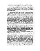
When the reader opens the leaflet the first thing the reader looks at are the images. Friends of the Earth made a good choice of emotive photos in my opinion. The first is of a man standing on top of his car because the whole area has been flooded: the photo is designed to shock readers by showing how close to home the effects can be, the photo is clearly in a developed country. The second photo is of a woman in a third world country, the reader can see she has her belongings and doesn’t have much, but she’s doing the best she can for the situation she is in. It was clever to use a woman because most people tend to feel greater pity for woman since they are seen as ‘weaker’. The final photo they use is of what appears to be an isolated polar bear, in a rather large photo surrounded by fragmented ice: even though polar bears tend to travel on their own, it is emotive, making people feel sadness for the ‘cuddly’ creature.
There is a lot of text in this leaflet but they have organised it in such a way it doesn’t look ominous to read; the text has been sorted into manageable sections. Also the leaflet was sent out with the Independent on Sunday so when they wrote the leaflet they were most likely aiming for more educated people, who would possibly be interested in reading more about the charity.
There is then the very manipulative title: ‘Tragedy or happy ending? You decide’ it doesn’t really give the reader much option, because most people wouldn’t like to feel something bad was their fault, Friends on the Earth are saying if you don’t help then everything will go wrong, it is making the reader feel guilt if they don’t do anything to help.
The leaflet then lays down some facts in bullet points; all the facts are ones, which are put there to make the reader feel horror at what is happening: ‘160,000 die every year’. They also use ‘scientists’ to bring their views across, using expertise makes what they are saying more of a fact then an opinion and people believe it is a real threat. They also use biased language to bring their point: ‘Some short-sighted politicians’ this also makes the reader feel better because the leaflet has provided them with someone to blame for their ‘wilful ignorance’. They then state that they are an ‘unique campaigning organisation’ which encourages people to join because it suggests Friends of the Earth are the only people doing this, making it exclusive and the one chance people have for putting things right. Having made the reader feel guilty about what is going on, they then give them some hope: ‘Our research shoes that a brighter future is possible’. This gives the reader the idea that they can help to put what they have supposedly done wrong right. ‘We’ve pushed through 8 Acts of Parliament’ this makes them sound more reputable showing that they have been able to achieve things.
They then tell us what our money will be used for, which makes the reader more sure about donating money because they can feel it will actually go towards something. They also persuade the reader to join by suggesting the reader will be part of a community: ‘150,000 people like you’ and most people want to feel they belong to something.
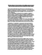
War on Want is the other charity leaflet we examined; their focus is worldwide poverty. The cover of the war on want leaflet is mostly taken up by a powerful image. The use of the old woman working makes the reader feel sorry and sympathy for her, in our society a woman who appears to be so elderly would not be doing manual labour. All around her is barren land, the reader can tell she is digging to try and grow crops but it doesn’t look like it’s possible for anything to grow in such harsh conditions. Putting the image in black and white puts emphasis on the bleakness of where she is and everything around her. We then have this title at the top of the page, ‘She’s working herself out of poverty’ a statement which is used by different groups to suggest some hope; but then War on Want have at the bottom used a large font for, ‘yeah, right.’ it a sarcastic comment, telling us that the statement at the top isn’t true. The use of colloquial language is effective because it makes a firmer point; most people have used the term ‘yeah, right’ and know how it is used. The strip of red, which contrasts with the black and white picture, highlights the ‘yeah, right’ making more of a point of it. War on Want have used the same image on the front and back of the leaflet, I think this makes it more attention grabbing because, the reader almost can’t get away from the image which is effective because the image is a very emotive.
When the reader opens the leaflet, the reader is first presented with a page on War on Want; this helps persuade the reader because it talks about what they do and what they have achieved making it more appealing because it then appears to be a legitimate business. The language they use in this part is emotive: ‘Helping people who live on Mumbai’s rubbish tips’, using the idea of rubbish tips to get to you, people find the idea of living somewhere with rubbish more unappealing and most people don’t like the idea of other people suffering, so it’s more effective then saying the poor people of Mumbai. On the same page it then talks about ‘How [we] can help’; it directly aims its points at the reader making it more personal. In this section the first line reads; ‘We’re not like other development charities’, making them sound individual as if they are the only charity doing what they do making it exclusive. The logo is very good as well: the concept of taking something, which is seen as evil and portraying it as a positive thing. Then there is the phrase, ‘Fighting Global Poverty’ which shows us that they understand that poverty is worldwide and they have the will power and determination to fight poverty everywhere.
As in the other leaflet, when the reader opens it fully, they look at the visuals: War on Want have repeated the picture of the old woman. I think this was a good thing to do because they are almost imprinting the image, that most would find pitying to look at, in your brain making the reader feel terrible if they don’t donate. Also they have expanded the picture, which shows more of the barren wasteland all around and the solitude of the woman. The second photo I don’t think is particularly good. I can see they were trying to aim for the little girl to look scared and their soldier protecting her but I think the photo looks too staged, the little girl doesn’t come across as being scared and the soldier doesn’t look as if he is there to protect her.
There is then the repeat of, ‘she’s working herself out of poverty’ but the reply, which is also a subtitle, is: ‘No she isn’t.’ which is a firm response and bluntly tells us how it is. Using the line: ‘The fact is,’ is effective because it means they aren’t giving you opinions but the truth, making it more definite. It also says that we must do something and makes the reader feel guilty by attacking your conscience if we don’t: ‘Unless we do something...she’ll stay poor for the rest of her days.’ They follow this by saying, ‘You know that.’ They direct most of the speech directly at the reader. They then give you hope and encourage the reader to join War on Want by saying joining can solve everything: ‘But did you know that you can do something about it, by joining War on Want?’ They give the reader something to blame, ‘that political and economic systems make people poor and will keep them that way.’ Then War on Want tells you briefly where they fight the injustice and cleverly uses alliteration, ‘Factories and fields’.
Use of the statement ‘We can make a big difference’ shows confidence and determination encouraging people to take action through them. They say they are ‘fighting for Justice, fairness and giving a poor woman a real chance in life.’ The use of the word, ‘Justice’ is persuasive because it is powerful and suggests that it is the right thing to do.
They finish by talking about what you will gain from donating; so the reader do get something personally from donating and aren’t just giving your money away.
Both charity leaflets use many of the same ideas of persuasion for example: they both say their charities are unique and are emotive, making the reader feel sorry for the people they help. I think that the Friends of the Earth ‘The Big Heat’ leaflet does this better though. I think this because their way of getting the readers attention was more catching, they were able to make the reader initially interested, and then make their cause sound more thrilling and exciting. When I opened the leaflet they then gave you more information and facts which I think was better because it meant you actually had more a basis to go on when deciding; they taught the reader facts about the state our world is really in. Next they talked about how what they are doing can be achieved exactly which gives you more confidence because it means the can see a plan they have.