Curry’s Website Analysis
Layout
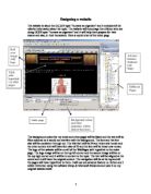
The website uses a standard layout with links on the left in a table and main headings along the top. The rest of the information and links are spread across the rest of the page but everything is set out in as table to keep things even and neat.
The main logo is situated in the top left corner with a link to the homepage as nearly all websites do. A search box is also present which gives you more freedom in your searches and / or if you don’t know where to look for the item you are after.
Any awards that they have received are positioned out of the way at the bottom of the page along with official company owner and also cards for payment accepted by the company.
Colour
Curry's have a specific colour theme in which contains red and white. This is used on all items related to the business, for example the website, the leaflets and the carrier bags. They use red and white because they are contrasting colours and stand out when used together. It gives a more professional feel to the website. And rather than using red on white for text they use white on red.

This is a preview of the whole essay
Peer Reviews
Here's what a star student thought of this essay
Quality of writing
The structure is very clear, as the report is divided upon different sub-headings which make it very clear what the student is referencing to. The writing is quite random, as some of the writing doesn't make sense. It's quite difficult to read and make sense of all of the work. As a reader, I have to assume a number of words as there are words missing in some places.
Level of analysis
Generally the report is lacking high levels of analysis, as the answer is quite basic. However on the plus side, the section 'Information Capture' is in-depth and does provide the analysis required. The issue is, is that the report isn't consistent, as some areas are high analysis and other area's aren't. If all areas were of the same quality as the section mentioned above the report would acquire high marks.
Response to question
The report is quite basic, which describes how the Curry's website is targeted towards their core consumer base. However the website doesn't entail detailed analysis, which is needed for high marks. The student acknowledges key areas of the website, such as the layout, colour scheme and the ordering process and describes a little about each one. For higher marks it would be necessary to write a more in-depth view.