Fit For Purpose
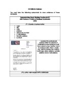
The document is indeed for purpose because it shows all the information needed in a bullet point forms, furthermore, all the information is displayed clearly with the white background. Like I said before, if there is much colour, the colour will distract the person reading the letter, there is also a watermark in the background telling what type of document it is. Last but not least, all the contact details are on the top right hand corner and there is also the website link at the top as well, so if the customer wanted more information on something, they could go on the website, all this information is laid out neatly along with the organisations logo. There is also a signature at the bottom of the letter and that authenticates the document. The house style is also shown here, for example the logo and also the bullet points are also all the same in all the documents. Furthermore, the company slogan is on every document.
PowerPoint
Flyer
Target Audience
The target audience for my flyer is for everyone, but if the games that I am advertising have and age rating, e.g. 8+,12+,16+ and 18+, those games are intended for those people that are aged the ages stated or older to be able to buy and play the games.
Purpose
The purpose of the flyer is to advertise some of my most popular games to the public for the near coming Christmas holidays, so they can buy the games or game consoles as a present for friends, family etc. or just for themselves.
Layout and Style
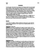
The layout of the flyer is that there is the right amount of text and pictures and also that the logo and slogan is also on the flyer. The contact details and slogan were deliberately added at the bottom and at the end of the flyer so the customer can contact us if they have any inquires and also the slogan was left there also with the world “and remember” so that the people will remember about our slogan. The text and pictures have been very neatly laid out. There is also a table that is also added and that is to display rental prices ad that make it more easier for people to see and study rather that reading it out in a paragraph. Last but not least, the company title is right at the top and like I said before, the title is against a white background and also the title highlighted in bold, italics and it’s also underlined and all that also adds to make it easier to notice the title.
The style of the flyer is that it’s very neat, so it makes it easier to navigate through the whole flyer with ease. Furthermore, the discount picture along with the “50%” off stands out against the white background so when people sees the flyer, the first thing that they will see is the big “discount” and “50% off “first and they will automatically know that there is a sale going on. In the paragraph when there is a review on the game called Grand Theft Auto IV, they rate the games 99/100, which shows that this is an excellent game with high ratings and they also write, “It is a MUST have game”, the word “MUST” is written in capital letters and when they read the paragraph, they will notice the capital letters. Last but not least the back ground of the game is white and that is because when the people read the flyer they wouldn’t get distracted by and background picture and the pictures that are displayed are vey striking pictures that show action and suspense and that again will make the flyer more eye catching.
Fit for Purpose
The document is fit for purpose because all the information is laid out neatly so it’s easy to navigate through the flyer and the flyer is very eye catching, furthermore, this is a nice simple flyer that isn’t too packed with colours and text etc, the background is white so it makes it easier to read the writing and if some people have seeing difficulties, it would be easier for them to see the document. Last but not least, there are warnings about age ratings, so you have to be a certain age to buy certain games.
Advanced Features used in my documents.
Mail Merge
Slide Master
Using Animation
Spell Check
Using Header
I added header on my letter document because whatever it in the header, it will be on all the other pages on the document, I also inserted my logo into the header.
Using Footer
I also used header and footer, I also added my name and the date.
Inserting the Logo
The get my company logo onto my letter document, I had insert it. I pressed the “Insert” tab, then I pressed the picture tab and then a screen came up that looked like this.
Watermark
I inserted a watermark into my document to specify what type of document the letter was.
To insert a watermark I pressed the “Page Layout” tab, and then I pressed the “Watermark” tab and options of what watermark I wanted to insert came up.
Importing Logo
I created my logo on “Adobe Fireworks CS3” software. To be able to use the logo in a document, you have to save the image as a “JPEG” image to be able to use it.
To be able to use the picture in my letter document, you have to go to “Insert” tab and the you have to press the “Picture” image and then you have to find the picture to where you save the image in.
Using Template
I saved my letter document as a template which means that if I want to write up another document with the logo or the slogan or with any house styles, when I open up a new document, all those feature will already be in place which will save me time and energy. This can be a useful tool if you are going you write up lots of documents.
What I Learnt.
I have learnt a lot from Strand B and I have used the knowledge to apply what I have learnt to make my own document in Strand C, for example, I have learnt about house style and I have used a house style in my document with the logo for example.