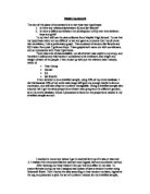
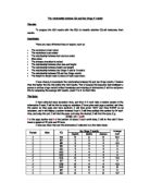
To see if there indeed was a correlation between Sat Results and IQ, I decided to plot graphs. I plotted two graphs for each year group, both of different gender. I also used box plots to show my data, doing them the same as the graphs.
This is the result of the graphs:
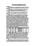
YEAR 7
Female:
In this graph we clearly see a relatively weak correlation between the IQ of the young girls and their KS3 Sat Results. It doesn’t really matter about their IQ; as they’re all quite close together anyhow, and still they're marks still have quite a large range.
Male:
In the male equivalent of the year 7 graph, we see a far stronger correlation between the IQ and the KS3 Sat Results, as they have the same range of KS3 Sat Results scores, but with a bigger range of IQ levels. Not only that, but u can see from my graph that a general trend is present, with higher IQ yielding better KS3 Sat Results. Of course there is quite a lot of overlap, but that may be due to the larger number of boys in my survey.
YEAR 8
Female:
Again in this graph we see a positive correlation between IQ and KS3 Sat Results, as in all the graphs. Also, the correlation is similar to that of the last graph, as shown by the R-value. A fairly good correlation is shown.
Male:
This graph contains the best correlation so far seen in my investigation. The high R-value shows this. It also contains the largest range of values, which may be a significant factor in the correlation, and this will be addressed later.
YEAR 9
Female:
Another strong correlation shown in this graph, though the range is not quite as extreme as in the previous graph.
Male:
The correlation between IQ and KS3 Sat Results is again good in this graph. And again the male year 9 graph has a larger range of values than the female.
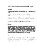
YEAR 10
Female:
The strength of the correlation on this graph is not as strong in previous years, and also all the points apart from two achieved a 4 score in the KS3 Sat Results. This could have thrown correlation.
Male:
It seems to be a role reversal in this year, as it goes against the trend of males having a larger range of data in comparison to the females. But in this year that is not the case. But yet again a good correlation is shown.
YEAR 11
Female:
This graph is very different to all the others so far apart from the year 7 females, as it shows very little correlation.
Male:
This is more like the trend the previous graphs were showing; a fairly good, positive correlation is again shown.
Graph Summary
The graphs are all very irrefutable pieces of evidence that generally show the same trends.
They all show positive correlations that are generally strong between IQ and KS3 Sat Results; this generally supports my hypothesis, with some exceptions.
Before I conducted my investigation I noticed some incomplete data so I omitted these from my investigation. These were 2-year males, 1 year 8 female and 1 year 11 male. I understand that this introduces bias but will make my evidence more conclusive.
I saw one major outlier in the female results in year 7. The person achieved a quite good KS3 Sat Result but had a very low IQ. The IQ of this person was so small that it could well have been a typing error when the data was being put into the computer. However, this may not be the case and it may be accurate, but it was a major outlier and threw my results dramatically, therefore I decided to omit it from my data. I realise this introduces bias to my sample.
All in all the graphs supported my hypothesis, that there is a correlation between IQ and KS3 Sat Results. There were good positive correlations and my R values are all generally good, with some exceptions, like the year 7 females graph, which showed pretty poor correlation. But still I think the graphs are conclusive and prove my hypothesis to be right.
Box Plot Summary
My box plots help me to look into my second hypothesis, the difference in the development in IQ over time between males and females.
The box plots show a definite trend with the size of the box plots and the correlation of the graphs also.
For instance, look at year 11 and year 7. The males have the larger quartile range and also have the better correlation. This can be seen below.
The males clearly have the better correlation as shown in the R-value. And the box plots show they have a larger inter-quartile range. Infact, my entire data shows the larger the inter-quartile range, the better the correlation.
Also, the box plots and these graphs answer my second hypothesis, as it shows that males generally have better correlation between the IQ and their KS3 Sat Results, but the box plots show that the sexes are nearly equal when it comes to who has the best median, with the boys having 3 of the largest and the girls having 2.
But, the boys also have the greatest range of IQ’s, with the girls being more even, as shown by the smaller inter-quartile range.
This leads me to believe that males, for the most part, have higher IQ’s on average, but also have the lowest IQ shown.
Conclusion
In conclusion, I can see there is a definite correlation between IQ and KS3 Sat Results in my data. It shows that the higher the IQ, the better the KS3 Sat Result. The graphs all show a positive correlation and nearly all of them have high R-values, showing good correlation. Therefore I predict that a male year 9 that scores a KS3 Sat Result of 5 will be likely to have an IQ of 108. This is shown in the graph below.
In relation to my second hypothesis, my box plots and graphs show a definite trend of male dominance in the higher levels of IQ, on average. Also, it seems that the larger the inter-quartile range, the better the correlation between IQ and KS3 Sat Result. this also seems to lead to higher average IQ due to a higher median.