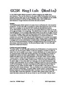
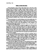
A slogan is a short and simple catchy phase about a company. The slogan for the Givenchy perfume is ‘very elegante, very fun, very you’. The Dolce & Gabbana product does not have a slogan; it doesn’t need one because it sells itself. The slogan is directed at women who enjoy themselves but want to be elegant and original. The slogan is effective because it says that the person who uses the product will be elegant, will have fun and will be very sophisticated.
A logo is a company’s symbol and it is used on every product to identify it. The Givenchy Company doesn’t use a logo in this particular advert because they show the celebrity covering most of the page, which replaces it. The Dolce & Gabbana advert also doesn’t use a logo because they’ve written Dolce & Gabbana out in full, possibly because Christmas is coming up and they are encouraging people to buy the product as a Christmas gift. By putting only D&G, buyers might not recognise the company’s name and not buy its products.
The woman in the Dolce & Gabbana advert is a tanned model just wearing a bra. With prominent lip-gloss on her lips, she’s laying back. She’s holding the perfume just over her chest showing the name of the brand. Promised land is used to indicate that if you use it you will look as sexy as her. The American actress Liv Tyler presents the new fragrance in a black and white advert. The advertisers have used the colour black and white to make the product seem sophisticated. To make the actual product stand out the only other colour used is pink which is the colour of the bottle. It also highlights the name of the fragrance ‘Irresistible’. Also in pink there is a small sentence saying ‘the new feminine fragrance’. Pink is used possibly because it is a girly colour.
The layout is how all the written work and pictures are placed. The Givenchy advertisers have used borders on the top and the bottom to make it look like a film clip. On the left there is a picture of Liv Tyler. On the opposite side there is a picture of a product itself. It is overlapping both the borders. In the Dolce & Gabbana advert all the page is taken by the model. On the Givenchy advert all the writing except for the slogan is placed in the middle. In all the Dolce & Gabbana advert the writing is at the bottom. The pink bottle on the Givenchy advert catches the eye first. In the Dolce & Gabbana advert it is the model that catches the eye first. The largest writing in both pictures is the brand name. The smaller writing is used all the other information that is printed. They’ve used the larger writing for the information that needs to stand out. Also in the Givenchy advert ‘Liv Tyler’ is written in a medium font so that people who look at it and don’t recognise her, know it is her, in very tiny letters on the far right of the page is the company’s website.
If I were to design the Dolce & Gabbana advert I wouldn’t change a lot. The only thing I would put on there is the name of the product. For the Givenchy advert I would only put white circles on the boarders to make it clear it is a film still.
In conclusion I think both adverts are equally successful. Certainly the Givenchy one has a celebrity who looks really eye catching and attractive on the photograph. The other one – Dolce & Gabbana – is effective because the whole picture doesn’t have a lot of detail yet the model looks really gorgeous.