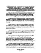
The images in both adverts are very effective. The converge for the Oxfam advert in the image is the girl’s eye and also all her bandages. Her clothes look worn out and old. The girl’s hair is a mess, untidy and unsanitary, that shows that these people can not afford to have a decent wash. Her facial expressions show she is upset, inconsolable and she looks innocent. By putting a picture of a child it shows someone who can not have done wrong. You do not customarily relate transgression to a young child. The bandages show she has been injured and physically abused. The picture says a lot even without words, from the picture we can get a vague idea about where she lives, most presumably a shelter or a hut in a third world country, such as Vietnam or Africa. The image alone says she’s trying to show how not to end up how she did, and we can preclude that from happening to somebody else.
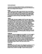
In the CCF advert again the child looks very innocent and despairing. The girl looks as though she had been crying. The child is young. You feel condolence towards the girl. She is looking directly at the camera; this is because she wants us to imagine what it would be like to be in her shoes. Someone, who’s parents can not afford to feed them properly parents who can not give her a life, which every human deserves.
Even though the Oxfam advert image says a lot more, I personally think the CCF advert image is a lot more effective. The girl’s eyes seem full of sorrow, and the girl in the Oxfam advertisements is older. We feel more emotional towards the younger girl.
The adverts both have very clever headlines. The Oxfam advert is very resourceful it uses two puns. It stands out because it’s big and bold. The line ‘look me in the eye,’ is a pun. It’s a phrase often used but people say ‘look me in the eyes’, the girl in the picture only has one eye we can look into, so we can not use the plural. When you first read the headline you think it’s about something very different. You read ‘arms control,’ and think its about a girl that has been beaten up, physically abuse, but by the word arms, it is meant weapons. There is the use of assonance in the words, ‘tough enough.’ That makes it a memorable feature of the headline.
The headline in the CCF advert is very simple. It uses the girl’s name to make you think more of her as someone like us. It expresses the parent’s feelings through the headline. It is bold but not that big. There is a use of assonance in, ‘mother…father… love her.’ It makes it stick in your mind.
I think the Oxfam headline is overall more effective and interesting, the use of puns makes you think when you’re reading it.
In both advertisements the headline and caption are the same thing. The caption in the Oxfam advert read, ‘look me in the eye and tell me that arms controls are tough enough,’ assonance is used as a technique. It makes it sound more interesting and makes it more memorable. Alliteration is also very easy to remember. ‘The,’ ‘tell,’ and ‘that’ are all examples of alliteration.
The caption in the CCF reads, ‘Amie has a mother and father that love her… so why does she need a sponsor like you?’ This is a rhetorical question, which is answered in the text. These kind of questions make the reader think, ‘why?’
As a caption I think the CCF advert is more affective because it makes the reader want to know the answer to the question and makes them want to read on.
The logo for Oxfam is very well known and recognisable. It is placed at the bottom right hand corner of the advertisements. It is the word Oxfam, but the o looks like a globe. The globe represents that Oxfam is helping people world-wide
.
The logo for the CCF is simple. It is ‘CCF’ in bold writing with three images of young children on either side.
The Oxfam logo is more affective because it is something you look at and you instantly know where it’s from.
The slogan for the Oxfam advertisements is, ‘Cut Conflict Campaign,’ this is alliteration and affective because it is noteworthy. The slogan for the other charity is, ‘Christian Children’s fund,’ which again uses assonance, but is abbreviated to ‘CCF,’ which is much easier to remember.
The small print for Oxfam uses a number of techniques such as alliteration, ‘murder’ and ‘maimed’. These are emotive words, which make the reader feel guilty and sympathetic. It also uses repetition such as ‘in the eye’ and ‘tough enough’. Again this is very persuasive and easy to remember.
The CCF uses alliteration such ‘Christian Children,’ ‘self-sufficiency,’ ‘Eastern Europe,’ ‘Education Eventual,’ and many more. It makes the advertisements catchier.
The objective information used is ‘they live in Gambia, one of the least developed countries on earth.’ This is a true fact. Subject information is ‘The family simply don’t even have a crust of bread to share!’ This kind of information is emotive language and tries to make you feel sorry for the girl. One important fact about the advertisements is ‘just £15 a month can give a child a decent future’. This is true because money is life and with it you can buy things like tools and seeds, which would help feed them.
Oxfam also uses objective statements such as, ‘guns can be easier to buy than tools in some countries.’ This is because in some countries you need a gun to protect you. This makes the reader want to stop the fear and do something about it, so people will not have a fear of death without a gun. It does not have subjective statements because they are trying to fight against Tony Blair and he knows what is right and wrong. Facts are more powerful than opinions because a fact is something that can be proven when seen. Your opinion is what you think, there is no right and wrong, it is your view on something and other people may think about it a totally different way. The reader wants to know something about not what another person thinks about something.
In both adverts the images of the girls are being exploited. This is because of the way they are being presented. The Oxfam advertisement makes her look badly hurt and the CCF makes the girl look very upset. This is wrong because they should consider the feelings of the girls. It is also manipulative in both cases because in the Oxfam advertisements they are making people think that everyone is hurt like the girl in these countries. The CCF advert is making people thinks that all the children are unhappy with what they have out there. By exploiting the pictures it makes the reader fell they have to do something urgently and fast, but sometimes it makes the reader turn away from the advert because they think, if the picture is exaggerated than all of the text will be as well.
Oxfam implies that the girl is the implied speaker, where she is not the person saying the caption. They do this because the caption and image are related to one another, and when doing this, the reader feels sorry for the girl because they think she is saying the caption.
Both of the adverts are in Standard English. It would be unprofessional to write in colloquial English. The text in the CCF advert is well written, there is one paragraph, ‘Can you imagine the pain of having to watch your own child grow up without being able to give her enough food to eat, the simplest of medicines when she falls ill or any books to help her with her learning?’ it is very emotional, no parent would want this happening to them. It makes the reader feel sympathetic towards them.
The line, ‘ Soul destroying effects poverty,’ is very effective. It is emotive language. In the last paragraph it says, ‘We know of thousands more little children like Amie who desperately need a sponsor…’ is very effective because they made it a fact by saying we know, the describe the children as little and say the desperately need a sponsor to try to get through to the reader. They also say thank you at the end of the text as though they are already certain that the reader will sponsor them, but it could also mean thank you for reading the text.
The Oxfam advertisement text is a lot shorter than the CCF’s. It is laid out in a very simple way. The text contains many facts and figures about weapons and murders, there is also a pun in the text, ‘a code that stops arms falling into the wrong hands,’ it is talking about weapons, but we do not usually refer to weapons as arms. Towards the end of the text it says, ‘only then can EU leaders look us in the eyes and…’ this is because we have two eyes to look in to, the girl in the picture only has one so the heading says eye.
Both advertisements have very different layouts, which is good. This is because it gives us a contrast on the adverts.
Both of the advertisements are powerful in there own ways. I think the CCF advert is overall more powerful and effective. The Oxfam advert makes you think and fight. Where as the CCF is persuading you to pay money monthly. Above all Oxfam is a better know charity than CCF, so more people would probably read Oxfam’s advertisements. I would choose to support the CCF because everybody should have a home to go to and food to eat. When we are starving we want food straight away, but there they probably have to wait for a long time, and the Oxfam’s request is much more complicated and would take long as well.
Priyum Popat 10RR English