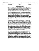
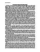
The Diet Coke advert has a brightly coloured background that has the character Superwomen on it. This resembles a picture that you might find in a comic. This is a good way of making the advert stand out and helps to draw more people in. The Nivea advert uses an image that is bright, not because of different colours but because light is coming from a window e.g. – because of the sun. This emphasise being “happy” but also paints a picture in the readers mind of a sunny place e.g. – the beach. However, the background for Nivea is hardly seen as there are two characters’ that are positioned in front drawing your eyes more towards them, whereas the Diet Coke advert positions the girl directly in the middle of the picture but the background can still be seen much more in the advert.
In both adverts characters’ are used to stress the products that are being advertised. Diet Coke uses a young woman and positions her in the middle of the poster. Behind her is the brightly coloured background, so to make her stand out she is coloured black and white. This creates a contrast between the two, but may also point out the difference between her and “superwomen” making her equal to us rather than the background. The Nivea advert has two women positioned very close to the front of the poster. The camera angle is positioned upwards so it looks like the women are looking down on the reader. This may portray that they are inferior to us because they use the product being advertised. The clothes that they wear also match the scene that the poster sets e.g. – yellow and blue have connections with the sea/beach. A contrast that you can see in the advertisements is the way in which they have presented the characters’. On one hand you have the Diet Coke advert, which doesn’t highlight how beautiful or tidy the girl looks but tries to put both you and the character on the same level of importance and showing the audience that you don’t have to be special to purchase their product. On the other hand, the Nivea advert has made their characters’ look perfect to emphasise what you will look like and feel like if you purchase their product.
The Diet Coke has a picture of its product on the poster however it’s not positioned in the middle and it’s not very big. This means that it’s not the first thing you see when you look at the poster. Nivea on the other hand has made the size of the product very big so its one of the first things you notice.
The Nivea advert reminds me of other companies that also advertise products for the body e.g. – Dove. I think this because most of the time, they always show characters’ that have been made to look prefect so you can imagine yourself looking perfect too. I don’t think this is a good way of advertising a product because you never see anyone that looks the way they do. Also, I think that they can try to make the product so perfect, they actually don’t make it realistic and this would put people off buying the product.
The advert Diet Coke has a young target audience. The character that has been used is a young person and in general fizzy drinks are usually consumed by younger people. Also just like the Nivea advert, the character(s) is a woman. In my opinion, I think that a woman has been used for the Diet Coke advert because in this particular poster the product is “Diet” and in most cases women are more conscious about their health than a man. I also think that a woman has been used in the Nivea advert because women generally care more about their health, appearance than a man.
So these particular adverts have used characters’ that stereotypically would buy their products.
To sell their products both companies need to have characters’ that the audience can interact with. So in terms of trying to sell the product they need to show similarities between the characters’ and the reader. The Diet Coke advert has chosen clothes and accessories that younger girls would wear e.g. – jeans showing that you don’t have to be someone special to purchase the product. In the same way, the Nivea advert has chosen clothes that women may wear in the summer. So through making the characters’ appearances like the general public they appeal more to their target audience.
Both adverts appeal to younger people but both products are very different.
The Diet Coke advert is plain but effect and lets the product sell itself. Whereas, the Nivea advert uses lots of effects to help the draw the audience in and sell the product. I prefer the Diet Coke advert as I can relate with the character more than I can with the Nivea characters. In my opinion I cannot see how body lotion would have such I big effect in my life as the poster suggests. Also the Diet Coke advert has much less writing so it’s easier to understand the poster but the Nivea poster has lots of text and it seems as though it’s overcrowded with information. I would purchase the Diet Coke but would take advantage of the sample that Nivea offer.