Expression – will be a vertical translation,up, by –b.
Using the stated method above, we can calculate the translation of.
First of all let’s move all the input and output altering numbers to the left side of the equation:
3 is added to the input and 2 to the output. This means that the graph of the function is transformed by a vector of (-3; -2). Or in human language, it is shifted by 3 points to the left and 2 points down.
Another topic to explore is multiplying or dividing the output or input of a function.
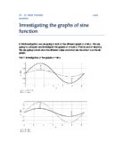
These graphs clearly show a stretch of some kind, but determining whether it is vertical or horizontal is difficult to determine at a glance. An easy workaround for this is to use a mathematical function that creates a graph that touches the x axis multiple times. Fortunately, trigonometric functions do this for us.
These two graphs not only confirm that multiplying the output or input stretches the graph but it also helps us understand how to calculate the stretch and also the direction.
The first graph (cosine graph) that multiplies the input shows us that a horizontal stretch occurs. The stretch is seen as being, because the input was multiplied by 3. This observation is made by looking at the intervals difference (circled in black) between the original graph and the transformed one. The stretch happens along the y axis.
The second graph represents a sine graph and its transformation done by multiplying the output. The stretch is a vertical one. The two circled points help us notice that it is a stretch of ½, because the output was multiplied by 2. It is along the x axis that the stretch occurs.
Why did this happen? For example, let’s say that the input of a function was multiplied by 3. Arriving to an output of 5 will take of the original distance, because the input value was multiplied by 3. This creates a compression (or stretch) horizontally, because that is where the input values are plotted. The explanation of what happened to the graphs where the output was multiplied is simply that whatever was outputted was multiplied by the inverse of the multiplication factor, therefore stretching (or compressing) the graph vertically. Multiplying (or dividing) by a negative number reflects the graph. (More about reversing the sign of a number [it is equivalent to multiplying it by -1] is available later in the investigation.)
Another way to explain this transformation is the following:
This shows how the output ends up being divided (or multiplied by the inverse).
- We now know that a graph is stretched when its output or input is multiplied.
Multiplying the input ( will stretch the graph by (The inverse of a) horizontally (It is stretched along the y axis.).
Equation → Multiplying the output will stretch the graph by vertically (stretched along the x axis).
Note: When we say multiply, division is also implied because it just comes back to multiplying by the inverse. The same is when we talk about stretching a graph; compression of a graph is just the opposite.
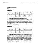
Once again, we can move on to another transformation in function graphs. This time, we will investigate reversing the sign of the input or output. To begin with here is a series of graphs:
The transformation clearly appears on these graphs. We can directly conclude that:
- Reversing the sign of the input reflects the graph’s image in the y axis.
- Reversing the sign of the output reflects the graph image in the x axis.
One interesting outcome was for the first graph (), since the graph already reflected into the y axis (because the function took into account the absolute value of x), no change was noticed.
The reason this effect (reflection) is simple. All output values being reversed, they end up showing to have been reversed on the graph reversed. The transformation is done horizontally because the y axis (the output) is perpendicular to the x axis (input). Negating the input values creates a similar transformation, but horizontally, because the input values are done along the x axis.
Inversing the input or output of a function is also something to be considered:
Graph of
And
Graph of:
And
The transformations that appears on these functions are a bit more complex, but easily understandable. First we must remember what inversing means .A number and its inverse multiplied together will always equal 1. This means that the inverse of a number greater than 1 or littler than -1 will have an inverse littler than 1 or bigger than -1(A positive number will have a positive inverse and a negative number will have a negative inverse.). This is however not possible with 0, because 0 multiplied by any number is 0. Also nothing is divisible by 0.
The second graph simply shows a sine graph and the inverse of its output. Since we know an easy way to find an inverse of a number is to divide 1 by the number, then the graph makes sense. Every time that it has a negative value, it has a negative inverse, that tends to as the graph moves back up to become positive. And whenever a y value is equal to 1, so is its inverse. This transformation ends up having 2 lines that define where the transformation takes place. for positive values and y = -1 for negative values. The best way to describe the transformation is that it applies a reflection, stretch and compression, on either side of the y = ±1 line and it also smoothes out the output image, leaving it with a curved look (This cannot be observed on this graph but can be on the following :
This shows how the graph is given a curved look.).
The first graph () obeys to the same principles of what was previously explained, but since it is the input that was inversed, so a transformation will occur around the line of x = ±1. Instead of having a vertical transformation, it is a horizontal one.
An interesting graph found by inversing the input is the following:
This interesting graph comes with an explanation. We know that a usual sine graph is a series of waves. We also know that inversing the input means that any value over than 1 will result in being smaller than 1(littler than -1 will result in being bigger than -1.). This is because the sine function does not tend to ±, as x tends to; all it does is fluctuate indefinitely. Therefore the inverse, where a value near 0 will tend to, will place all the infinite number of fluctuations between -1 and 1.
Instead of taking the inverse, we could consider taking the absolute value of the input or output.
The results here show us that when the absolute value of the output is taken, the parts of the graph in the lower negative quadrants are reflected back up into the upper positive ones through a line of reflection along the x axis. This means that nothing is left in the lower quadrants. When the absolute value of the input is taken, all parts of the graph on the left side of the quadrant are omitted and are just a reflection of the right side of the quadrant. The line of reflection is the y axis.
The graphs turned out this way because of the way the modulus function works. If we think about it, the function makes sure any number that it processes turns out to be positive. When taking the absolute value of the output this meant that there was an impossibility of the graph being on the lower (and negative) quadrants, thus resulting in the observed reflection. Taking the absolute value of the input means that even on the left quadrants where the input(x) is negative, the graph ends up being calculated with a positive input, meaning that the quadrants of the left are a reflection of the ones on the right.
A derivation from these findings is applying on the functions input and output.
The following graphs show us what happens when applying the opposite of the modulus, which instead of ensuring that the sign of a number is +, ensures that the sign is -. So both of these graphs are perfectly understandable and the same reasoning has to be applied to understand and prove the behaviour of these graphs. Applying the opposite of the modulo on the output just ensures that all the values are in the two bottoms quadrants, creating a reflection in the x axis. Applying the opposite of the modulo to the input simply reflects whatever was in the left quadrants into the right quadrants, ignoring the graph supposed to be on the right quadrants.
Grouping up the most reliable findings, we can calculate the translation and stretch (including compression) to generalize the findings into functions:
In these equations:
-
The graph is stretched along y (vertically) by a factor of a.
-
The graph is stretched along x (horizontally) by a factor of
- The graph is shifted along y (vertically, up) by d points.
-
The graph is shifted along x(horizontally, left) by c points in the first function, and by points in the second function.
The last statement is proven by factorising the second function:
The only difference between the two is the order in which adding and multiplying the input is made. This ends up creating a different centre of transformation, which can easily be mistaken for a centre of rotation when working with a y=p+qx type of graph (linear function).
The first function has a centre of transformation at (-c;d) when values of a and b are changed. The second function has its centre of transformation at.
The concept of this centre of transformation is proven by taken both of the values that shift the graph across the Cartesian plane.
These two graphs have a parent function of the kind.
The two graphs overlapped for a clearer understanding.
For both of these graphs:
b = 0.5
c = 2
d = 1
In the first graph, a is 1.5 and it is -1.4 in the second one.
So the centre of transformation for f(x) is (-2; 1) and g(x) has its centre at (-4; 1) calculated with the following:
The term “centre of rotation” is ambiguous, as no real rotation occurs, but rather a compression/stretch. The fact that the graph is a linear one can easily confuse us, but as we have seen earlier, multiplying input or output just stretches or compresses.
This time instead of using a parent function of f(x) = x we can use one of the kind.
So we have the following functions:
Note: We will use the same values that we used for the previous functions with f(x) =x as parent.
So b = 0.5, c = 2, d = 1. And a will be 1.5 and -1.4 in each respective graph.
The two graphs overlapped.
So the centre of transformation for h(x) is (-2; 1) and g(x) has a centre of transformation at
(-4; 1).
This shows how the centres of transformation are still the same, irrelevant of the parent function.
With all of this in written down, can we predict a graph transformation? If it is so, let’s give it a try.
At first sight, this is a cubic equation that has in g(x) been shifted and compressed (or scaled).
Cubic function graphed.
Input Transformation: First, we know that it is shifted left by 3 points. After, we know that it has been expanded by a factor of (or compressed by a factor of 4) horizontally.
Output Transformation: The graph is then stretched by a factor of vertically. It has also been shifted upwards by 2 points.
To check our prediction, here are the graphs of the two functions (The red one being the original and the blue one the transformed one):
To pursue the validity of the generalisations that have been made, we can try yet another function.
First of all we identify the parent function of being of the form. Then, to make it be in the form
We expand it:
Now all we have to do is apply the rules that we have discovered:
Input Transformation: First, we know that it is shifted left by of a point. After, we know that it has been expanded by a factor of horizontally.
Output Transformation: The graph is then stretched by a factor of vertically. It has also been shifted upwards by -6 points.
Sure enough, the results are as expected:
Another transformation that did not make a function because it resulted as a one-to-many equation was still noteworthy of exploration. What was changed to the input or output was adding a ± sign before them.
These graphs just create a mutual reflection in x and y depending whether the input or the output was changed.
Changes such as these are easily explainable; in the cases of, positive and negative values of x(input) are considered, just on the right side of the quadrant (where x is positive). The same is true for the left side (where x is negative), therefore creating this mutual reflection in the y axis. Putting ± as a multiplier of the output plots the graph in its positive and negative values, creating this mutual reflection along the x axis. As a quick note, we can also notice that the rule of the output modification creating a vertical transformation and the input modification creating a horizontal transformation also applies in these graphs.
Up till now, only graphs of function have been explored. Equations also can de graphed and modified. For example, we can graph (x−a)²+(y−b)²=r².
In the following graph, a=0; b=0; r=1
a=2; b=1; r=1
a=2; b=1; r=3
From these observations, a and b change the x and y coordinate of the circle and r changes its radius.
If we think about it, it is actually logical.
Since each variable is squared, this means that it is a one-to-many equation. Therefore multiple points will be plotted because there are two solutions for each values. This is what forms the circle. a and b are what creates the circle shift; which is somewhat similar to earlier observations. Finally r changes the diameter, because when changed, it forces x and y to adapt to the change, creating a bigger or little circle, depending on the range of the solutions.