To find these relationships I am going to need a sample of pupils whose information I can use and compare. To choose which pupils information I am going to use, I will use a sampling method. This will be less time consuming because I will not have to find out about all the pupils and just the ones that have been chosen. I will take a sample of 8% of the total amount of in year 7, 8, 9 and 10. I will 1st choose a sampling method.
-Random sampling ~ this where you just select individuals at random, each member of the population has an equal chance of being chosen. It is used when you have no information about the characteristics of the population. This method should be repeated a number of times to ensure that the method is random and accurate.
This method would not be appropriate, because if the pupils are chosen at random, the chosen pupils may not be representative for their whole year. It may have only 2 pupils chosen from year 8 and 15 chosen from year 10, and this would not be representative. This method would also mean that my chosen sample may not be in proportion to the amount of pupils in each year or the amount of males and females in each year.
-Systematic sampling ~ this is where you have a population and you select every nth person after the first person, n is chosen at random.
This method is also unsuitable to choose my sample, because again the chosen sample may not be representative of their year and it may also not be in proportion to their year and other years.
-Convenience sampling ~ this is where you pick lets say the 1st 50 people you meet, if you want a sample size of 50 peoples. It is a convenient form of sampling if you do not already have a population.
This would not work for choosing my sample as I already have a population from which to choose the sample from, and this form of selecting a sample can be biased and unrepresentative.
-Quota sampling ~ this is where you pick a sample which as far as possible reflects the whole population by having the same proportion of lets say males/females or adults/children etc.
This could be used for choosing my sample, however, I have to consider the proportionalities of year groups as well as genders and so this method would not really work.
-Stratified sampling ~ this is when the population is divided into groups which have something in common e.g. age. A random sample is then taken from each group. The number in each sample is proportional to the group.
This method is appropriate for choosing my sample because I will be able to have the chosen sample in proportion with year group and gender. This will mean that I will have a representative number of pupils from each year, and these pupils will be of different genders depending on the amount of males and females in that year. Therefore, I will be using this method to pick out my sample group.
I am going to be having a sample size of 10% of the total given population. This amount, I think, will give a representative number of pupils from each year and a representative number of males and females from each year. It is important for me to have a representative sample for the population so that my end results are not biased, so when I come to compare the results they are fair and correct.
Sample size = 1180 × 10 = 118
100
I will be using the stratified sampling method. To find my sample I will be using this formula:
No. of pupils in each year × sample size
Total no. of pupils in all years
I will now find out how many pupils need to be chosen from each year using this formula.
Year 7 = 282 × 118 = 28.2 = 28
1180
Year 8 = 270 × 118 = 27
1180
Year 9 = 260 × 118 = 26
1180
Year 10 = 200 × 118 = 20
1180
Year 11 = 168 × 118 = 16
1180
I am now going to find out how many males and females need to be chosen from each year so that my chosen sample is representative of the males and females in each year. To find out how many males and females I need in my sample group I am going to use this formula:
Total number of males/females in each year × the amount of pupils to be chosen from
Total number of pupils on that year that year
Pupils to be chosen from year 7 =
Females = 131 × 28 = 13
282
Males = 151 × 27 = 15
282
Pupils to be chosen from year 8 =
Females = 125 × 27 = 12.5 = 13
270
Males = 145 × 27 = 14.5 = 14
270
Pupils to be chosen from year 9 =
Females = 143 × 26 = 14.3 = 14
260
Males = 117 × 26 = 11.7 = 12
260
Pupils to be chosen from year 10 =
Females = 94 × 20 = 9.4 = 9
200
Males = 106 × 20 = 10.6 = 11
200
Pupils to be chosen from year 11 =
Females = 84 × 16 = 8
168
Males = 84 × 16 = 8
168
I am now going to randomly select this amount of males and females from each year. I will do this by giving each pupil a number, and then using the random button on the calculator, I can randomly pick pupils corresponding to that number.
As I am going to compare the factors to the BMI, will need to work out the BMI using this formula:
BMI = weight(kg)
hieght²(m)
BMI calculates body fat according to the relationship of weight and height. A BMI of 20-25 is viewed as normal, higher then this is over weight and lower then this is under weight. BMI is particularly helpful for identifying children and adolescents who are at risk for being overweight as they get older. In older children and teens, there is a strong correlation between BMI and the amount of body fat. Therefore, those with high BMI readings, and probably high levels of fat, are most likely to have weight problems when they are older.
I will be investigating each prediction by drawing out some of the followings to help me obtain some results that I can compare and support my predictions by:
Frequency polygons ~ these are used to show the trend of the results obtained from continuous data. You join the mid-points of the class intervals and I can then see the value that is at the highest peak of the trend line, this would be the modal value/class. It will also be clearer to see where the results increase or decrease, and I can then see if there is a noticeable trend. I could compare the frequency polygons and see who has the lowest BMI’s and who has the highest BMI’s.
Line graphs ~ these are also used to show the trend of the results. I can use this to show the increase or decrease of BMI’s relating to different factors that may affect it.
Box and whisker diagrams ~ box and whisker diagrams will highlight the quartiles and extreme values of my obtained set of data, showing me where most of the BMI values lie. The positioning of the median will tell me whether the data is positively skewed or negatively skewed. This is useful for my work as it can tell me whether most of the data is at the higher BMI values or at the lower BMI values. Box and whisker diagrams are also easier to compare which is very important for my work.
Cumulative frequency graphs ~ drawing cumulative frequency graphs help to show the spread of grouped data and to find the median BMI’s. I am also going to use the cumulative frequency graphs to show the interquartile ranges. This will show whether the data on each graph is widely spread about the median, which will mean that there’s a variety of BMI’s, or concentrated about the median, which will show that the BMI’s are of similar amounts.
I will be working out the:
- Median (middle value), form the cumulative frequency graphs to see the skewness of the data.
- mean so that I can compare different averages, to see which BMI value is higher or lower between 2 sets of data
- Working out the mean will then help me work out the standard deviation. Standard deviation will show the spread and dispersion of my data. This again will just help me compare how similar the BMI’s are of 2 sets of data.
- Modal classes, this will show me which class of BMI contains the most number of pupils. I can see which modal class is higher and can then find out who has a higher BMI value, by comparing them.
I am now going to start to investigate each of my hypotheses:
- Your gender has an affect on your BMI
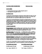
I am going to be drawing cumulative frequency graphs, box and whisker diagrams, frequency polygons, and find the standard deviation, mean, mode and quartile ranges. I can then compare each of these graphs for males and females and see the variation and difference between the BMI’s.
These box and whisker diagram is for the males and females and shows their BMI range. The box and whisker diagram for males shows that the median value is closest to the upper quartile value, and therefore this data is negatively skewed. This means that most of the data is at the higher values, which shows that the males have a higher BMI. The box and whisker diagram for females. For this, the median is closest to the lower quartile value. This means that it is positively skewed, and most of the data is at the lower values, which means that the females BM values are low. This supports my predictions.