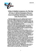
The Time’s use of images for this story is a simple photograph of the accused man. Although this is a small picture, it is the largest on the front page. This is because The Times target audience want more of the factual sides and text of stories and want to know what is going on whereas the Suns target audience want more drama and excitement from a newspaper article. Because of this, the picture of the man takes up half of the page. It is also obvious when looking at pictures from both papers that the image has been darkened slightly and given the impression of an unshaven, unclean man. His eyes especially have been made much darker with larger eyebrows. The man appears much rougher and scarier.
The Times use of typography is very formal and neat. They have used Times New Roman in size eight. The punctuation and wording is very correct. The story also has a quote from Commander George Coleman, head of the Anti-Terrorist branch of Scotland Yard. This again is the kind of sound facts that the Time’s readers want. The Sun’s story is written in Times New Roman sized twelve. Both stories are divided up into small, indented paragraphs. The Sun’s punctuation is much less formal with some sentences starting with “and”. The first paragraph of The Sun’s story is written in bold type. This paragraph gives a brief overview of the entire story.
The layout of the Times Story is neat with clean lines. The text is divided up into three columns and situated in the top right hand corner of the front page. There are also many other stories in The Times given front page coverage. The Sun’s story is situated in the bottom left hand corner of the front page. It is the only story which takes up this area as the text and the picture take up half of the page. The picture is half the size of the page and is located to the right of the text. The main headline is at the top, above all the other content with the sub-headline just beneath to the left in a neat column. The first thing which the reader sees is the “WANTED” headline and the picture of this dark and sinister man. It has the impression of a old “wild west” style wanted poster.
The Times and the Sun use different style vocabulary in this story. The Times uses “Scotland
Yard” and “Anti-Terrorist Branch” when describing the police whereas The Sun uses “Detectives” and “Scotland Yard Detectives”. This is the typical “gung-ho” style speech the sun regularly uses to create the excitement in their stories. The Times text is plain and factual and simply provides the reader with an insight into what is happening. The Times would generally take a political view into their stories regarding such topics like terrorism and conflict whereas The Sun usually opts for the “action movie” style of news reports.
The Times refers to the woman involved with this incident as “she” and the “woman”. This is formal and considerate towards the woman and is also just stating facts. The Sun calls her “the sobbing girl” and “pregnant girlfriend”. This makes the reader fell sorry for the girl and turns them against this man. Calling the woman “the sobbing girl” very much dramatises the story. The writers have written this story as if they were writing the script for a soap opera.
The Sun calls the man “Arab rat” and “Arab terrorist” whereas The Times simply calls him “the man” and “Nezar Hindawi” (his name). Nowadays, (this story went to print in 1986), calling the man an “Arab rat” and an “Arab terrorist” would have been considered racist and not “politically correct”. Because of this the story would have been censored and changed.
The bomb is referred to by the times as “Human time bomb” and “an improvised explosive device”. This section of the article is different because it is the Times which use the dramatising language;
“Human Time-bomb” – The Times
The Sun uses the factual and informative language with “10lb bomb” and “the bomb”. Both newspapers refer to the bomb as “it”.
The Times refers to the plane involved simply as “the aircraft” and “Boeing 747”. This is again because The Time’s target audience e.g. bankers and businessmen want factual, intellectual news from a newspaper. However, The Sun’s target audience may want excitement, drama and even comedy from their newspaper. This is reflected in the Sun’s choice of wording about the plane,
“The Jumbo” – The Sun
This creates a larger sense of size and may enquire the reader to think of the sheer size of this incident and what repercussions could occur.
The Times use of stylistic devices is very formal. They use Times New Roman text in size 12. The text is divided up into small paragraphs with spacing. These are all indented and equally sized. The text is aligned into two columns. The layout the Times has opted to use for this story is neat and easy to read. The sun’s story is set into three columns which comprise of only a single sentence. These are not spaced like the Times story but are indented. Like the Times, the font is Times New Roman, sized 12. This is probably because this is a standard font and is easy to read. In the centre of the main article is the word,
“Primed”- The Sun
This element of the layout and stylistic device gives the impression that the story has been written very informally and is almost like a magazine article.
The Times, as apposed to the Sun, tells the reader that the bomb was hidden in a fake bottom of a piece of luggage and also gave a short description of the man.
“He is described as being 5ft 10in tall with black curly hair, greying at the sides.”
(The Times) Although the Times is considered the more informative and factual of the two papers, The Sun talks about the bomber himself.
“…The Arab rat, 35 year old Jordanian Journalist, Nezar Hindawi…” -The Sun
Tom Baggley
10QU