Semiotic Analysis - Unit One (Rich).
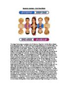
Semiotic Analysis – Unit One (Rich) The image I have chosen to analyse is the CD sleeve to ‘Step One’, the first album released by the pop group STEPS. The album sleeve has a white background to the whole image. Our society associates this colour with purity. When STEPS were released as a pop group, they were meant to be the new ABBA. However, they also had to be squeeky clean so that they would prove good role models to children and teenagers. Steps managed to uphold this image, not only through what they did and said, but also how they were seen, but also (as we can see in this image) their costumes. they were
always happy smiley and bright looking which helped their image. The white background on this album sleeve just reitterates to the buyer, and fans, that they are a squeeky clean production. The album sleeve has pictures of the each individual member across the middle of the cover. Each of which, there is a normal smiling picture, and underneath, turned upside down so that the two images join into one, there are pictures of the band members pulling funny faces. The title of the album is written at the top of the image and can be seen flipped round at the ...
This is a preview of the whole essay
always happy smiley and bright looking which helped their image. The white background on this album sleeve just reitterates to the buyer, and fans, that they are a squeeky clean production. The album sleeve has pictures of the each individual member across the middle of the cover. Each of which, there is a normal smiling picture, and underneath, turned upside down so that the two images join into one, there are pictures of the band members pulling funny faces. The title of the album is written at the top of the image and can be seen flipped round at the bottom. This makes the cover so it can be turned upside down, and the buyer would still know what the product was. The target audience of this product would be young children, teenagers, women and gay men, the major target audiences for pop music. The colours of clothes that the band members are wearing are very bright and bold, so on the white background, these would stand out. The typography used as the title of the album is very striking, it is not one usually seen. ‘STEPS’ is written in italics, and bold with a white outline. The inside part of the word is either pink or blue, depending on which way round the cover is seen. The background to the word is then the colour that isn’t involved in the word itself (eg, if the word was pink with a white outline, the background would be blue). This is then outlined with a thin line, the opposite colour to the background. This has an extra bit on the end in which the title of the album, ‘Step One’ can be found in a simple font. The is the same as ‘STEPS’, however, it has no white outline to it and instead of being italic, it has an upward shadow as if light is shining on to it from the bottom right of the title. The colour of this text is the same colour as the background for the text immediately on its left, and the background to the shadowed part of text is plain white like the cover. Both bars, have a shadow coming from the top right of them. This creates a drop shadow effect. This image does work in terms of context. It reached it’s target audiences and led STEPS onto a five year career in pop music before they decided to split on 26th December 2001. The news devastated fans, but they wanted to go out on the top, and they did just that. STEPS have overall released five albums, out of which, white is the main background colour for four. So we can see how the colour white has helped them with their image as a brand new pop group. The popularity of STEPS was also greatly increased through the fact that they were one of the first mixed sex pop groups of the nineties. The market was saturated with all girl, or all boy bands like The Spice Girls, Boyzone, All Saints, and the Backstreet Boys, and groups such as Take That and East Seventeen had already split, so they were something new to the industry, a welcomed break.