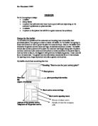
Version 3: Here you will see that I have begun to fill in the text boxes although I have not yet thought of a name for the performing arts school and so this area has been left blank. On the centre page I have written the title and have begun to write some information about the performing arts school. You will also notice that I have added another picture into my publication. I found this on the eastenders @ BBC website, which I then Copied and Pasted onto my publication. Again the picture was originally rectangular and when I put it into my publication I decided to Cut and Paste it into another file, allowing me to Crop it and Paste it back into my publication as you now see it. You will see that I have added a sub header at the top of the right hand side of the page and that I have deleted the one on the left-hand side to allow space for more text. On the back page of the publication you will find a circular frame which was placed here in case I decided to put a picture here.
Moving on the Version 4, I have decided on a name for the school and have typed it into the text frame on the front cover. I have also changed the format of my publication from 4 pages to 8. This has caused some problems on the print outs as you will see, but this will be sorted out for my final product. As you can see I have put the writing on the second page into columns and have created space for the columns on the following pages for Music and Dance. I have also produced a graph in Microsoft Excel and Pasted it into my publication. Typing in my data, highlighting the figures and pressing the graph symbol on the menu bar allowed me to do this. I then chose which graph I wanted to use and typed in the relevant details such as title, name of x axis, and name of y axis and produced it as part of sheet 1. I then selected the graph and pressed Cut and then Pasted it into Publisher. Here I had to resize it so it would fit into my publication, and then I moved it into the appropriate place. On the new pages made for Music and Dance, I have put a picture, which has been framed with a circular shape. I did not change the shape of the actual picture; I merely drew a circular frame around it.
Version 5 as you will see has had a few changes made to it since version 4. I have produced this on my home computer, therefore allowing me immediate access to a colour printer. As you can see I have chosen bold colours to attract the customers eye. This shows my original plan in the Identifying section. You will also notice the motif in the corners of each page, this was done simply as an addition to the rest of the publication for good presentation, which is always needed when advertising something. These were taken from clipart and re-sized to my liking. They were then positioned and rotated by going to the menu bar and finding the rotate button in Publisher. The picture in the centre of the page has also changed due to the change of computers, the updated version of Publisher did not have the same pictures as those at school, therefore I had to choose another picture that would be as effective. I feel that this does just that.
I have printed off two copies of the front cover to see how effective each were and to see which one I preferred. The second has a double border, although this effect was simply done by using the box frame in the toolbox menu. On this version of the front cover you will see that the colour in my printer was beginning to run out and that is why there are streaks of blue in the purple.
The next version, Version 6, as you can see has moved on from the previous quite a lot and I have added in clipart pictures and most of the text has been completed. You will again see that the colour in the printer had nearly run out, the colour you see on this version will not be on the final publication. As you will see I have changed the format of the publication once again, this time from 8 pages to 12 pages, and I have created an application form on the back page. The pictures from clipart were simply found in the clipart picture gallery and the computer put the picture onto my publication. As mentioned before the pictures needed to be moderated in size by using the selected frame. Here I placed the curser on a corner of the frame and clicked and then dragged the frame to the size I wanted. Generally I needed a smaller frame. The computer always asks before creating the desired picture if you want the frame to be changed to fit the picture or the picture to be changed to fir the frame. I chose the appropriate for the picture. As you will see on this version of the publication I have used red pen to highlight areas that I will need to correct on the final printout and final publication. It also shows miner adjustments, which I will need to do before printing out the final publication.
The final publication has been adjusted to my liking and all moderations have been made. Spellings have been checked and all is looking good.
Evaluation
It took a long time and a lot of work to get the publication looking as it does now. By looking at the implementing design section and looking at the number of printout I have produced in order to see the progression of the publication itself, it can be seen that I encounter a few problems along the way. For example the printer firstly ran out of toner, and secondly on my home computer the colour ink cartridge ran out. But these were not too much of a problem as they were only ruff designs and were not final, it just meant that by the time I needed to print out my final publication that this problem had been solved.
Looking at the original design and the final piece, there are many difference, in fact I have basically changed the whole design. But I feel that it has been a successful move and was definitely not done immediately. It took many steps to improve upon the previous versions and printouts, but as I said, I feel that this has been a good move.
I feel that I have covered all areas available to me in the project and have used most of my computer skills to produce it. I am very pleased with its outcome and the comments made by people on the publication. I think by printing out copies of the publication as I went along helped me to see mistakes and therefore put them right. You will see the step-by-step route I took by looking in the implementing design section, where I have shown in detail how I managed to get to my final piece. If I were to extend on the piece I would have to think carefully as to what was wanted by the school or a similar school so that this could then be added. I was pleased with the pictures and the text and the layout of the publication and would not change any of the immediate layouts. I feel that although the pictures were effective I could have used scanners and widened my range of skills shown during the process of producing the publication. This would also have made the publication look more professional.