ICT - Microsoft Publisher, Pizza restaurant menu.
GCSE ICT PROJECT Microsoft Publisher Pizza Restaurant Menu Part One - Identify Statement of the problem Mr Suits is the owner of a pizza restaurant - "Pizza Colosseum". Mr Suits wants to open up new branches. At the moment his restaurant only has a very dull looking and unattractive menu. It is simply a list of the food available typed up using a word processor. Although he has many regular customers, many of his customers judge the restaurant when they see the uninspiring menu. He needs a new menu in order to attract more customers to raise enough profit to expand. Sometimes, the customers want to know whether a dish is vegetarian or not, spicy or not. They also want to know what ingredients are in the pizza, sometimes the waiters/waitresses are busy and do have the time to answer these questions or do not actually know them. Consideration of Alternative Solutions One solution could be to produce an attractive menu by hiring an artist to draw up an eye-catching menu. This could then be colour photocopied and distributed. However, colour photocopying is very expensive and a hand drawn menu does not seem very professional. Every time the menu has to be updated, the artist has to be hired again and the design photocopied all over again. Another solution could be to use the current word processor method but add the extra needed content such as description of
'We cannot care enough about Pip to fully sympathise with him.' Do you think this is true?
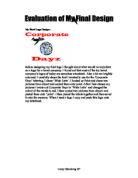
My Final Logo Design:- Before designing my final logo I thought about what would be important on a logo for a travel company. I found out that most of the top travel company's logos of today are aeroplane orientated. Also a lot are brightly coloured. I carefully chose the font I wanted to use for the 'Corporate Dayz' lettering, I chose 'Wide Latin'. I loaded up Paint and chose two pictures from clipart and copied them onto paint. After I had chosen my pictures I wrote out Corporate Dayz in 'Wide Latin' and changed the colour of the words to red. I then copied two pictures from clipart and pasted them onto 'paint'. I then pieced the whole together and then saved it onto the memory. When I need a logo I copy and paste this logo onto my letterhead. Corey Glendining
I have been asked to create a business of my own choice and to produce the following: a brochure, a letterhead, a poster, a logo, a business wallet, and a business card.
GCSE Information Technology Project Systems Design: P K Music. Analysis: The purpose of a prospectus is to inform people of a business. I have been asked to create a business of my own choice and to produce the following: a brochure, a letterhead, a poster, a logo, a business wallet, and a business card. I hope I can achieve making all the above successfully using Microsoft Publisher. I will need to use Microsoft Publisher for all these tasks. My chosen target audience is people of all ages. Design: I have chosen a picture of a CD, from Microsoft Publisher clip art, for my logo with my business name- P K Music written in 'chiller' style font below the picture of a CD. For my letterhead I have used a template from Microsoft Publisher. I will have my address, phone number, website address and e-mail; address at the top right-hand corner. My logo, which I created in Microsoft Publisher, will be on the top left-hand corner whilst my name and signature is on the bottom right-hand corner. I will be using a border of musical notes from a selection on Microsoft Publisher. For my poster, I will have my logo on the left-hand side, whilst examples of the products I will be selling will be on the right side of the poster. For my business card, I will have my logo, company name and my name on the left, whilst the company address, phone number and e-mail address are on the

Promotional car brochure stand for a car company.
Specification I have to design a temporary promotional car brochure stand for a car company. There are many important features that need to be included in the design. > Needs to attract the attention of potential customers because otherwise they might go to a rival and purchase off them. I will do this by using vibrant colours that stand out like black & yellow, or black & sliver; this can make the stand look expensive. > The stand will also have to with stand testing of dropping brochures into the stand and any other ware 'an' tare that might occur. This is because people may put back brochures and they don't care if they drop them in so it has to with stand the tests. The brochure stand that I will produce will be sturdy and not cheap, otherwise it won't attract customers. > The brochure stand is an important feature to the car market as it can help sell the brochures so that there are more potential customers. Therefore the design must be aesthetically pleasing. > I will use the information I get from my questionnaires to develop my ideas to create the best idea for my final design. > Must be made of suitable material because there would be no point making it out of Titanium when it would look as good and cost less with aluminium that can also be recycled. > Should be a seasonable size because if its too tall people wouldn't be able to reach it and too small and

The logo for the British Heart Foundation uses only two colours, black and red. The red highlights the word 'Heart' and is used for the very clever graphic depicting what looks very much like the lines on an E.E.G running in the shape of a hear...
The logo for the British Heart Foundation uses only two colours, black and red. The red highlights the word 'Heart' and is used for the very clever graphic depicting what looks very much like the lines on an E.E.G running in the shape of a heart. The choice of the colour red is obviously because of blood. This stands out from the rest of the logo as it is the very core of what the charity is about. The choice of black for the remaining two words surrounding the red heart and the use of strong bold lettering emphasises the seriousness of the work that the British Heart Foundation does at the same time as drawing attention to how grave the consequences of heart disease can be. The logo advertising MECCA Bingo immiediatley looks like fun. This has been achieved by the use of different bold colours for the capital letters and the smaller wavy lettering used in the word Bingo. The blocks around the capital letters remind you of the tiles used in some bingo games or the squares on the bingo card. The use of stars and the circle orbiting the word depicts great heights and the possibility of a big win! The white cloud behind the word bingo makes it look lighter and so makes bingo look like fun. The logo used for the NSPCC is very clear on a white background and to the point. By using large clear capital letters it shows that this is a very serious matter and they have very cleverly
They need a plant information leaflet.
Problem 1: They need a plant information leaflet. Form of output: a leaflet the customer can take home. Information to be output: * A picture of the plant * The plant name, * Instructions for growing, * The garden centre's name, * Address, phone number and logo. * Also there must be information about the opening hours, range of products and at least one garden photo. The data needed to produce the output * A disk that is provided by Jo provides the information such as the pictures of the plants, name of the plants, instructions for growing, range of products, and facts about the agave americana. The logo * A business card provides the garden centre's name, address and number, opening hour times Desired outcome and criteria * Leaflet must be in colour and well laid out * Latin plant names must be in italics * Making sure that the picture is the right one * Make sure that the picture is under the same name of plant * The heading will be 'how to care for your century plant' * The heading must be big * File name must be in plants common name * Logo must be on leaflet * Details of what they sell must be on leaflet * Opening times must be on leaflet * Leaflet is A4 size with information on both sides * All the details of the agave americana must be on one side of the leaflet and its photo * Garden centre photos must be on the leaflet Testing * Is
Project Evaluation: Comparing my Outputs to the Specification
Comparing my Outputs to the Specification The logo My solution to the task allows the users of the system to print off a ready designed promotion package and customise each part of it to include their name and the address of their particular branch of Daisy Chain. The users can alter the logo slightly and can also create a completely new logo from the user guide. They can edit details quickly, for example if a shop moves or a designer is employed, then these details can be added to the business card or letterheaded paper. The system can only use fonts and borders that exist on the software- they can't create original ones. I have managed to produce a suitable logo that meets all the points on the specification. It has been significantly changed since I drew the initial design and I now feel that it is now much better than the original version. Everyone I have asked about it has confirmed this. There are however some points that you can't really say whether the logo has met- you can't tell whether the logo will date or not. If it does then following the user guides could produce a new one. To produce most of the items in the promotional package I used Adobe, which isn't strictly a graphics program, but it has sufficient features to meet all the needs of this project. The Business Card I have produced a business card that meets all the requirements set out in my design
Creating the logo - Software and Hardware
Creating the logo- Software and Hardware To create the logo I have decided to use the scanner to get the image of the daisies and then alter this image using 'Adobe Photo Deluxe.' I could have used the scanner program, which also allows me to manipulate the image, but it has fewer features. Adobe will allow me to save the image, alter it, and go back to the saved version if the results are unsuccessful. It allows me to change my original image in many ways including resizing, changing the colour of my image, change the background and using a large range of special effects. It is the most advanced of the software I have at home and with other graphics programs it is often difficult to use a photo or scanned image. Adobe is specially designed for altering images of this type and I am also quite used to using it. Using Adobe will save a lot of time that I could have spent trying to work out how to alter a scanned image in a graphics program. The scanner I will use is a flatbed AGFA SNAPSCAN310. It is large enough to fit the daisies in, and the lid can be raised enough to fit the daisies, chain and paper under. It is capable of producing high quality images even if they are of 3D objects. However the lid of the scanner can easily damage the flowers and you can't see what the image will look like until you've scanned it. If I were to use a digital camera to take a picture of
Describe the document you will create using your ICT skills
Project Outline Describe the document you will create using your ICT skills. It is really important to make the purpose of your document clear, and describe where/when it will be used and who will be your audience. Research / Background Information Describe the steps that you took to collect information from both IT and non-IT sources for your document. Remember to say why the information that you have collected is relevant to your project (Is it fit for it's purpose, suitable for your intended audience?) What have you learnt from your research? Were you able to draw any conclusions of your own? Did your research help you to design your own original work? Design Outline Design your document. Save this design. This can be done by hand or on the computer. You can add notes (annotate) to your design, explaining things such as * Where you will get the data * Which fonts you will use * Why you chose certain objects/design features. Remember you need to show consistent use of spaces, tabs, returns, format of numbers, graphics features such as line thickness and shading Implementation At this stage you can finalise your design and make your document. Try out at least two different arrangements of the text, images and numbers. Save these drafts. Choose the layout you prefer giving reasons for your choice. Checking Once you are satisfied that you have checked your

Produce a report describing, comparing and evaluating 2 types of documents from three different companies all evolved in the same market.
Jonathan Fraser-Gadd Report Unit 1 Task 2: Introduction: I collected my documents from the following organisations, Barclays, Lloyds TSB and HSBC. These documents were payslip and a brochure. For task 2 I was required to produce a report describing, comparing and evaluating 2 types of documents from three different companies all evolved in the same market. In my report I will evaluate the different aspects each professional document have, for example layout, content and purpose. I will then go onto mention the good and bad points and compare the documents I have collected. I will be comparing and evaluating the following: * Presentation * Style * Layout * Text and graphic * Consistency * Readability Payslips: The first group of documents are payslips and were collected from the following banks: Barclays, Lloyds TSB and HSBC. Barclays Payslip: The Barclays payslip I collected is a strip of paper about 15cm by 6cm. This document contains all the relevant information for its purpose. The layout of this document is very neat and professional. The payslip contains tables, numbers, text and a logo. The documents readability is simple but is aimed at people who have a reasonable knowledge about banking, i.e. not aimed at children. The document is very bland, and only uses black and white. The justification on this document is very central and organised. Lloyds