An investigation into the relationship between the height and weight of pupils at Mayfield school.
Ben Good
Maths Coursework
An investigation into the relationship between the height and weight of pupils at Mayfield school
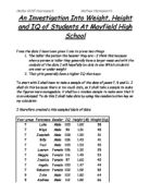
Introduction
Mayfield School is a secondary school of 1183 pupils aged 11-16 years of age. For my data handling coursework I am going to investigate a line of enquiry from the pupils' data. Some of the options include; relationship between IQ and Key Stage 3 results, comparing hair colour and eye colour, but I have chosen to investigate the relationship between height and weight. One of the main reasons being that this line of enquiry means that my data will be continuous (numerical), allowing me to produce a more detailed analysis rather than eye or hair colour where I would be quite limited as to what I can do because the data is discrete.
Pre-test
We do a pre-test so we can see if there is any correlation between a persons height and weight because if no correlation is present. Then there is not any point in continuing with the investigation.
There were many things that could have gone wrong when I was sampling the data. One of them was that I could have got an anomalous result and I did. The anomalous result I got was: 'Student: 914, Seymour Banks, 1.60m, 9kg'
Seymour Banks is an anomalous result because he weighs 9kg. I overcame this by ignoring it and picking another pupil instead. I also picked the same pupil three times while randomly sampling. To help me choose the students fairly I chose them randomly on the computer.
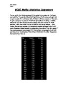
Female students:
Height
Weight
.5
45
2
.48
37
3
.8
60
4
.58
54
5
.59
44
6
.62
54
7
.45
51
8
.58
48
9
.66
45
0
.64
47
1
.56
56
2
.79
43
3
.54
42
4
.75
57
5
.64
55
6
.63
52
7
.58
55
8
.55
50
9
.65
48
20
.68
47
This is a table containing the female results from my random selection for the pre-test
Male Students:
Height
Weight
.5
59
2
.63
50
3
.86
56
4
.81
54
5
.73
47
6
.65
55
7
.5
41
8
.75
75
9
.75
68
0
.75
60
1
.77
57
2
.67
60
3
.49
43
4
.47
42
5
.4
40
6
.72
64
7
.52
37
8
.49
47
9
.91
82
20
.82
75
A scatter graph showing the relationship between female height and weight.
This graph shows the positive correlation between a girl's height and weight this tells me that I would be possible to conduct an investigation into this relationship.
A table containing the randomly selected male data for the pre-test
A scatter graph to show the relationship between female's height and weight.
This graph proves that there is a relationship between a boy's height and weight. So it would be possible to conduct an investigation into this relationship.
To help me analyse the two graphs I am going to plot them together. On the same graph so I can see which gender has the highest gradient on its line of best fit.
(NB. The male data is blue and the female data is red. The Green line of best fir is for the boys, the purple line of best fit is for the girls.)
This graph shows that the correlation between the height of boys and girls differs slightly. The boy's correlation is slightly stronger than the girl's.
Hypotheses
It is of my opinion that the following will be discovered when I conduct my investigation:
I. I believe that the range of the boys' height in year nine will be greater than the range of the boys' height in year seven and year eleven.
II. Boys will generally weigh more than girls.
III. In general the boys will be taller than the girls.
IV. I think that the range of female weights will be higher than the range of male weights.
V. I think that the average year seven girl will be taller than the average year seven boy, whereas the average boy in year eleven will be taller than the average year eleven girl.
VI. I think that the BMI of the girls is higher than the BMI of the boys.
VII. For boys the older the person, the higher the BMI.
Investigating Hypotheses
Investigating my first Hypothesis
My first hypothesis was that "the range of the boys' heights in year nine will be greater than the range of the boys' height in years seven and years eleven." I plan to prove or disprove my hypothesis by drawing a box plot for each year because box plots are good at displaying the comparable range of data. To get the data to plot on the box plots I randomly sampled. I randomly sampled the data because that way you get a good mix of people. In this investigation I am excluding years eight and nine because I feel they are too close to the other years to be any use to me. Here is the data:
A table containing boys' height from years seven, nine and eleven.
Box plots showing the heights of year seven, nine and eleven boys
Year Seven Boys
Height (m)
Year Nine Boys Height (m)
Year Eleven Boys Height (m)
.56
.60
.68
.49
.69
.71
.65
.70
.70
.47
.54
.62
.47
.81
.67
.54
.66
.64
.73
.48
.92
.58
.64
.97
.53
.65
.52
.46
.80
.84
.62
.60
.62
.60
2.03
.57
.60
.68
.67
.52
.82
.72
.55
.72
.76
.60
.63
.57
.59
.53
2.06
.68
.74
.61
.63
.61
.63
.55
.71
.65
.48
.43
.51
.53
.64
.73
.62
.56
2.00
.71
.67
.52
.65
.48
.78
.35
.80
2.03
.50
.72
.70
.42
.70
.65
.43
.65
.80
.58
.58
.84
Box plots containing data about boys heights in years seven nine and eleven.
Box plots showing the heights of boys in years seven nine and eleven.
I have decided to put my data into a stem and leaf chart because that enables me to analyse the data more easily than in a conventional chart. In a stem and leaf diagram I can work out the mean mode median and range with greater ease.
Year Seven
Stem
Leaf
Frequency
2
0
3
5
4
2,3,6,7,7,8,9
7
5
0,0,2,3,3,4,5,6,7,8,8,9
2
6
0,0,0,2,2,3,5,5,8
9
7
8
0
9
0
20
0
Year Nine
Stem
Leaf
Frequency
2
0
3
0
4
3,8,8
3
5
3,4,6,8
4
6
0,0,1,3,4,4,5,5,6,7,8,9,
2
7
0,0,1,2,2,4
6
8
0,0,1,2
4
9
0
20
3
Year Eleven
Stem
Leaf
Frequency
2
0
3
0
4
0
5
,2,2,7,7
5
6
,2,2,3,4,5,5,7,7,8
0
7
0,0,1,2,3,6,8
7
8
0,4,4
3
9
2,7
2
20
0,3,6
3
Using the stem and leaf diagram and my box plots I can work out this:
Heights (cm)
Mean
Modal Class
Median
Range
Year Seven
61 cm
50-159 cm
57 cm
38 cm
Year Nine
72 cm
60-169 cm
66 cm
60 cm
Year Eleven
72 cm
60-169cm
69 cm
55 cm
This proves my hypothesis because the range of heights for the year nine boys is twenty-two centimetres larger than the year seven boys height range and five centimetres larger than the year eleven boys height range. Now I am going to check my data for outliers to see if any of my results are anomalous. We check for outliers by doing the following:
. Put the numbers in order.
Year Seven Boys Height (m)
Year Nine Boys Height (m)
Year Eleven Boys Height (m)
.35
.43
.51
.42
.48
.52
.43
.48
.52
.46
.53
.57
.47
.54
.57
.47
.56
.61
.48
.58
.62
.49
.60
.62
.50
.60
.63
.50
.61
.64
.52
.63
.65
.53
.64
.65
.53
.64
.67
.54
.65
.67
.55
.65
.68
.56
.66
.70
.57
.67
.70
.58
.68
.71
.58
.69
.72
.59
.70
.73
.60
.70
.76
.60
.71
.78
.60
.72
.80
.62
.72
.84
.62
.74
.84
.63
.80
.92
.65
.80
.97
.65
.81
2.00
.68
.82
2.03
.71
2.03
2.06
2. Find the lower and upper quartiles.
Year 7 Boys Height
Year 9 Boys Height
Year 11 Boys Height
Upper Quartile(m)
.61
.72
.82
Lower Quartile(m)
.485
.59
.62
Inter Quartile Range (cm)
2.5
3
20
3. Then you have to use the formulas.
To find the lower boundary you use this formula: Q1 - (Q1- Q3)
To find the upper boundary you use this formula: Q3 + (Q3-Q1)
Using the formulas
Year 7 boys
Lower boundaries
Q1 - (Q1- Q3)
48.5cm - 12.5 (161- 148.5) = 125cm
Upper Boundaries
Q3 + (Q3-Q1)
61 + 12.5 = 173.5cm
So the upper boundary for outliers for the year seven boys is 173.5cm and the lower boundary is 125cm. This proves that none of my year seven male data is anomalous.
Year Nine
Lower boundary
Q1 - (Q1- Q3)
59cm ...
This is a preview of the whole essay
To find the upper boundary you use this formula: Q3 + (Q3-Q1)
Using the formulas
Year 7 boys
Lower boundaries
Q1 - (Q1- Q3)
48.5cm - 12.5 (161- 148.5) = 125cm
Upper Boundaries
Q3 + (Q3-Q1)
61 + 12.5 = 173.5cm
So the upper boundary for outliers for the year seven boys is 173.5cm and the lower boundary is 125cm. This proves that none of my year seven male data is anomalous.
Year Nine
Lower boundary
Q1 - (Q1- Q3)
59cm - 13 (172 - 159) = 146cm
This means that one of my pieces of data is too low. The anomaly is 1.43cm which is 3 cm too small and is therefore classed as an outlier.
Upper boundary
Q3 + (Q3-Q1)
72 + 13 (1712 - 159) = 185cm
This means that there are no high outliers in the year nine data I have randomly selected.
Year Eleven
Lower boundary
Q1 - (Q1- Q3)
162 - 20 (182 - 162) = 142cm
There are no low outliers in the eleven data I have randomly selected.
Upper boundary
Q3 + (Q3 - Q1)
79 + 20 (182 - 162) = 199cm
Three of my heights for the year elevens are higher the 199cm boundary. They were 200cm, 201cm, and 206cm.
Now that I have discovered that some of my data in anomalous I am going to re-plot the box and whisker diagrams, replacing the anomalies with new randomly sampled data, to see if my hypothesis is still true.
Box plots for years seven nine and eleven (revised)
This box plot is very different to the other one. This graph that the year group with the biggest range in heights is year eleven. The other graph supported my hypothesis that year nines had the biggest range in height. However you can not be 100% accurate at reading off the range from a box plot so I am going to plot stem and leaf diagrams because they enable to analyse the data more easily.
Year Seven
Stem
Leaf
Frequency
20 cm
0
30 cm
5
40 cm
2,3,6,7,7,8,9
7
50 cm
0,0,2,3,3,4,5,6,7,8,8,9
2
60 cm
0,0,0,2,2,3,5,5,8
9
70 cm
80 cm
0
90 cm
0
200 cm
0
(NB. The data in this stem and leaf diagram is in centimetres)
Year Nine
Stem
Leaf
Frequency
20cm
0
30cm
0
40cm
7,8,8
3
50cm
3,4,6,8
4
60cm
0,0,1,3,4,4,5,5,6,7,8,9,
2
70cm
0,0,1,2,2,4
6
80cm
0,0,1,2,4
5
90cm
0
200cm
0
(NB. The data in this stem and leaf diagram is in centimetres)
Year Eleven
Stem
Leaf
Frequency
2
0
3
0
4
0
5
,2,2,7,7
5
6
,2,2,3,3,4,4,5,5,5,7,7,8
3
7
0,0,1,2,3,6,8
7
8
0,4,4
3
9
2,7
2
20
0
(NB. The data in this stem and leaf diagram is in centimetres)
Using the stem and leaf diagram and my box plots, I can work out this:
Heights (cm)
Mean
Modal Class
Median
Range
Year Seven
60 cm
50-159 cm
56 cm
36 cm
Year Nine
72 cm
60-169 cm
66 cm
37 cm
Year Eleven
72 cm
60-169cm
66 cm
46 cm
(NB. The values for the mean and median have been rounded to the nearest whole number.)
This chart clarifies that my hypothesis was wrong. I thought that year nine would have a bigger height range than years seven and eleven. I thought that in year nine some of the boys would have gone through a growth spurt and others wouldn't have, however I was wrong.
Investigating my second hypothesis
My second hypothesis was that "Boys will generally weigh more than girls." In this hypothesis investigation I am going to use stratified sampling to get the data to plot. This is a table showing the number of girls and boys in each year at Mayfield:
Girls
Boys
Total
% of Whole School
Year 7
31
51
282
24%
Year 8
25
45
270
23%
Year 9
43
18
263
22%
Year 10
94
06
200
7%
Year 11
86
84
70
4%
To get the stratified sample of the students I have now got to work out how many girls and boys I will need from each year to make sure that my sample is a good representation of the whole school. To do this, I must consider the boys and girls separately as there are 580 girls in the school and 603 boys. When working out the year 7 sample this is what I'd do;
Take the total number of year 7 girls-131, and divide that by the total number of girls in the school, 580 ...
31/580 = 0.22586207...I then have to multiply that number by 30 as that is the total number of girls data I wish to obtain ... 0.22586207 X 30 = 6.7758621 ... if I then round that number up to one whole number it means that I need 7 girls from year 7 in my stratified sample.
This is the calculations performed to retrieve my stratified sample numbers;
Year 7 - Girls - 131/580 = 0.22586207 X 30 = 6.7758621 = 7
Year 7 - Boys - 151/603 = 0.25041459 X 30 = 7.5124377 = 8
Year 8 - Girls - 125/580 = 0.21551724 X 30 = 6.4655172 =6
Year 8 - Boys - 145/603 = 0.24046434 X 30 = 7.2139302 = 7
Year 9 - Girls - 143/580 = 0.24655172 X 30 = 7.3965516 = 7
Year 9 - Boys - 118/603 = 0.19568823 X 30 = 5.8706469 = 6
Year 10 - Girls - 94/580 = 0.16206897 X 30 = 4.8620691 = 5
Year 10 - Boys - 106/603 = 0.17578773 X 30 = 5.2736319 = 5
Year 11 - Girls - 86/580 = 0.14827586 X 30 = 4.4482758 = 5
Year 11 - Boys - 84/603 = 0.13930348 X 30 = 4.1791044 =4
Using the stratafied sampling these are the results for girls and boys weights I got:
Weight of Boys
Weight of Girls
32
29
38
29
39
36
40
36
43
38
44
38
45
40
45
42
45
42
46
45
47
45
47
45
47
45
48
45
50
47
50
47
51
48
51
48
52
49
54
50
54
50
60
50
60
51
60
51
64
51
70
52
70
52
80
60
80
60
82
60
Histogram of boys' weights
Histogram of girls' weights
Obviously by looking at the two graphs I can tell there is a contrast between the girls' and boys' weights, but to make a proper comparison I will need to plot both sets of data on the same graph. Plotting two histograms on the same page would not give a very clear graph, which is why I feel by using a frequency polygon it will make the comparison a lot clearer.
Frequency polygons for boys' and girls' weights
This graph does support my hypothesis, as it shows there were boys that weighed between 80kg and 90 kg, whereas there were no girls that weighed past the 60kg-70kg group. Similarly there were girls that weighed between 20kg and 30kg were as the boys weights started in the 30kg-40kg interval. Although by looking at my graph I am able to work out the modal group, it is not as easy to work out the mean, range and median also. To do this I have decided to produce some stem and leaf diagrams as this will make it very clear what each aspect is, for the main reason I will be able to read each individual weight - rather than look at grouped weights. Stem and leaf diagrams show a very clear way of the individual weights of the pupils rather than just a frequency for the group-which can be quite inaccurate.
Girls Boys
Stem
Leaf
Frequency
Stem
Leaf
Frequency
2
9,9
2
2
0
3
6,6,8,8
4
3
2,8,9
3
4
0,2,2,5,5,5,5,5,7,7,8,8,9
3
4
0,3,4,5,5,5,6,7,7,7,8
1
5
0,0,0,1,1,1,2,2
8
5
0,0,1,1,2,4,4
7
6
0,0,0
3
6
0,0,0,4
4
7
0
7
0,0
2
8
0
8
0,0,2
3
(NB. The data in this stem and leaf diagram is weight in kilograms)
From this table I am now able to work out the mean, median, modal group (rather than mode because I have grouped data) and range of results. This is a table showing the results for boys and girls;
Weights (kg)
Mean
Modal Class
Median
Range
Boys
50 kg
40-50 kg
50 kg
50 kg
Girls
46 kg
40-50 kg
47 kg
31 kg
(NB. The values for the mean and median have been rounded to the nearest whole number.)
Despite both boys and girls having the majority of their weights in the 40-50kg interval, 13 out of 30 girls (43%) fitted into this category whereas only 11 out of 30 (37%) boys did which is easily seen upon my frequency polygon. I could not really include that in supporting my hypothesis as the other aspects do. My evidence shows that the average boy is 4kg heavier than that of the average girl, and also that the median weight for the boys are 3kg above the girls. Another factor my sample would suggest is that the boys' weights were more spread out with a range of 50kg rather than 31kg as the girls results showed. The difference in range is also shown on my frequency polygon where the girls weights are present in 5 class intervals, whereas the boys' weights occurred in 6 of them.
Third Hypothesis
My second hypothesis is that "In general the boys will be taller than the girls" to prove or disprove this hypothesis I am going to draw some histograms because histograms are good for comparing data.
Histogram of boys' heights
Histogram of girls' heights
Similarly as with the weight, I can see the obvious contrasts between the boys' and girls' heights, but the data is not presented in a practical way to perform a comparison, that is why I am going to put the two data sets on a frequency polygon.
Frequency Polygon of Boys' and Girls' Heights
This graph does support my hypothesis as the boys' heights reach up to the 190-200cm interval, whereas the girls' heights only have data up to the 170-180 cm group. Similarly there were girls that fitted into the 120-130cm category whereas the boys' heights started at 130-140cm. This is the data used in the Graphs to get this data, I used random sampling to get this data.
Girls Boys
Stem
Leaf
Frequency
Stem
Leaf
Frequency
20 cm
0
20 cm
0
30 cm
0
30 cm
2
40 cm
2,2,3
3
40 cm
8
50 cm
4,5,5,6,7,8,9,9
8
50 cm
0,0,0,2,2,3,3,4,5,5,9
1
60 cm
0,1,1,2,2,2,2,3,3,5,7,8,8
3
60 cm
0,1,2,3,5,6,6
7
70 cm
0,0,2,3
4
70 cm
2,5
2
80 cm
0
80 cm
0,0,0,0,2,6
6
90 cm
0
90 cm
0,1
2
With these more detailed results, I can now see the exact frequency of each group and what exact heights fitted into each groups, as you cannot tell where the heights stand with the grouped graphs. For all I know all of the points in the group 140 ? h < 150 could be at 140cm, which is why I feel it is a sensible idea to see exactly what data points you are dealing with. I can also now work out the mean, median and range or the data, these are the results I worked out;
Heights (cm)
Mean
Modal Class
Median
Range
Boys
64 cm
50-160 cm
62 cm
59 cm
Girls
58 cm
60-170 cm
61 cm
53 cm
Differing from the results from my weight evidence, the heights' modal classes for boys and girls differ, and much to my surprise the girls' modal class is in fact one group higher than the boys. This is very visible on my frequency polygon as the girls data line reaches higher than that of the boys. This doesn't exactly undermine my hypothesis however as the modal class only means the group in which had the highest frequency, not which group has a greater height. On the other hand the average height supports my prediction as the boys average height is 6 cm above the girls. The median height had slightly less of a difference than the weight as there was only one centimetre between the two, although again it was the boys' median that was higher. When it comes to the range of results, similarly to the weight the boys range was vaster than the girls, although there was no where near as greater contrast in the two with a difference of only 6 cm between the two.
To test that my investigation was fair I am going to check for outliers.
Boys
Lower bounds
Q1 - (Q3 - Q1)
52.5 - (180 - 152.5) = 125cm
There are no pieces of data that are below the lower bound.
Upper bounds
Q1 + (Q3 - Q1)
80 + (180-152.5) = 207.5cm
There are no pieces of data that exceed the upper boundary.
Girls
Lower bounds
Q1 - (Q3 - Q1)
55 - (166 - 155) = 144cm
This means that five of the pieces of data are below the lower bounds and will have to be replaced.
Upper bounds
Q1 + (Q3 - Q1)
66 + (166 - 155) = 177cm
There is no data that exceeds the upper bound limit.
To ensure that my hypothesis is still correct I am going to plot a revised histogram of girls' height and frequency polygon to compare the two genders. I do not need to plot the height of boys histogram again as it does not contain any outliers.
Histogram of Girls height (Revised)
To make it easier to compare the two histograms I am going to do another frequency polygon.
Frequency polygon to show the heights of boys and girls revised.
The new graph I have drawn does not change that my hypothesis was correct and the outliers did not affect that.
Investigating my fourth hypothesis
My fourth hypothesis is that "I think that the range of the females' weight will be lower than the range of the boys' weight." To test this I am going to draw box plots and use stem and leaf charts. To get the data I am going to use stratified sampling because it takes into account the size of the different factions within the data group.
Box plot to compare the range of the weight between boys and girls
This box plot seems to suggest that my hypothesis is correct but to make it easier to analyse the data I am going to use a stem and leaf chart to work out the ranges of the data.
Girls Boys
Stem
Leaf
Frequency
Stem
Leaf
Frequency
20
9,9
2
20
0
30
6,6,8,8
4
30
2,8,9
3
40
0,2,2,5,5,5,5,5,7,7,8,8,9
3
40
0,3,4,5,5,5,6,7,7,7,8
1
50
0,0,0,1,1,1,2,2
8
50
0,0,1,1,2,4,4
7
60
0,0,0
3
60
0,0,0,4
4
70
70
0,0
2
80
80
0,0,2
3
90
90
0
(N.B. This stem and leaf diagram is measuring weight in kg)
Using the data form the stem and leaf diagram, these are the results I worked out;
Mean
Modal Class
Median
Range
Boys
51.2 kg
40-49kg
50 kg
50 kg
Girls
44.5 kg
40-49kg
61 kg
31 kg
To ensure that none of my data is anomalous I am going to check the outliers:
Girls Weight
Lower Boundary
Q1 - (Q3 - Q1)
41 - (51 - 41) = 31kg
This means that two of my pieces of data for girls' height are below the lower boundary, they are both 29cm. This means that I will have to plot the graph again using data from the same year groups that they came from otherwise the stratified sampling would be undermined.
Upper Boundary
Q3 + (Q3 - Q1)
51+ (51 - 41) = 61kg
This means that none of my data is too high as the highest pieces of data I have used are 60 kg.
Boys Weight
Lower Boundary
Q1 - (Q3 - Q1)
45 - (60 - 45) = 30kg
This shows that there are no pieces of data that exceed the lower boundaries so there are no low anomalies. The data that was the closest to the boundary was 32 kg.
Upper Boundary
Q3 + (Q3 - Q1)
60 + (60 - 45) = 75kg
According to this three of my pieces of data for the male weight are too high. These pieces of data are: 80kg, 80kg and 82kg. So I am going to have to replace the anomalous data with data that is from the same year group and they will be within the lower and upper boundaries.
A box plot for the boys and girls weights excluding outliers
A new stem and leaf diagram excluding the outliers but including the replacements.
Girls Boys
Stem
Leaf
Frequency
Stem
Leaf
Frequency
20
0
20
0
30
6,6,8,8
4
30
2,8,9
3
40
0,1,2,2,3,5,5,5,5,5,7,7,8,8,9
5
40
0,3,4,5,5,5,6,7,7,7,8
1
50
0,0,0,1,1,1,2,2
8
50
0,0,1,1,2,4,4
7
60
0,0,0
3
60
0,0,0,2,4,8
6
70
0
70
0,0,4
3
80
0
80
0
90
0
90
0
(N.B. The this stem and leaf diagram contains data about weight in kg)
Mean (to 1dp)
Modal Class
Median
Range
Boys
53.3 kg
40-49kg
50 kg
42 kg
Girls
48.3kg
40-49kg
61 kg
24 kg
This proves that my hypothesis is correct. The range of the girls' weight is smaller than the range of the boys' weight. The range of the girls' weights was 24kg whereas the boys is 42kg. This means there is an 18kg gap between the two ranges but it is not as large as the 29kg difference in the test before I removed the anomalies. The data for this investigation was chosen using a stratified sample of years seven to eleven. In this investigation into my hypothesis I used data from all the year because I felt that because I was investigating the weight of genders in the school in general to make my results more relevant to my hypothesis.
Investigating My Fifth Hypothesis
My fifth hypothesis is "That the average year seven girl will be taller than the average year seven boy whereas the average year eleven boy will be taller than the average year eleven girl." To prove or disprove this hypothesis I am going to plot box plot and stem and leaf diagrams to locate the average.
Girls Height
Stem
Leaf
Frequency
1
9
2
0, 5
2
3
5
4
, 2, 3, 6, 7,7,8,8
8
5
0, 2, 3, 3, 7,9,9,9
8
6
0, 0,2,2,4,4,5,6
8
7
2, 5, 5,
3
Boys Height
Stem
Leaf
Frequency
1
2
2
3
0
4
4, 5, 7,7,8,9
8
5
0, 0, 0,2,3,3,4,4,8
9
6
0,1,1,1,2,3,3,5,5,5,7,7,8
3
7
0
A box plot to show the height of year seven girls and boys
This disproves my hypothesis but to make sure that this is a valid box plot I am going to test for outliers.
Year seven girls
Lower boundary
Q1- (Q3-Q1)
44.5 - (163 - 144.5) = 126cm
There are three pieces of data that are below this boundary they are 119cm, 120cm and 125cm. These pieces of data will have affected my box plot and this means that my hypothesis may still be true.
Upper Boundary
Q3 + (Q3 - Q1)
63 + (163 - 144.5) = 181.5cm
There are no pieces of data that exceed the upper boundary.
Year Seven Boys
Lower boundary
Q1 - (Q3 - Q1)
63 - (163 - 149.5) = 176.5cm
There is one piece of data that exceeds the lower boundary this is 130cm.
Upper Boundary
Q3 + (Q3 - Q1)
49.5 + (163 - 149.5) = 163cm
There are no pieces of data that exceed this boundary; there are no anomalies that are too high.
As a result of me finding anomalies I am going to re-plot the box plot excluding the invalid data.
This is a graph to investigate the patterns in the average height of different gender year seven pupils
I have decided to put my data into a stem and leaf chart because I think that enables me to analyse the data more easily than in a conventional chart because in a stem and leaf diagram I can work out the mean mode median and range with greater ease.
Girls Boys
Stem
Leaf
Frequency
Stem
Leaf
Frequency
.2
.2
.3
5,7,8
3
.3
.4
,2,3,6,7,7,8,8
8
.4
3,4,5,6,7,7,8,9
8
.5
0,2,3,3,7,9,9,9
8
.5
0,0,0,2,3,3,4,4,5,8
0
.6
0,0,2,2,4,4,5,6
8
.6
0,1,1,1,2,3,5,5,5,7,7,8
2
.7
2,5,5
3
.7
.8
.8
.9
.9
(N.B. This stem and leaf diagram contains weight in kg)
Using the stem and leaf diagram I have worked out
Mean
Modal Class/Classes
Median
Range
Girls
.54633
.4-1.49,1.5-1.59,1.6-1.69
.55
0.4
Boys
.55677
.6-1.69
.54
0.25
This disproves the first part of this hypothesis because the table states that the average girl's height (1.54633) is lower than the average boy's height (1.55677). However the averages are very close together the gap between them is 0.01044.
I am now going to investigate the second part of my hypothesis which is that "the average year eleven boy is taller than the average year eleven girl." To investigate this I am going to use the same methods as I used in the first part of the hypothesis because I felt they were good at determining the averages.
Box plots to work out the average height of the eleven boys and girls
This graph is very spread out so I think there might be some outliers in it especially in box plot the year eleven girls.
Gender
Lower quartile
Upper quartile
Inter-quartile range
Lower boundary
Upper boundary
Boys
.635
.85
0.215
.42
2.065
Girls
.5975
.72
0.1225
.475
.8425
I am now going to plot a stem and leaf table so I can see which data is anomalous.
Girls Boys
Stem
Leaf
Frequency
Stem
Leaf
Frequency
.3
7
.3
0
.4
0
.4
0
.5
3,5,6,8,9,9
6
.5
0,1,2,2,7,7
6
.6
0,1,1,1,2,2,2,2,3,5,5,5,5
3
.6
2,4,5,7,8,8
6
.7
0,0,2,2,2,3,4,5,8
9
.7
0,1,1,2,2,7,8,8
8
.8
3
.8
0,2,4,8
4
.9
0
.9
,2,7
3
2.0
0
2.0
0,6
2
2.1
0
2.1
0
This stem and leaf table tells me that there is only one outlier in this investigation and that is for the girls. The lower boundary was 1.475m but there was one piece of data which was 1.37m tall. To combat this anomaly I am going to replace it by randomly selecting another and putting that onto the graph instead.
Box plots to work out the average height of the eleven boys and girls (revised)
As you can see the outlier being removed and replaced has had a huge impact on the female box plot. Now to see if my hypothesis is true I am going to draw out the stem and leaf table again (excluding the anomalies) to help in the acquiring of the averages.
Girls Boys
Stem
Leaf
Frequency
Stem
Leaf
Frequency
.3
0
.3
0
.4
0
.4
0
.5
3,4,5,6,8,9,9
7
.5
0,1,2,2,7,7
6
.6
0,1,1,1,2,2,2,2,3,5,5,5,5
3
.6
2,4,5,7,8,8
6
.7
0,0,2,2,2,3,4,5,8
9
.7
0,1,1,2,2,7,8,8
8
.8
3
.8
0,2,4,8
4
.9
0
.9
,2,7
3
2.0
0
2.0
0,6
2
2.1
0
2.1
0
From the stem and leaf table I found out this:
Mean
Modal Class/Classes
Median
Range
Girls
.694
.60 - 1.69
.625
0.3
Boys
.739
.70 - 1.79
.715
0.56
This proves that this part of my hypothesis is correct, the average height of a boy (1.739m) is bigger than the average height of a girl (1.694m). There is quite a reasonable distance between the two averages in this part of my hypothesis.
Overall my hypothesis was partly correct. The average year eleven boy is taller than the average year eleven girl. However the average year seven girl is not taller than the average year seven boy, this was the opposite of the first part of my hypothesis.
Investigating My Sixth Hypothesis
Before making a final summary of my findings throughout this investigation, I am going to briefly look at one more factor to compare height and weight to, and that is the 'Body Mass Index'. A body mass index defines whether you are underweight, healthy, overweight or obese by calculating; kg/m = BMI.
You can tell whether you are underweight, normal, overweight or obese from the number these are the categories ;
Under 17 = underweight
7-25 = normal (between 17 and 22 you are expected to live a longer life)
25-29.9 = overweight
Over 30 = obese
Using a stratified sample of 60 pupils girls and boys, I have worked out the BMI for each of the pupils and produced a graph comparing the BMI and weight, and the BMI and height. One prediction I made is that:
"Girls have a higher BMI than Boys"
To do this I'm going to obtain 10 pupils heights and weights from each year, 5 boys and 5 girls, then I will work out each of their BMI and come up with an average BMI for each separate sex in each year group. I am going to work out one of the pupils just to explain how you work it out. Take for example a boy from year 7, he weighs 47 kg and is 149 cm tall, therefore the calculation for his BMI would be;
47/149 = 31.54362416 therefore this boy slightly obese
This is a table showing the average BMI for each year group (boys and girls);
Boys average BMI
Girls average BMI
Year 7
20.0
8.9
Year 8
21.2
20.6
Year 9
22.1
20.8
Year 10
22.4
21.4
Year 11
23.1
22.0
As you can see the average BMI for each gender and age group is in the normal/healthy range. The BMI doesn't in fact say, the heavier you are the more your BMI will be, all it states is when you compare your height and weight whether you are normal, underweight, overweight or obese. However there is a pattern occurring within these results, that being that all of the boys BMI's are higher than the girls. Knowing that all of these average body mass index results are in the healthy range it would suggest that Mayfield High-School is in a good area and the children that attend the school live in reasonable conditions. However if all of the results were either underweight or obese, I could suggest that the school may be situated in a deprived area - and children are either not fed properly or over eat from depression or boredom. This is only a very rough suggestion but it could be a possible outcome.
Another one of my hypothesis was:
"For boys the older the person, the higher the BMI"
To test this hypothesis I am going to plot scattergraphs of age against BMI. To get the data for this investigation I am going to randomly select thirty boys. On the scattergraphs I am going to plot years old against BMI. I am not going to plot Bmi against which year they are in because the different ages overlap between years.
Boys age compared to BMI
This diagram shows a weak positive correlation between the two variables. The gradient of the line of best fit in this graph is 0.1737, this means that for every 1 BMI point the age goes up 0.01737. To make the conclusion I am going to find the averages of the data instead, therefore making the investigation clearer and easier to analyse.
Years Old
Mean
Median
Lower Quartile
Upper Quartile
Inter-quartile range
Lower boundary
Upper boundary
1
29.3570
28.112
25.1789
35.1575
9.9786
5.2003
45.1361
2
30.4429
29.6738
26.4712
35.1838
8.7126
7.7585
52.9423
3
31.5282
29.8128
26.4109
38.3603
1.9512
4.4608
50.3113
4
34.7039
34.2013
30.5286
39.3818
8.5326
21.6753
48.2350
5
36.0209
35.9965
35.1211
37.0652
.9441
33.1770
39.0093
6
38.1102
39.3227
31.8181
43.1899
1.3718
20.4462
54.5617
This table shows how the mean of the year groups increases as the years old variable gets larger thus proving my hypothesis. To make sure that my graphs and tables are accurate I have placed the upper and lower outliers boundaries in the table. This enables you to look at them all in the contexct of the other data. However there are no outliers in this data.
From looking at the graphs and tables, it proves to be that age is a large factor when considering the BMI. I know this as the Age and BMI, show that the data points create some form of positive correlation which would suggest that the older the pupil the higher their body mass index - supporting my prediction made. This could be because you do tend to gain weight far easier as you get older, also because you are growing until around approximately 16-18 years. This would not necessarily happen in all cases however, as you could have 5 obese year sevens' in one group and 5 underweight pupils in another group, but coincidentally it has proved to be as your age increase the BMI does also.
Conclusion
I have answered all of these predictions throughout the project with either graphs or text, and it is proved that most of my hypotheses made have been in general correct. There have been some slight points which undermine the predictions and one hypothesis that was wrong, but overall they have been successful. My original task was to compare height and weight, although I have not only considered height and weight but including biased factors such as gender and age. Additionally to this, I have also introduced another factor - being the body mass index to see whether age and gender have any relationship to the BMI values of students. As mentioned above, my graphs show that age does have a relationship with the BMI, whereas height does not appear to.
When considering age as a biased factor, I produced a stratified sample trying to create a suitable representation of the school on a smaller scale. Using the data for this stratified sample my results proved that in general the older you are the heavier/taller you are, however there was a group of pupils in year 9 which undermined this prediction. These results are however are not 100% effective due to there only being a very minimal amount of data for each year group and gender.
Despite considering the age factor, I also spent a great deal of time looking at the differing genders to see whether that affected the height and weight of pupils at all. When looking at this I produced histograms, frequency polygons, cumulative frequency graphs and box & whisker diagrams, stem & leaf diagrams and scatter diagrams. The overall conclusion was that boys in general are of greater height and weight - mainly defined by the mean values which were higher than that of the girls.
However, all of these hypotheses were all as a part of my main prediction; "The taller the pupil the heavier they will weigh", and from answering all of these other predictions I can confidently say that it is true. I have come to this conclusion based on all of the graphs, diagrams, tables and statements made. On the other hand there were cases where certain data undermined this prediction but that could have been because of the small samples I had allocated myself to obtain. When producing the random sample of 60, I felt that was a satisfactory amount to work with as picking up an analysis and producing graphs from this data was simple and done efficiently. Although when it came to the stratified sample, and I was looking at the different age groups using again a sample of 60 trying to represent the school on a smaller scale - I do not feel it was as successful. If I were to repeat or further this investigation - I would definitely use a larger number of pupils for the stratified sample as when the numbers of the school pupils were put on a smaller scale, I only ended up in some cases with a scatter graph with only 4 datum points upon for the year 11 students. To retrieve accurate results from this method of sampling, I feel it is necessary to use a sample of at least 100. Additionally to the stratified work, if I had a larger sample - I would also produce additional graphs, i.e. cumulative frequency/ box and whisker, as I feel that I could draw a better result from these as I felt the scatter diagrams I produced were rather pointless.
I feel my overall strategy for handling the investigation was satisfactory, if I had given myself more time to plan what I was going to do I think I would have come up with a better method and possibly more successful project. One of the positive points about my strategy is that because I used a range of samples it meant that I was not using the same students' data throughout - I instead used a range of data therefore maintaining a better representative of Mayfield school as a whole. There is definitely room for improvements in my investigation - if I were to do it again I would expand my planning. Despite that I feel my investigation was successful as it did allow me to pull out conclusions and summaries from the data used.