461
Then for girls in year 10: _ 94 x 75 –15 Girls
461
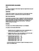
Everyone in the school that was surveyed was given a number and I need to find out which numbers we want at random and I will do that by using the following equation: _
Random Number x No. of boys/girls in the year group = No. of the child we
Want from the survey
I will get this random number by pressing the random number button on a calculator.
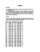
I need 19 boys from year 9 I need 23 girls from year 9
Numbers in ascending Numbers in ascending
Order order
0.768 x 118 = 91 7 0.129 x 143 = 18 4
0.665 x 118 = 78 11 0.981 x 143 = 140 5
0.314 x 118 = 37 19 0.569 x 143 = 81 7
0.224 x 118 = 26 20 0.052 x 143 = 7 13
0.171 x 118 = 20 26 0.215 x 143 = 30 18
0.952 x 118 = 112 27 0.953 x 143 = 136 19
0.917 x 118 = 108 33 0.621 x 143 = 89 20
0.093 x 118 = 11 34 0.289 x 143 = 41 24
0.161 x 118 = 19 37 0.667 x 143 = 95 30
0.722 x 118 = 85 72 0.353 x 143 = 50 34
0.607 x 118 = 72 78 0.140 x 143 = 20 41
0.966 x 118 = 114 83 0.235 x 143 = 34 50
0.229 x 118 = 27 85 0.413 x 143 = 59 51
0.285 x 118 = 34 91 0.825 x 143 = 118 59
0.059 x 118 = 7 108 0.440 x 143 = 63 63
0.999 x 118 = 118 112 0.131 x 143 = 19 81
0.987 x 118 = 117 114 0.035 x 143 = 5 89
0.707 x 118 = 83 117 0.729 x 143 = 104 95
0.277 x 118 = 33 118 0.027 x 143 = 4 104
0.355 x 143 = 51 118
0.166 x 143 = 24 119
0.829 x 143 = 119 136
0.086 x 143 = 13 140
I need 17 boys from year 10 I need 15 girls from year 10
Numbers in ascending Numbers in ascending
Order order
0.879 x 106 = 93 4 0.558 x 94 = 52 20
0.994 x 106 = 105 6 0.849 x 94 = 86 23
0.727 x 106 = 77 18 0.549 x 94 = 51 31
0.672 x 106 = 71 23 0.638 x 94 = 60 41
0.457 x 106 = 48 39 0.724 x 94 = 68 51
0.513 x 106 = 54 43 0.661 x 94 = 62 52
0.821 x 106 = 87 47 0.211 x 94 = 20 56
0.892 x 106 = 95 48 0.868 x 94 = 82 60
0.523 x 106 = 55 54 0.978 x 94 = 92 62
0.037 x 106 = 4 55 0.332 x 94 = 31 64
0.950 x 106 = 101 72 0.734 x 94 = 69 68
0.168 x 106 = 18 77 0.246 x 94 = 23 69
0.059 x 106 = 6 87 0.433 x 94 = 41 82
0.314 x 106 = 39 93 0.681 x 94 = 64 86
0.407 x 106 = 43 95 0.596 x 94 = 56 92
0.440 x 106 = 47 101
0.218 x 106 =23 105
Interpret And Discuss Results
Comparing Boys To Girls in Year 9
Firstly from the grouped frequency tables it is obvious that the boys mean height and weight is higher than the girls as I said before and there is quite a big gap between the heights but a much smaller one between the weights.
From the cumulative frequency graphs we can see that the boys median, upper and lower quartile heights are bigger than that of the girls but the interquartile range is also bigger than the girls. So the boy’s heights are slightly more spread out than the girls. The weights are much closer together and the girl’s upper quartile is larger than the boys. This could be for a number of reasons that I have already addressed. Also the girl’s interquartile range is more than the boys showing a wider spread.
From the box and whisker diagram for heights the girls lowest value is very far away from the median, upper and lower quartiles. This could be because of one anomaly or the girl’s height is much wider spread out. But we already know they aren’t, so this must be an anomaly. From the weights diagram we can see a wider spread of results for the girls, which we know from the interquartile range so there are no big anomalies in this diagram.
The boy’s height-weight graph is weak positive correlation, whereas the girls one is a much stronger positive correlation. This is when we do the calculation of mean distance of points from line of best fit. The boys mean distance is 1.89cm, but the girls mean distance is 0.91cm. This is quite a significant difference and shows us that the girl’s results are much less spread out than the boys results.
Comparing Boys To Girls in Year 10
The results for year 10 are very similar to the year 9 results. The boys mean weight has got considerably more than the girls but the difference between the mean heights has shrunk. This could be because the girls in year 10 have grown or I could have, by chance, picked a group of very tall girls.
Also the boy’s median, upper and lower quartiles are bigger than the girls, for height, but the girl’s interquartile range is bigger than the boys, showing a wider spread in results. The boys median, upper and lower quartiles, for weight, are noticeable larger than the girls showing us that the boys are gaining a lot of weight in year 10 but the girls are staying pretty much the same. Although the girl’s interquartile range is bigger than the boys, showing us the girls have a wider spread once again.
From the height box and whisker diagram we can once again see that the girls have a wider spread of results, as the box is bigger. This also applies to weight, as we can see from the next box and whisker diagram. Furthermore the boys’ box is much nearer the highest point than the girls’ box, which is actually very close to the lowest point. So we can see the boys are considerably heavier than girls in year 10.
Both of the height-weight graphs for year 10 are weak positive correlations. This is shown in that the mean distance of points from line of best fit is very similar. The boys mean distance is 1.23cm and the girls is 1.2cm. So from these graphs we can see that both set of results are just as spread out as each other.
Comparing year 9 to year 10
The mean for pupil’s heights in year 10 is more than in year 9 but not by too much. So the pupils haven’t grown as much as I expected. Once again the pupils weight in year 10 is only marginally bigger than year 9 but I thought this would happen because usually children don’t put a lot of weight on at that age.
Also the median, lower and upper quartiles for height in year 10 are slightly bigger than year 9 and the interquartile ranges are very similar showing not much difference in the spread of the two year groups. But the weight cumulative frequency graph shows us that the median, lower and upper quartiles for year 10 are much bigger than year 9 and the interquartile range shows us that year 10’s range is wider than year 9’s.
From the box and whisker diagram for height we can see that year 9’s range is much bigger than year 10’s and the box is bigger in year 9’s diagram so the interquartile range must be bigger. In the weight diagram the box for year 10 is much nearer the highest point, so the weights in year 10 are bigger than year 9. Also year 9’s range is marginally bigger than year 10’s.
Both height-weight graphs are strong positive correlations, but year 9’s is slightly stronger and this is shown when we do the calculation for mean distance from the line of best fit. In year 9 the calculation comes to 0.85cm but year 10’s is 1.42cm, so year 9’s results are less spread apart than year 10’s.
These results are moderately significant if you want a basic look at year 9 and year 10’s height and weights. But if you want a better overlook of year 9 and 10 you need to do a survey over every school and every pupil in those schools.
I think that my strategy towards investigating heights and weights of school pupils has been quite good and accurate. I have done this investigation very systematically so the results are easy to understand.
The main improvement to this investigation would be to use more pupils and pupils from different schools, so you are looking more at year 9 and 10 in the country than just year 9 and 10 in one school.