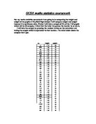
Sample:
Results:
Scatter Graphs:
The table on the left shows me the all the females in my sample in both year 10 and year 11. To find out where to put my line of best fit I had to work out the mean of IQ and the Average SAT’s Result, to work out the mean I had to add up all the figures in the IQ column and then divide it by forty, and to find the mean of the Average SAT’s Results I also had to add up all the data and then divide it by forty.
Working Out – on spreadsheets
IQ- In the cell below the final IQ figure I had to type in: STEP ONE: =SUM(C3:C42) the formula on the left is used to work out what all of the IQ’s added up together will equal [To get the (C3:C42)] you click on the first IQ figure and then drag the highlighted box down to the last figure].
STEP TWO: =SUM(C43/40) this formula is used to work out the mean. You need to type in =SUM into to cell below the cell you just got the calculation for and then make an open bracket and then click on the figure you just found out and then enter the divide button (/) and then type in 40 (how many females there are in your sample) then close the brackets and then press enter to get your mean.
Average KS2 SAT’s Results- you carry out the same process for to work out the total of the average KS2 SAT’s results and the mean.
The formulae that I used to get my mean were:
STEP 1 formula: =SUM(G3:G42)
STEP 2 Formula: =SUM(G43/40)
I will be using this method to find out the mean for each of my graphs (for both axis). I have chosen to use this method as it is less time-consuming to find out the mean as you don’t have to type all the figures into the calculator – you just have to type in two formulas and this method will give you the correct answer if you use the correct formula and there is also less chance of human error being made.
Cumulative Frequency Tables:
The cumulative frequency tables below show the spread of data (IQ) of the male and female people in my sample. The data in the cumulative frequency column will be plotted onto a cumulative frequency graph, to show the spread of data and then the median, upper quartile and lower quartile will be plotted in a box plot to show the inter-quartile range (the upper quartile take away the lower quartile) and to see who is more intellectually smarter (males or females).
Male
Female
The cumulative frequency tables below show the spread of data (IQ) for the two different year groups in my sample (Year 10 and 11).A box plot will be plotted to show the inter-quartile range and to see who is more intellectually smarter (Year 10 or Year 11).
Year 10
Year 11
The cumulative frequency tables below show the spread of data (Average SAT’s Results) of the male and female people in my sample. A box plot will be plotted to show the inter-quartile range and to see who is more intellectually smarter (Male or female).
Male
Female
The cumulative frequency tables below show the spread of data (Average SAT’s Results) of the male and female people in my sample. A box plot will be plotted to show the inter-quartile range and to see who is more intellectually smarter (Year 10 or Year 11).
Year 10
Year 11
Conclusion:
I have been able to prove my hypothesis ‘the higher the IQ the higher the SAT’s Result’ by using my graphs and comparative box plots to help me. I have been able to find that there is a positive correlation between IQ and KS2 SAT’s Results, as one increased so did the other. I have been able to find that a lot of people had the IQ of 100 by looking at my sample. My first graph ‘Male and Female Scatter Graph’ showed me that there was a strong positive correlation between the two variables (IQ and Average SAT’s Results). But as I started to break my graphs down into different categories like IQ with a particular subject or gender I found that some subjects had a weak positive correlation whereas others had stronger correlations.
I put two other IQ and Average SAT’s Results into the ‘Male and female scatter graph’ one was of my own IQ against average SAT’s result and another was from a class mate, but these two results showed me that are IQ’s were in fact above average, this my be down to a number of reasons such as: there may have been lower IQ levels within my sample, teaching method in both schools are different etc. This piece of information could imply that students in Mayfield High School have a lower IQ intelligence than the students in Queens Park Community School, but if I were to make this prediction without getting a range of students of different types to be apart of my investigation it wouldn’t be a fair test as I would be jumping to conclusions without actually investigating it, so therefore I believe this section wasn’t a fair test (as I never got a range of students to prove this).
I think that I have proved my sub-hypothesis females in my sample will have a higher average SAT’s result than the males as my scatter diagrams show me that the female (as a whole graph) has a better correlation than the male scatter diagram. My Average SAT’s Results box plot also shows that the female median is higher than the male median.
With my cumulative frequency graphs I wasn’t able to come to a clear conclusion about who was more intellectually smarter males or females, year 10 or year 11, to was because the results varied in both cumulative frequency graphs (IQ and Average SAT’s Results). The median for males was higher than the median for females in the IQ cumulative frequency graph whereas in the Average SAT’s Results graph the females had a higher median then the males. This same problem occurred with the Average SAT’s Results box plots.
Evaluation:
The limitations in my data were that I never had enough variables. If I had more time or if I were to do to this investigation again I would extend my investigation by adding in other variable such as: favourite subject, average number of hours TV watched per week, favourite subject (if a student enjoys English, maths or science they will be motivated to do better and push themselves further to achieve there highest potential grade).