Where x with a line over it is equal to the Mean, Σ is the sum of, f is equal to the frequency and x is equal to the mid point of the grouped data. From using this formula we can work out that the mean is:-
Therefore the mean equals 12.96610169
Median:
To work out the median I halved the cumulative frequency by dividing it by 2, find that point on the axis, draw a line across to the curve and then down to the horizontal axis and finally read off the median.
½ x 59 = 29.5
Therefore the median equals 17
Lower Quartile:
To work out the lower quartile I quartered the cumulative frequency by dividing it by 4, find that point on the axis, draw a line across to the curve and then down to the horizontal axis and finally read off the lower quartile.
¼ x 59 = 14.75
Therefore the lower quartile equals 11.5
Upper Quartile:
To work out the upper quartile I times the total cumulative frequency by three quarters, find that point on the axis, draw a line across to the curve and then down to the horizontal axis and finally read off the upper quartile.
¾ x 59 = 44.25
Therefore the upper quartile equals around 26.5
Interquartile Range
Therefore the median equals 17
Therefore the lower quartile equals 11.5
Therefore the upper quartile equals around 26.5
Using this data I can work out the interquartile range = 26.5 - 11.5
Interquartile range = 15 hours
Description
The results cumulative frequency graph shows that the values are greater earlier on which shows that most people watch an average amount of television in a week but then the graph slowly increases this is because only a few amount of students from the sample watch lots of television. Therefore students either watch loads of television and other ones watch around the average amount of hours.
Explanation
A student can only watch a certain number of hours of television because no one can watch more then 168 hours a television a week because there is only a limited amount of time in a week. For certain periods most students will be doing things like going to school as all the students have the same amount of time at school they are all influenced by what other people are watch and this is perhaps why there is an average which most people are gathered around. However there will always be exceptions too the extreme, someone who doesn’t have a television will not watch any television and the opposite extreme to this is person who watches the most amount of television this person is probably addicted too watching television and has a television in most rooms that way they can still watch television even if they are eating or even doing there homework. To compare the median and quartiles I have chosen do box and whisker diagrams as these are easy and clear ways to present this data.
Box and Whisker Diagrams
Using the information from the cumulative frequency graph and using the median, upper and lower quartiles I can analysis the data using box and whisker diagrams. The advantages of box and whisker diagrams is that they are a clear way representing this data and also by just by looking at the pattern you can come to a clear conclusion.
Using this information I was able to draw the following box and whisker diagram:-
Explanation
From looking at the box and whisker diagram we can see that the spread is not even as that the median and upper and lower quartiles are all towards the left of the graph which means that first set of numbers were very high. The majority of people that watch television don’t watch as much compared to some. From looking at the position of the median we can see that there is a positive skew because the median is closer to the lower quartile then the upper quartile. From the Box and whisker diagram you can clearly see that all the data is not spread out and that is mainly confined to the left hand side or the low numerical side this shows that not hardly any students watch hours and hours of television but they prefer too indulge in only a couple hours a night. Because the median is quite close to the lower quartile this means that the line isn’t to steep.
Overall Conclusion
The results showed that on the cumulative frequency graph that there was a wide spread from less then ten hours to seventy hours watched but the median and the quartiles showed that the majority hardly watch any television compared to others who watch loads. The box and whisker diagrams also showed that the spread was uneven and that it sloped to the left and that there was a positive skew. The majority of students that watches television only watch around watch around seventeen hours per week. Therefore this disagrees with the original hypothesis sp it must be rejected. For further development we could see if this hypothesis works for other schools.
Hypothesis 2
‘There is a relationship between height and weight which is the taller a person is the less that they weigh.’
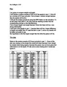
For this hypothesis I also used the same random sample because to use every piece of data would be to complex and it would also be too hard to find a distinct pattern with so much constant data.
The data that I have chosen is continuous this is because the data runs continually along a graph and that there is a big range.
Firstly’ to compare the data I will be drawing a scatter graph along the x axis will be height (m) and on the y axis there will be the weight (kg).
Now that the graph has been plotted I can work out the lone of best fit. To work out the average I will need to add up all the numbers together and then I need to divide them by the amount of numbers that there is. First I work out the averages of the height and then the weight. So that I know the gradient or slope of the line I will need to separate the data about around the averages and then for the two separate sections I will work out the averages for those sections and now I can produce the following table.
Using the table above a plotted the line of best fit onto the graph of height against weight.
Explanation
The graph shows that the graph has a positive correlation. The correlation shows that both measurements are strongly connected. The graph shows that the taller someone is the less that they weigh. It also shows that small people weigh less and that between the two extremes there are people that have an average weight and average height. There are also students that have an average height but have a large weight. Which forms a weird shape but the line of best fit still fits the graph. To explore this further I can check the spread using spearman’s rank.
Spearman’s rank
Spearman’s rank is able to convert a complex scatter graph to a number between negative one and positive one. Where one equals a perfect positive correlation and minus one is a perfect negative correlation a lower positive number indicates a weak positive correlation and a low negative number indicates a weak negative correlation. First I need to draw a table of values so that I am able to complete the spearman’s rank formula. Then I need to substitute the values that I am given into the formula.
My Result was that there was that there was a very weak negative correlation of
-0.01116977
Year Groups
Now I might find that there is a more correlation between people who are in different year groups. So first of all I will need to generate five new scatter graphs one for each year group. But to do this I am going to take my random sample and divide them into individual year groups or stratum. Now that I have divided them into year groups there is different amount of students in each group so now I will work out in comparison to the whole sample how many of each groups are needed.
From the 60 to be sampled I have this amount of students to be tested upon now I will generate the scatter graphs with this data.
The Graphs
All the graphs had a weak positive or negative correlation and when you compare all the graphs together you would get the overall one. In the first year I found that the majority of people were very tall on there was hardly any short people. Year eight showed that there were a lot of people that weighed a lot and that were very tall there were short people but there weight was quite low. Year 9 was spread out all over the graph there is a large range. Year 10 showed that was a strong positive correlation between height and weight the graph showes that as height increases weight appears to double. In year 11 there appears to be a negative correlation it shows that as weight increases height decreases. All the graphs did show one thing and that is that anyone who weighs over 55 kg tends to be around 1.60 metres tall.
Overall Conclusion
I found that the scatter graph showed that there was a weak positive correlation. Later on when I calculated spearman’s rank correlation coefficient I found that there was a very weak negative correlation and there was almost no correlation. The separate graph all showed all the graphs either had positive or negative correlation. The hypothesis does seem to match the graphs and all the evidence but it only works for some things and not all of the students. The rule only applies to some students and at one point people who weigh over 55kg tend to be around 1.60 metres tall any one who is taller has a low weight which is always less than 55kg. It is important to keep in mind that if fewer than 30 people were surveyed there is not enough people to draw up a conclusion. Some of the data was stupid of greatly exaggerated. You could see if the conclusions brought up will apply to other schools.