Mathematics Coursework- Handling Data- Mayfield High
In this investigation, I am going to look at the relationship between height and weight. I am then going to investigate further and see if this differs between boys and girls. I have chosen to look at height and weight mainly beacuse in this line of enquiry, my data will be numerical, meaning that I will be to produce a more detailed analysis. For example, if I had chosen to look at eye colour and hair coulour I would be limited to what I could do.
My aim in this investigation is to see if there is a correlation between height and weight and to see if this varies between genders.
I think that as the student gets taller they will weigh more. I also think that generally boys are taller than girls, if this is true, according to what I have said above, they should be heavier too. Although I believe this will generally be the case, I do expect to see some anomalous results because there are so many personal factors that can affect height and weight.
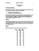
The Mayfield high database that I am using is secondary data. The data that I will be using for height and weight is continuous data. This will effect which graphs I choose to use as the data will not be a set value but within a range. I have decided to take a random sample of the whole school. This may not be as accurate as perhaps looking at just key stage four or a particular year group, but I could look at that if I were to extend the investigation. For now I would like to find out if I am able to see a correlation using a variety of students. I have chosen to take a random sample of 30 boys and 30 girls, leaving me with a total of 60 pupils. I have chosen to use this amount as I feel this will be an adequate amount to gain some good results and conclusions from. However, on the other hand it is a rather small amount which could make my graph work far more difficult and in some cases harder to work with.
In order to obtain my sample I used Microsoft excel. Here I highlighted my data and from the "data" tab I was able to sort it by gender allowing me to have the first 30 boys and the first 30 girls' records. There are other techniques of random sampling, for instance, you could give each of the boys a number, and use the random number button on your calculator to choose your sample. You repeat the process 30 times until you have 30 boys, you could repeat this method for the girls. Computers are a faster method, but there are other ways of doing it as I've shown above.
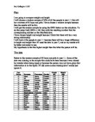
Boys Girls
Height (m)
Weight (kg)
Height (m)
Weight (kg)
.54
48
.66
45
.71
46
.70
48
.43
33
.62
65
.62
42
.54
54
.62
50
.62
52
.67
53
.74
47
.56
74
.64
44
.78
50
.80
60
.57
50
.48
39
.65
64
.60
51
.72
58
.73
44
2.03
86
.54
45
.52
54
.57
36
.91
82
.62
53
2.06
84
.52
40
.63
41
.70
55
.55
65
.52
45
.47
41
.59
50
.57
64
.56
45
.53
32
.67
57
.53
40
.48
47
.91
62
.50
45
.70
54
.75
56
.60
55
.62
54
.81
56
.59
52
.48
26
.59
55
.62
52
.61
48
.58
59
.72
51
.47
42
.60
60
.65
55
.52
45
However, although I am aware of how to use this method I have chosen to use the excel formula as all my data is on a database. This method is quicker, more accurate and generally more efficient. I am going to use this information for my scatter graph.
I need the mean point because my line of best fit has to go through it. In doing a scatter diagram, I will be able to meet the first part of my aim; I will be able to see if there is a correlation between height and weight. There are limitations in using a line of best fit. For my graph it is a best estimation of the relationship between height and weight. There are some exceptional values in my data that don't really fit in, for example the with a weight of 74 kg but a height ...
This is a preview of the whole essay
I need the mean point because my line of best fit has to go through it. In doing a scatter diagram, I will be able to meet the first part of my aim; I will be able to see if there is a correlation between height and weight. There are limitations in using a line of best fit. For my graph it is a best estimation of the relationship between height and weight. There are some exceptional values in my data that don't really fit in, for example the with a weight of 74 kg but a height of just 156 cm. These don't fall in with the general trend. The line of best fit is a continuous relationship. Rounding figures to the nearest whole number makes my predictions less accurate.
I have found that there is a correlation between height and weight. As I had predicted, the taller students are heavier. This was the case most of the time. However, there were a few anomalous results, I think this was mainly because in the sample that I have taken the range of the boys' heights and weights was very big. Their results were more spread out and not always proportional. This may be due to the fact my sample was including all year groups and people grow at different times. I wouldn't expect all the points plotted to be very close to the line anyway as there are so many personal factors that result in peoples weights varying, for example, the amount of exercise one does, the type of diet and lifestyle people have. It was inevitable.
Now I am gong to try and meet the second part of my aim. I would like to see if height and weight varies between genders. As I think that height depends on weight, I shall investigate height first.
Firstly I will use histograms to look at the difference in height between girls and boys. I am going to record my data on a histogram rather than a bar chart because I am using continuous data. To make it easier to produce a histogram, I will need a more useful representation of the data. So I have decided to sort my data and put it into height frequency tables. This way I will be able to see the data more clearly and it will allow me to plot graphs from the data with less difficulty.
Boys height frequency table
Height (cm)
Tally
Frequency
40 ? h < 150
4
50 ? h < 160
9
60 ? h < 170
9
70 ? h < 180
3
80 ? h < 190
2
90 ? h < 200
200 ? h < 210
2
In the height column 140 ? h < 150 means "140 up to but nothing including 150." Any value greater than or equal to 140 but less than 150 would go in this class interval.
Girls height frequency table
Height (cm)
Tally
Frequency
40 ? h < 150
2
50 ? h < 160
1
60 ? h < 170
0
70 ? h < 180
6
80 ? h < 190
The modal height in my sample was the same for boys and girls. However the boys range is larger and many more of the boys are in the taller groups. From looking at the two graphs I can tell there is a difference between the girls' and boys' weights, but in order to make a more definite comparison I would like to plot two sets of data on the same graph. A frequency polygon would be ideal and would make the comparison a lot clearer.
My frequency polygon has been successful in making things clearer. This graph does support my hypothesis, as it shows there were boys that had a height between 190cm and 210cm, where as there were no girls that had a height past the 180cm-190cm group. From looking at my graph I am easily able to work out the modal group, but it is more difficult to work out the mean, range and median also. In order to do this I have decided to make a back to back stem and leaf diagram as this will make my data very clear. This will enable me to read each individual height - rather than look at grouped heights. Stem and leaf diagrams are useful as they show a very clear way of the individual heights of the pupils rather than just a frequency for the group-which can be quite inaccurate.
In creating my stem and leaf graph I have been able to find the averages of the data more easily. It was certainly a very useful representation of the data.
The boys' averages were generally higher than the girls except for the mode, which was the same. I could not really include that in supporting my hypothesis as the other aspects do. However, the averages show me that the average boy is at least 2cm taller than the average girl. Also, the fact that the mode was the same was probably because the boys data was more spread out meaning that there was only a few people with the same height spread out everywhere. The range reinforces how much more spread out the boy's data is, with a range of 57.06 in comparison to the girls 32. The evidence from the sample suggests that 17% of boys were in the tallest groups between 180cm-210cm, where as only 3% of girls fit in to that category.
To display my averages and have a clearer understanding of them I am going to produce a boxplot diagram. Boxplot diagrams otherwise known as Box and whisker diagrams show the minimum and maximum values, the median and the upper and lower quartile. The size of a box and whisker diagram depends on the highest and lowest values in the sample.
The box and whisker plots show that the girls' interquartile range is almost 10mm less than the boys. This confirms what I already knew, the boys' results were more spread out and the boys' median was higher than the girls.
In order to see if gender affects weight I am going to produce a cumulative frequency graph. Cumulative frequency can be a very powerful tool when comparing different data sets. This is a perfect opportunity for me to compare the boys' and girls' weights. You can get a more accurate figure for the median from a cumulative frequency graph than from a stem and leaf diagram. This is because the cumulative frequency graph is a continuous approximation of the distribution of values. To make it easier to produce the graph I have created some cumulative frequency tables:
Boys Girls
Weight
Cumulative frequency
<30
<40
3
<50
0
<60
22
<70
26
<80
27
<90
30
Weight
Cumulative frequency
<30
0
<40
2
<50
5
<60
27
<70
30
<80
30
<90
30
My cumulative frequency graph shows that boys are heavier than girls. The girl's' weights only go up to 70kg where as the boys go up to 90kg. The boys curve shows the trend towards the heavier weights. This does support my prediction, as I did say that I thought boys would be heavier than girls. If I wanted to further justify any inferences made, and the accuracy of my frequency curve, I could increase my sample size to, for example, 60 boys and 60 girls. The benefit of producing a cumulative frequency curve for a continuous variable like weight is that you can easily read off the median, upper quartile, lower quartile and interquartile range. I have displayed these below:
Weights (cm)
Median
Lower Quartile
Upper Quartile
Interquartile range
Boys
52.5
47.5
61
3.5
Girls
50.5
46.5
54.5
8
All three measures of the average in the sample were higher for boys than for girls, though the sample for boys, as with height were much more spread out, with a range of 60 kg compared to the girls 29kg. The evidence suggests that 27% of the boys had a weight between 60kg and 90kg, whilst only 10% of the girls had a weight in this range. In fact the girls weights only went up to the 60kg to 70kg group. The Majority of the girls were in the 40kg to 50kg group, where as the majority of boys, were in the 50kg to 60kg group.
These conclusions that I have made about the students' heights and weights are based on a sample of only 30 boys and 30 girls. I could extend the sample or repeat the whole exercise to confirm my results.
From the sample that I have taken it seems that my predictions were correct. There is a correlation between height and weight; the taller you are, the heavier you are. Also, it seems that heights and weight do vary between genders; the boys tend to be taller and weigh more. However I feel that my results aren't as accurate as they could have been because of some limitations. For instance, I know from common sense that generally a persons height and weight will be affected by what age they are. So, I am going to extend my line of enquiry to consider the relationship between weight and height rather than across the gender divide, I will look at it across different age groups. When age is taken in to consideration, the correlation between shoe size and height will be better than when age is not considered. So, I have produced two scatter graphs one will show the relationship between year group and height and the other will show the relationship between year group and weight.
The scatter graphs are very accurate. I can see a definite correlation with both year group and height and year group and weight. They both prove that the older you are, the taller and heavier you get. Obviously as I mentioned before, you can't expect perfect results as of so many factors that can affect each individual's height and weight.
In my pre-test I sampled 30 students at random from Mayfield High School. However there are often different amounts of people in year groups due to school's growing resulting in more students in the lower years than in year 11 for example. If this is the case it means that my sample is biased or unfair. If I were to investigate again and redo this investigation I would take a stratified sample. This ensures that different year groups are equally represented. In a stratified sample you sample values from a particular group in proportion to that group's size within the whole population.
I have been provided with some data to allow me to give an example of stratified data. The following table shows me the amount of pupils in each year at Mayfield High School:
Year Group
Number of Boys
Number of Girls
Total
7
51
31
282
8
45
25
270
9
18
43
261
0
06
94
200
1
84
86
70
Total Students
183
To ensure that my sample is in proportion I would need to work out what percentage of the overall total is, for example- Year 7 girls.
There are 131 year 7 girls and the total amount of people in the school in 1183, so the fraction of the year 7 girls is 131
1183
In order to work this out as a percentage you would: 131 x 100
1183
So the percentage of the number of year 7 girls in my sample is:
1.073541842772612003381234150465 rounded to 2dp= 11.07
Below, I have created a table, which shows the percentages needed for the girls and boys in each year group.
Year Group
Percentage of Boys
Percentage of Girls
Total Percentage
7
2.76415892%
1.07354184%
23.837700760%
8
2.2569738%
0.56635672%
22.823330520%
9
9.974640744%
2.08791209%
22.062552834%
0
8.960270499%
7.945900254%
6.906170753%
1
7.100591716%
7.269653423%
4.370245139%
Total Students
183
I have chosen to use 60 students, this is because it is an easy number to manage and it happens to be approximately 5% of the schools total students. Due to the fact my total sample will be 60 students, I will select 7.65849534 Year 7 girls.
60 x 0.1276415892 = 7.65849534
You cannot pick 7.65849534 students, it's impossible to take a fraction of a student! So I have rounded it to the nearest student. However this may result in my total going over 60, I might have to add or take a couple of students from a random year group.
Below are my results of my stratified sample. It displays the number of random students I will need to pick out from each year group from the data.
Year Group
Number of Boys
Number of Girls
Total
7
8
7
5
8
7
7
4
9
6
7
3
0
5
5
0
1
4
4
8
Total Sample
60
This investigation has proved a lot, here is a summary of some of my findings from this investigation:
* There is a positive correlation between height and weight. This can be shown both across the school and within year groups. This correlation seems to be stronger when individual year groups are separate and genders considered. In general the taller the person, the heavier they are.
* A sample of 60 students stratified over gender shows a mean height of 164.67 for the boys and 161.33 for the girls. However the range of boys was much greater than that for the girls. This suggests that there will be many boys who are shorter than the girls mean height.
* Gender does affect a person's height and weight. As boys are usually taller, they are heavier too.
* Although it is a simple statement I have proved that age does affect ones height and weight.
* Throughout my research I have found that the range of boys' heights and weights is greater than girls. The anomalous results come mainly from the boys suggesting that the correlation is better for the girls' and that the boys' heights' and weights are less predictable.
My investigation did prove my prediction to be correct. However, I don't think that my results showed as much correlation as they could have. I do regret not taking a sample with a smaller age range, for instance a group of year 11 girls and boys. This would have shown a greater correlation and my graphs would have been more accurate.
If I were to extend my investigation I could look at height, weight and BMI (Body mass index) this would show me if pupils were in proportion. I could look at some data from years ago at students' height and weight and compare it to nowadays to see if students are getting fatter. I could also look in to other methods to make data more precise and accurate such as the mean of deviations from the mean.
Katie Harrison 11SR