In the second part I will also find out the mean, mode, median, range and standard deviation, and I will comment on what it tells me about the differences between the girls’ height and weight and the boys’. I will plot scatter diagrams and lines of best fit to see if the first part of my hypothesis is right and also to spot out outliers. I will also produce back to back stem and leaf diagrams and frequency polygons.
In the third part I will use cumulative frequency diagrams and box whiskers to compare individual year groups in order to see if my second and third predictions are right or wrong.
Investigating whole sample
Before I start investigating individual year groups I want to see what the general distribution of height and weight in the school is. Using Excel I found the mean, mode, median, range and standard deviation. It is very easy and all I have to do is to highlight all the heights or weights and to press on the formula button and then on either mean, median, mode, range or standard deviation.
The results for the height are listed below:
Mean – 1.60 m
Median – 1.62 m
Mode – 1.62 m
Range – 0.80 m
Standard Deviation – 0.12 m
This shows me that the average height of the students in Mayfield High School is 1.60 meters. It also shows me that the most frequent height is 1.62 meters which is more than the average. Standard deviation is a formula that finds the average deviation from the average. The formula for it is √1/n∑(x-mean)². In this case the standard deviation is less than 10% of the mean therefore it means that there is a small spread of heights in Mayfield High School and that the mean reflects a big percentage of the heights.
These are the results for the weight:
Mean – 50.47 kg
Median – 50 kg
Mode – 45 kg
Range – 55 kg
Standard deviation – 9.96 kg
In contrary to the heights, there is a small spread of weights in the school. The range shows that between the heaviest child to the lightest one there’s a huge difference of 55 kg, which is about a 12 year old male weight. The standard deviation also agrees with that as we can see that the average deviation from the mean is almost 10kg (9.96) and it shows me that the mean doesn’t reflect most of the students. The average weight is 50.47 kg and the most common one is 45 kg this shows that there must be a lot of heavy students to make the mean bigger than the mode.
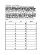
These frequency tables show the different weights and heights of students in the 10% sample Mayfield High and how frequent they appear:
Using the information shown in these tables I will plot 2 histograms, one for each. I will do this also using Excel.
These graphs show me the frequency of the heights and weights of the whole sample. From them I can see that most of the students are 1.60 m to 1.69 m tall and weigh 45 kg to 49 kg.
Male and Female
I now have a lot of information about the whole sample of Mayfield High School. Now I will break it down to male and female categories and compare the information to show different facts, like girls are taller than boys in year 7 but boys are taller then girls in year 9. First I will find out the same information I found out for the whole sample, the mean, mode, median, range and standard deviation for both heights and weights.
Boys
These are the statistics for the heights of all the boys in Mayfield High School:
Mean: 1.62 m
Median: 1.62 m
Mode: 1.70 m
Range: 0.80 m
Standard deviation: 0.14 m
These statistics show the following facts:
- The most common high in Mayfield High School is 1.70 meters tall (as the mode is 1.70). This is very unusual as the mean height is 1.62 meters (there is a difference of 8 cm between the mode and the mean).
- According to the range there is a big height difference between the tallest boy and the shortest one, 80 cm.
- The standard deviation in this case proves that the mean reflects most of the data is the average deviation from the mean is not too big which means that most of the data is quite near the mean.
Below are the results for the averages of the boys’ weights:
Mean: 51.30 kg
Median: 52 kg
Mode: 54 kg
Range: 55 kg
Standard deviation: 11.36
This shows me that the average height of the boys in Mayfield High is 51.30 kg which is not very heavy. The most common weight (the mode) is 54 kg and again it’s above the average (although this time not by a lot). The range is yet again very big but it only tells me that there’s a big difference between the heaviest child and the lightest child. The standard deviation in this case is less than it was for the whole year group by 1.5 kg which means that the data is more spread and the mean reflects even less the different weights.
Girls
This is the information for the girls’ heights:
Mean: 1.61 m
Median: 1.62 m
Mode: 1.62 m
Range: 0.50 m
Standard deviation: 0.10 m
Ii is interesting to see that the girls are not much shorter than the boys; the average is only 1 cm less which is not a lot. The median (the middle value in an ascending series of numbers) is the same as the boys’, 1.62 cm. The range is much lower than the boys’, only 50 cm, which means that there’s no much difference between the tallest girl and the shortest one. The standard deviation is 10 cm which means that the mean is reflects almost all the heights and by looking at it I can understand what the average height of a girl in Mayfield is.
These are the stats fir the girls’ weights:
Mean: 49.60 kg
Median: 48 kg
Mode: 45 kg
Range: 40 kg
Standard deviation: 8.24 kg
From comparing the girls’ mean with the boys’ I learn that girls in general in Mayfield are a bit lighter than boys but there isn’t such a big difference, only 1.70 kg which is not a lot. The most common weight is 45 kg and the distribution is quite high as the standard deviation is almost 20% of the mean which shows that it is not very reliable.
Comparing height and weight
Up to this stage I have found the mean, median, mode, range and standard deviation of the heights and weights of the whole sample and for boys and girls, and analysed them. Now I will compare the differences between the heights and weights.
In the diagrams shown on the next few pages I will use a line of best fit to take my investigation one step further.
Equation of line of best fit
In the next scatter diagrams I will draw a line of best fit to show the nearest approximation to the height/weight ratio. The formula of this line (and of any other line) is y=mx+c, where m represents the slope of the line and c is the intercept (the point where the line cuts the vertical axis). The line of best fit represents the place where the sum of the squares of the distances of the results from the line itself is the smallest. When the line f best fit is drawn by hand you can never be 100% accurate or even close to that without using a very complicated statistical formula, therefore I will use Excel to work out the exact position of the line. It looks very confusing but it isn’t necessarily so, because all I have to do is only write the formula and then Excel does the rest of the work for me. First of all I will have to have the x values (the height) and the y values (the weight), then I will plot a scatter diagram using this data. Then I will have to find the intercept and the linear trend, but all I have to do is to tell Excel what I want to find out and then give it the x and y values, and it gives me back the results straight away. However this does not give me the exact position of the line, I need to use the formula y=mx+c on every x value to get it. After I have done this I will get the line of best fit.
This scatter diagrams shows the correlation of the heights and weights of the whole sample, in this case the correlation is positive although there is a big distribution. I can also find outliers and in this diagram I can only see at least two (1.91,82) and (2,86). I can also see that the most of the students are between 1.55 m to 1.70 m and they weigh 45 kg to 60 kg. Using the formula of the line of best fit, y = (49.13x) × (-28.84), I can find the height of a student when I’m given the weight and vice versa.
This graph shows the correlation of height and weight of the boys in Mayfield High School. I can see that the correlation is slightly positive although the points on the graph are not lined up. I can spot out a few outliers, (1.64,35) someone who is 1.64 m can never weigh 35 kg, (1.45,72) this person has to be very obese (or there was an error when the data was entered), (1.20,38) it is very unusual for someone in high school to be only 1.20 m.
This graph shows the correlation of the heights and weights of the girls in Mayfield High School. The correlation is also positive but less than the boys’ correlation, this means that there is less connection between the height and weight. Again I can spot some more outliers like (1.59,32), (1.66,72), (1.75,40) and (1.64,70). The line of best fit can help me in finding the approximate heights when I have the weights and vice versa.
The last three diagrams all have a positive correlation; therefore as the person gets taller he/she gets heavier. After looking back at my hypothesis I can see that my prediction about this was correct. Using the line of best fit I want to predict what a 1.65 meter tall male and female weigh. I can calculate this by using the formula of the line of best fit, y=mx+c. Firstly I will calculate what a 1.65 m tall male will weigh, the values of m and c are 51.48 and -32.21, therefore the equation is y=51.48×1.65+(-32.21).
y = 51.48×1.65+(-32.21)
y = 84.95+(-32.21)
y = 52.74
Therefore I predict that a 1.65 meters tall male will weigh 52.47 kg.
The values of m and c for the weight of a female who is 1.65 meters tall are 43.16 and
-19.72, so the equation is y=43.16×1.65+(-19.72).
y = 43.16×1.65+(-19.72)
y = 71.21+(-19.72)
y = 51.50
Therefore I predict that a 1.65 meters tall female will weigh 51.50 kg.
Comparing individual year groups
In the early parts of this investigation I proved that as a person gets taller he/she also gains weight (no matter if it’s a boy or a girl). Now I would like to see if girls are heavier in year 9 than in year 11. The easiest way to compare the two year groups is to draw a cumulative frequency diagram, however this time I will draw the graph by hand because cumulative frequency almost the only graph that Excel can’t draw accurately. Firstly I will draw 2 cumulative frequency tables, one for each year group, to help me plot the graph.
After the cumulative frequency I will plot box and whiskers diagrams.
The cumulative frequency diagram on the previous page shows me that girls in year 11 are heavier than girls in year 9, which mean that my hypothesis is wrong. This is because the year 11 curve is on the right side of the year 9 curve which means that the x values are bigger. I can also see these interesting statistics:
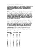
Year 9:
Median – 43 kg
Upper quartile – 45.5 kg
Lower quartile – 40.5 kg
Inter quartile range – 5 kg
Year 11:
Median – 44.5 kg
Upper quartile – 54 kg
Lower quartile – 41.5 kg
Inter quartile range – 12.5 kg
The box and whiskers diagram shows me more clearly that year 11’s median is slightly bigger and that there is much bigger spread of weights in year 11.