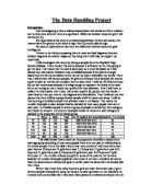
And after having done this, I have got the following set of data, which I will use to analyse, and prove or disprove my hypothesis, and analyse these using graphs. Firstly, I will analyse them individually to check for range and distribution, and then move on testing the hypothesis using scatter graphs. The final data set is as follows:
Data presentation / Analysis:
After having got the final data range, firstly, the standard deviation and correlation coefficient was calculated:
The standard deviation shows, on average, the distance of each data value from the mean, there fore giving us and idea of the distribution of the data set, and is more informative than just the mean itself. You can see that for all the data values, the mean is 4, and it doesn’t tell us much, but looking at the standard deviation, I can see that the average for KS2 has less of a distribution, and is closer together than the other two. Science has the widest ranges, and maths has a wider range than the Average for KS2, so it was a good idea to use the average, as it narrows down the inter-quartile range. IQ has a mean of 101, but this still doesn’t tell us a definite range of the concentration of IQ, so to explore each set of results further, I will compare the Maths, Science and Average with each other, using cumulative frequency and Box plots.
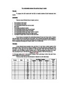
The above cumulative frequency diagrams don’t tell us much about the data ranges, without further investigation, so I will use figures for inter-quartile range, Median and highest and lowest values, to produce box plots for each of these data values, the cumulative frequency tables for these graphs are as follows:
Box and Whisker Plot to Compare the different data ranges of Maths, Science and the average KS2 result.
From the statistics and the box plots, you can see that maths and science have a relatively same structure; the main range is of the higher levels, 4-5, so very few people got lower than a level 4. The average narrows it down further to a 0.625 inter-quartile range, and this is a reason for doing the average, because it helps to narrow down the possible results available. For maths and science, the levels are discrete values so not much help, but the average tells us a lot about the range and now I know where the main area of the results are.
To work out, and get a clearer idea of the IQ, range, I drew a histogram of the results, which I got. The histogram results are as follows:
The histogram on the next page shows a normal distribution (Bell curve), which means that the major concentration of the people is around the mean, and the standard deviation value (8.269031), supports this, because the general area around the mean is what I am looking at, and that is the area with the most people, although the histogram narrows it down even further.
The purpose of investigating the data values individually before doing scatter graphs was to get an idea of each data value before I arrive to a conclusion, because these values may show statistics which may not easily be seen in scatter graphs, and using these will make my conclusion clearer and easier to make that without the histogram and the box plots.
Before I begin to Analyse and make the scatter graphs, I have worked out the correlation coefficient as seen earlier (Both the Correlation coefficient and standard deviation were work out using features of Microsoft excel). Correlation coefficient is the strength of the correlation. It does not show the gradient, but only the strength. It is never more than 1 and never less than -1. 1 is a strong positive correlation. -1 is a strong negative correlation. 0 is no correlation. A good correlation would be 0.9 which you would be likely to see in height against weight. In this investigation the correlation coefficient for all the graphs are about 0.7. This is quite a strong correlation, and you can see in the graph and judge for your own.
You can see that not all the values are not exactly on the line or really near it. In each of the graphs, there is one recurring anomaly, which has been circled. It is on the far left, for science there are two, and this was because their result was 0, which means for any reason, they did not turn up for the exam, and if they had taken the exam, they were likely to get a very high level 4 or an above average level 5, because there is a pattern, it is quite easy to predict results, based on the IQ, within half a grade. Of course there are many anomalies, some of the extreme ones have been circled, but generally, there seems to be a strong positive pattern to IQ against KS2 results.
From the Scatter graphs you can see that there is a very small area where IQ is, and this was addressed by the histogram, but for a clearer understanding, I have also done a cumulative frequency curve and an inter-quartile range of the IQ levels. The Table for it is as follows:
The inter quartile range is very small (7.25 – 106.25 is the upper quartile, and 99 is the lower quartile), so the IQ is base around that general area, as we saw from the normal distribution in the histogram.
After having analysed the cumulative frequency for the IQ, I can say that the IQ in the inter-quartile range, fits in with the scatter graphs, because if you look at the area of the inter-quartile range on the scatter graphs then it fits in with the line of best fit, and so now, after having analysed all the data values, individually and together, I can draw to a conclusion about this experiment. The cumulative frequency graph for IQ is on the next page.
Conclusion:
In conclusion, I believe that I have proved my hypothesis correct to a certain extent; I have proved that there is a correlation between IQ and KS2 result, and that the higher the IQ is, the chances of getting a higher level increase. Because of the gradient of the line of best fit (the slope being not very steep), IQ needs to increase at least 5 points to move on to the next level, if no other factors play a role in your intelligence.
I decided not to use English in my testing because English results for years 10 and 11 were not provided, and so the averages would not be fair. I believe that I have proved my hypothesis correct, because by analysing each data value before the scatter graphs, I made note of the range in which to look when analysing the scatter graphs, ignoring anomalies. So by using the inter-quartile range and then looking at the scatter graphs, I have come to a definite conclusion that IQ does have an effect on you KS2 result, but it is not wholly responsible for your result because the correlation coefficient was 0.7, and there is the other 0.3, the anomalies which leads me to believe that there are other factors involved in getting you a god grade, although IQ plays a majority role in this. Creativity and Social intelligence are just a few ideas, because IQ is a generalisation of intelligence. So to this extent I have proved the following statement correct:
“The higher the IQ level of an individual, the higher mark / level, that individual will get in KS2 examinations.”