Frequency polygons for boys' and girls' weights
This graph does support my hypothesis, as it shows there were boys that weighed between 80kg and 90 kg, where as there were no girls that weighed past the 60kg-70kg group. Similarly there were girls that weighed between 20kg and 30kg were as the boys weights started in the 30kg-40kg interval. Although by looking at my graph I am able to work out the modal group, but it is not as easy to work out the mean, range and median also. To do this I have decided to produce some stem and leaf diagrams as this will make it very clear what each aspect is, for the main reason I will be able to read each individual weight - rather than look at grouped weights. Stem and leaf diagrams show a very clear way of the individual weights of the pupils rather than just a frequency for the group-which can be quite inaccurate.
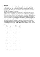
Girls Boys
From this table I am now able to work out the mean, median, modal group (rather than mode because I have grouped data) and range of results. This is a table showing the results for boys and girls;
(The values for the mean and median have been rounded to the nearest whole number.)
Despite both boys and girls having the majority of their weights in the 40-50kg interval, 13 out of 30 girls (43%) fitted into this category where as only 11 out of 30 (37%) boys did which is easily seen upon my frequency polygon. I could not really include that in supporting my hypothesis as the other aspects do. My evidence shows that the average boy is 4kg heavier than that of the average girl, and also that the median weight for the boys are 3kg above the girls. Another factor my sample would suggest is that the boys' weights were more spread out with a range of 50kg rather than 31kg as the girls results showed. The difference in range is also shown on my frequency polygon where the girls weights are present in 5 class intervals, where as the boys' weights occurred in 6 of them.
Height
I am now going to use the height frequency tables to produce similar graphs and tables as I have done with the weight. Obviously as height is continuous data, as mentioned already, I am going to use histograms to show both boys and girls weights. I am also going to make another hypothesis that;
"In general the boys will be of a greater height than the girls."
Histogram of boys' heights
Histogram of girls' heights
Similarly as with the weight, I can see the obvious contrasts between the boys' and girls' heights, but the data is not presented in a practical way to perform a comparison, that is why I am going to put the two data sets on a frequency polygon.
Frequency Polygon of Boys' and Girls' Heights
This graph does support my hypothesis as the boys' heights reach up to the 190-200cm interval, where as the girls' heights only have data up to the 170-180 cm group. Similarly there were girls that fitted into the 120-130cm category where as the boys' heights started at 130-140cm.
Girls Boys
With these more detailed results, I can now see the exact frequency of each group and what exact heights fitted into each groups, as you cannot tell where the heights stand with the grouped graphs. For all I know all of the points in the group 140 ≤ h < 150 could be at 140cm, which is why I feel it is a sensible idea to see exactly what data points you are dealing with. I can also now work out the mean, median and range or the data, these are the results I worked out;
Differing from the results from my weight evidence, the heights' modal classes for boys and girls differ, and much to my surprise the girls' modal class is in fact one group higher than the boys. This is very visible on my frequency polygon as the girls data line reaches higher than that of the boys. This doesn't exactly undermine my hypothesis however as the modal class only means the group in which had the highest frequency, not which group has a greater height. On the other hand the average height supports my prediction as the boys average height is 6 cm above the girls. The median height had slightly less of a difference than the weight as there was only one centimetre between the two, although again it was the boys' median that was higher. When it comes to the range of results, similarly to the weight the boys range was vaster than the girls, although there was no where near as greater contrast in the two with a difference of only 6 cm between the two. With all of the work I have done so far, my conclusions are only based on a random sample of 30 boys and girls so they are not necessarily 100% accurate, and therefore I will extend my sample later on in the project. Before I go on to further my investigation, I feel that it is necessary for me to work out the quartiles and medians of both data sets, as this allows me to work with grouped data rather than individual points as in my stem and leaf diagrams. To do this I am going to produce cumulative frequency graphs as this is a very powerful tool when comparing grouped continuous data sets and will allow me to produce a further conclusion when comparing height and weight separately. I am also going to produce box and whisker diagrams for each data set on the same axis as the curves for this allows me to find the median and lower, upper and interquartile ranges very simply. I am firstly going to look at weight, and to produce the best comparison possible I am going to plot boys, girls and mixed population on one graph.
Cumulative frequency curves for weight
All three of my curves clearly show the trend towards greater weights amongst boys and girls. From looking at my box and whisker diagrams I have obtained the following evidence:
These results continue to agree with my prediction made earlier that the boys will be of a heavier weight than the girls. I can see this as the lower quartile, upper quartile and mean are all of lower values than the boys, but also the boys' range of weights is shown to be greater from these results as their interquartile range is two kg higher than the girls.
Cumulative frequency for heights
From all of the graphs and tables I have produced so far, I can fairly confidently say that the boys weights' and heights' are higher than the girls but none of my evidence collected so far helps me conclude my original hypothesis made; "The taller the pupil, the heavier they will weigh."
Although when looking at my cumulative frequency graphs of height and weight, I could make the statement that both diagrams appear to be very similar from appearance although I cannot make any form of relationship between the height and weight. I am now going to extend my investigation and see how height and weight can be related, and to do this the most effective way is by producing scatter diagrams. I will plot boys and girls on separate graphs as I feel the results will produce a stronger correlation when done this way and also to continue with the style I have begun with. Using scatter diagrams allows me to compare the correlations of the two graphs, and the equations of the lines of best fit (best estimation of relationship between height and weight) of each gender.
Boys' Scatter diagram of height and weight
This graph shows a positive correlation between height and weight, and all of the datum points seem to fit reasonably close to the line of best fit. There are a few points that I have circled which do not really fit in with the line of best fit, these are called anomalous points, it means that they do not fit in with the trend of the results.
Girls' Scatter diagram of height and weight
This graph similarly shows a positive correlation, although the correlation is stronger than the boys as the spread is greater on the boys graph than on the girls. The datum points on this graph are quite closely bunched together in the middle where as on the boys graph there is a wider spread of results - which would agree with the conclusion made earlier that the boys' heights and weights are of a larger range than the girls. I have again circled the anomalous points on this graph to show which data did not fit in with the trend of results.
Now I will be using a stratified sample to produce a scatter graph for each age and alternate gender, i.e. a boys and girls scatter graph for year 7,8,9,10,11. I am going to maintain the same hypothesis of "the greater the height, the greater the weight” but I can also extend this hypothesis and comment on “the older the pupil the greater the height or weight"
These are the following scatter diagrms to prove this:
Year 7
Boys
Girls
For the year 7 graphs, the lines of best fit appear to be at a similar slope to one another although the boys begin at a higher point on the y axis than the girls - which would determine that the boys were taller. The boy's points appear more spread out but closer to the line of best fit, where as the girls are more sparsely distributed but are situated quite closely together on the line area. Both lines have a positive correlation which would agree with the taller the person the heavier they weigh.
Year 8
Boys
Girls
Differing from the year 8 graphs the lines of best fit are at quite different gradients. These graphs show that the boys in year 8 follow a strong pattern, of the taller you are the heavier you weigh - shown by the positive correlation of the line. However the girls graph differs and has a very slight correlation which could be for many reasons - one being that girls watch their weight slightly more. The points on both of these graph are more sparsely distributed around the lines of best fit, where as the year 7 points were more closely grouped together. This could be for the reason that your body starts to change in many different ways as you grow older.
Year 9
Boys
Girls
The Year 9 graphs show greater contrast again, although of a similar pattern to the year 8 ones. The boys shows an even steeper positive correlation showing the heavier you weigh the taller you are, and similarly the girls show the line of best fit almost positioned horizontally across the page. Both of these graphs have points positioned very closely to the line of best fit, although that could just be a coincidence.
Year 10
Boys
Girls
The year 10 graphs show a complete change with both of the graphs consisting of a practically horizontal line of best fit, the girls could be explained due to this gender caring about their appearance more, but the boys change I cannot explain. This could just be a fluke, as there are only 5 points on the graph anyway - which is a small percentage of all the year 10 boys.
Year 11
Boys
Girls
The small amount of data points on these graphs is barely enough for me to make a conclusion, however the boys graphs shows again the positive correlation as before. But the girls' graphs differ again and now create a negative correlation which would predict that the taller you are the less you weigh.
Although these graphs have given me some points to consider, one being why the girls graphs tend not to consist of "the taller you are the heavier you weigh" as the age increases. I have come to the conclusion that because as girls reach puberty and start developing they become more aware of their appearance and therefore try to watch their weight a bit more. Although, I only had a small stratified sample to represent the whole school, so it would not be an accurate source of information to draw an efficient conclusion from. However I did produce this table from all of my data points to see whether a further pattern occurred:
The only part of the table that I can assume a conclusion from is the mean as, when the age increases the weight and height does so to. Apart from a couple of irregular points further up the school there is a slight trend in the average heights and weights.
Throughout this project I have made many hypothesise including;
1) The heavier the pupil, the taller they will be
2) In general boys will weigh more than girls
3) In general boys will be of a greater height than girls
4) The older the pupil the greater the height/weight
I have answered all of these predictions throughout the project with either graphs or text, and it is proved that all of my hypothesise made have been in general correct. There have been some slight points which undermine the predictions, but all over they have been successful. My original task was to compare height and weight, although I have not only considered height and weight but including biased factors such as gender and age.
When considering age as a biased factor, I produced a stratified sample trying to create a suitable representation of the school on a smaller scale. Using the data for this stratified sample my results proved that in general the older you are the heavier/taller you are, however there was a group of pupils in year 9 which undermined this prediction. These results are however not 100% effective due to there only being a very minimal amount of data for each year group and gender.
Despite considering the age factor, I also spent a great deal of time looking at the differing genders to see whether that affected the height and weight of pupils at all. When looking at this I produced histograms, frequency polygons, cumulative frequency graphs and box & whisker diagrams, stem & leaf diagrams and scatter diagrams. The overall conclusion was that boys in general are of greater height and weight - mainly defined by the mean values which were higher than that of the girls.
However, all of these hypothesises were all as a part of my main prediction; "The taller the pupil the heavier they will weigh", and from answering all of these other predictions I can confidently say that it is true. I have come to this conclusion based on all of the graphs, diagrams, tables and statements made. On the other hand there were cases where certain data undermined this prediction but that could have been because of the small samples I had allocated myself to obtain. When producing the random sample of 60, I felt that was a satisfactory amount to work with as picking up an analysis and producing graphs from this data was simple and done efficiently.
Although when it came to the stratified sample, and I was looking at the different age groups using again a sample of 60 trying to represent the school on a smaller scale - I do not feel it was as successful. If I were to repeat or further this investigation - I would definitely use a larger number of pupils for the stratified sample as when the numbers of the school pupils were put on a smaller scale, I only ended up in some cases with a scatter graph with only 4 datum points upon for the year 11 students. To retrieve accurate results from this method of sampling, I feel it is necessary to use a sample of at least 100. Additionally to the stratified work, if I had a larger sample - I would also produce additional graphs, i.e. cumulative frequency/ box and whisker, as I feel that I could draw a better result from these as I felt the scatter diagrams I produced were rather pointless.
I feel my overall strategy for handling the investigation was satisfactory, if I had given myself more time to plan what I was going to do I think I would have come up with a better method and possibly a more successful project. One of the positive points about my strategy is that because I used a range of samples it meant that I was not using the same students data throughout the project. I instead used a range of data therefore maintaining a better representative of Mayfied school on a whole. There is definitely room for improvements for my investigation however I feel my investigation was successful as it did allow me to pull out conclusions and summaries from the data used.